Hello TestPlayer
The HelloTestPlayer case study shows how model-based testing can be implemented for web applications. For this purpose the essential steps for an automated statistical usage testing process, i.e.
- Processing of the test requirements
- Creation of the usage model
- Generation of abstract test suites
- Creation of an executable test suite
- Execution of the test
- Generation of test reports
Processing of the Test Requirements
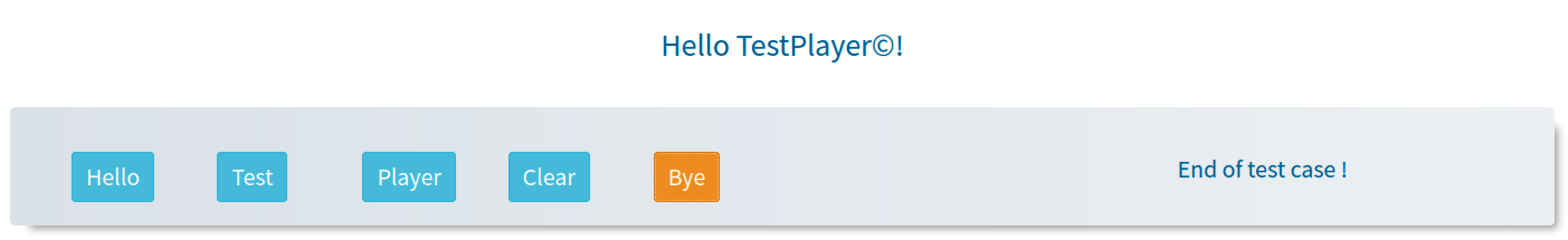
The following diagrams illustrate the required usage behavior of the
HelloTestPlayer web application:
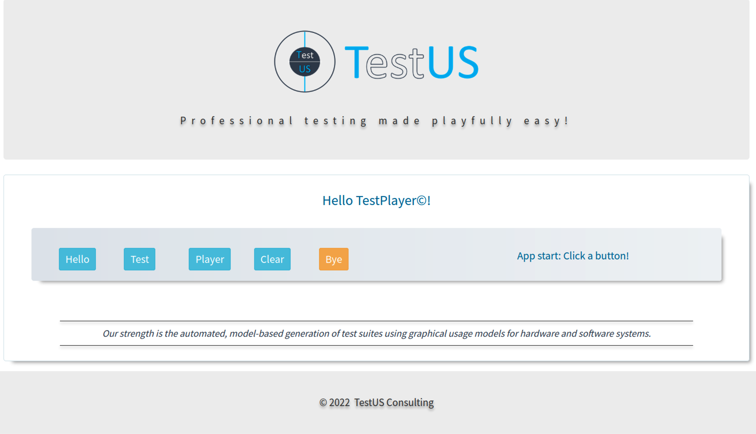
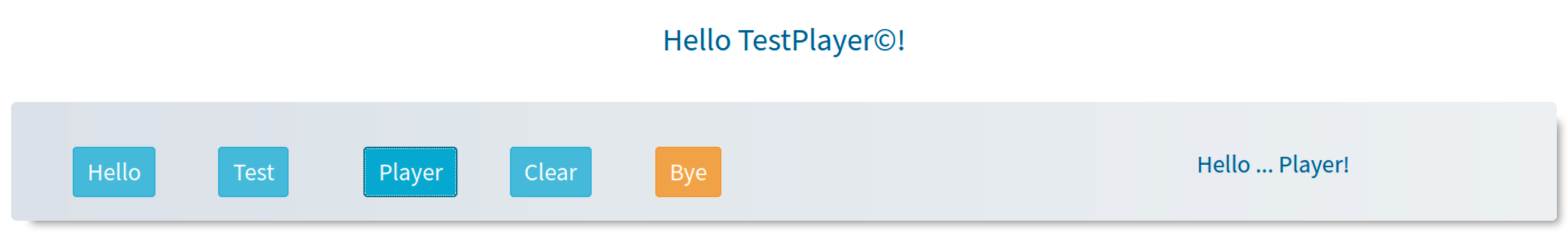
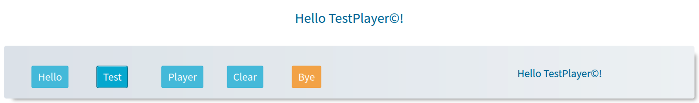
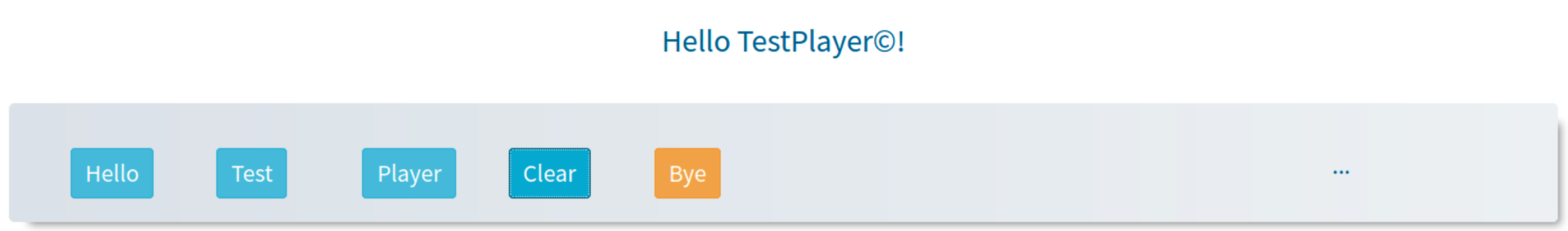
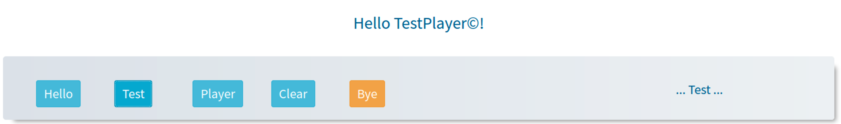
- when clicking one of the three buttons
Hello,TestorPlayerthe corresponding text is inserted into the output field - when pressing the
Clearbutton, the existing output text is replaced by... - if the orange
Byebutton is clicked, the messageEnd of test case!appears in the output field
-
Start -
-
Hello -
-
Player -
-
Test -
-
Clear -
-
Test -
-
Bye -
- etc.
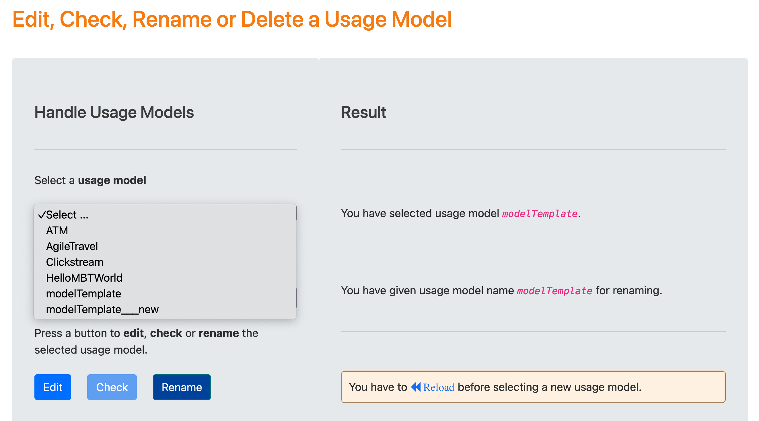
Creation of the Usage Model
Usage models can be created in Step 1 of the Test Suite Generation Wizard using the diagrams.net graphical editor.
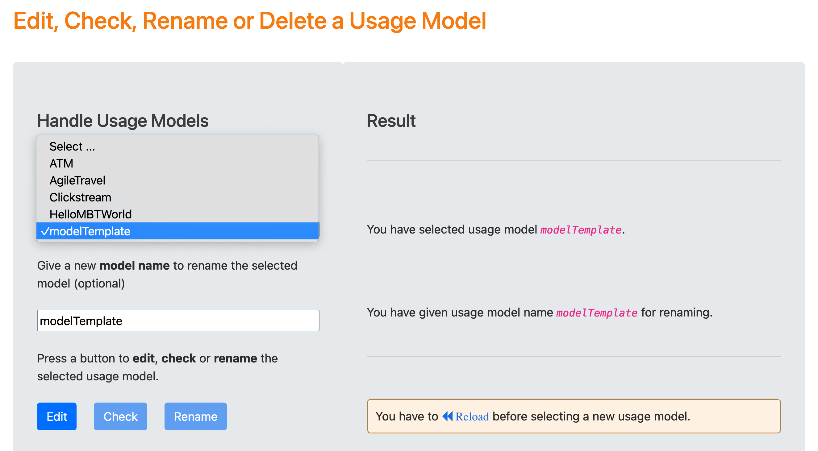
If the user clicks on the blue Edit button after selecting the modelTemplate usage model, the model editor provides access to a generic model without concrete state and event names:
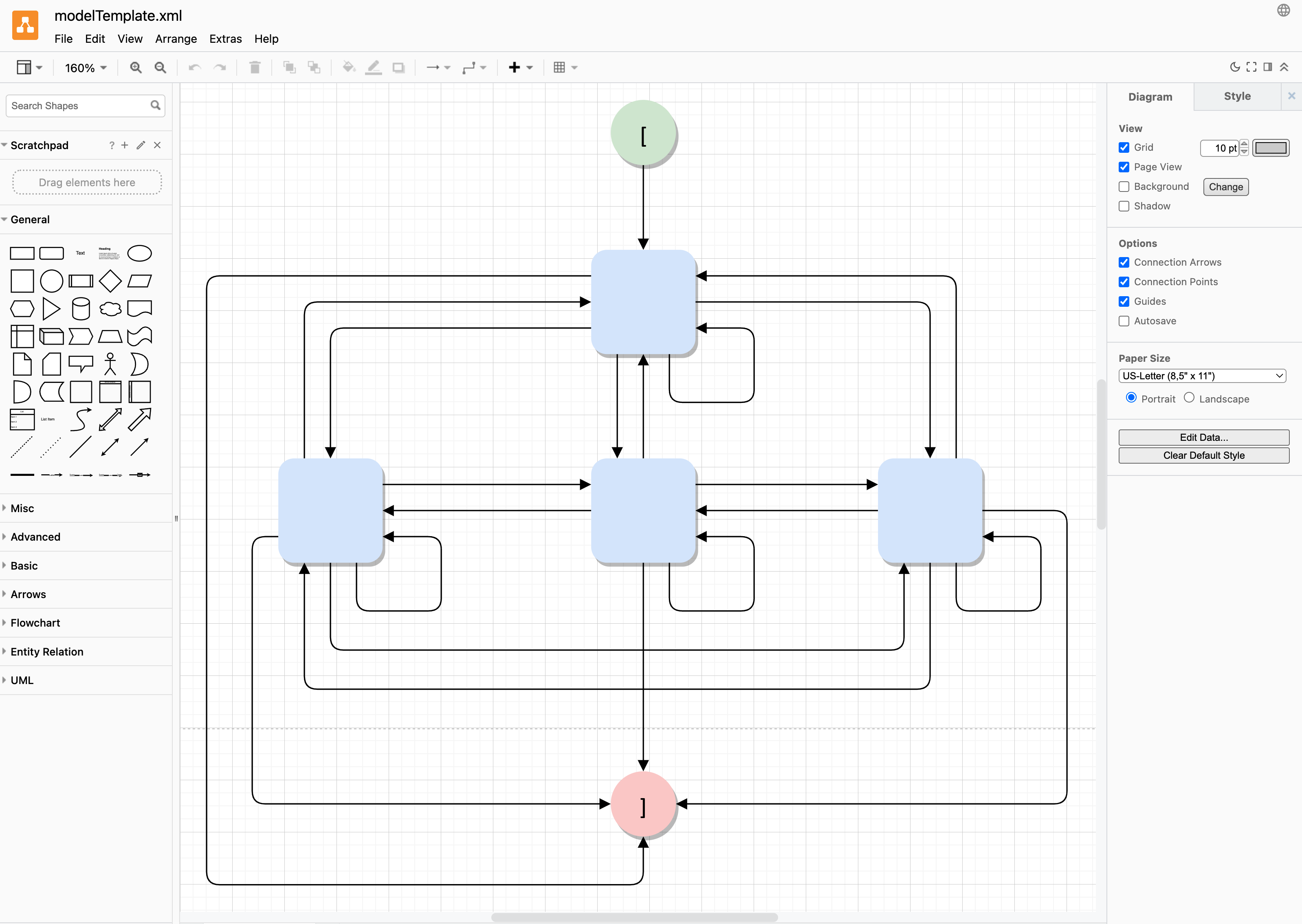
Usage models are stored by diagrams.net in XML format. This allows editing and checking the model code with a suitable XML editor, such as VS Code. It is also possible to extend an incomplete usage model or validate Markov chain usage models with repect to consistent Markov chain properties, i.e.
-
existing
startandstopstates - exactly one exit edge to the same successor state
- all states and all edges have unique labels
-
edge labels are pairs
event, probability, where probability is either a valid floating point number, an integer weight, an integer fraction less than 1, or a unique probabilty string of the formpx, where x is a unique number.
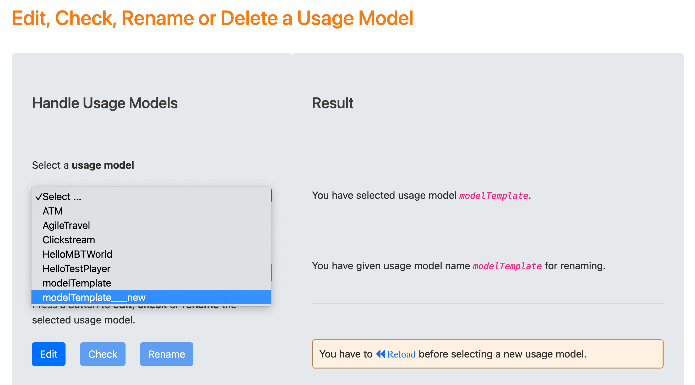
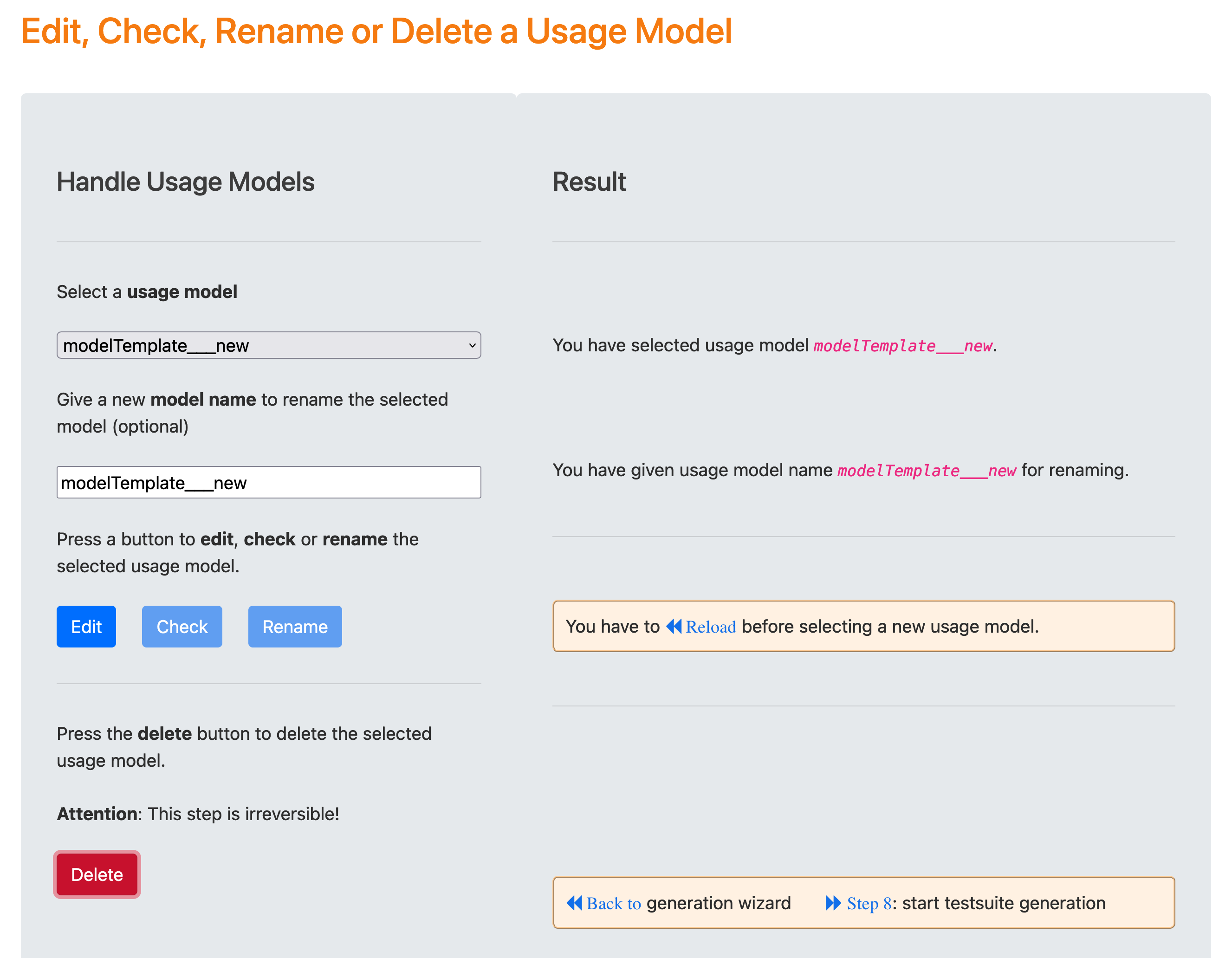
When the user clicks the green Check button after selecting the usage model modelTemplate, TestPlayer provides a new usage model named modelTemplate__new, which has generic state and event names.
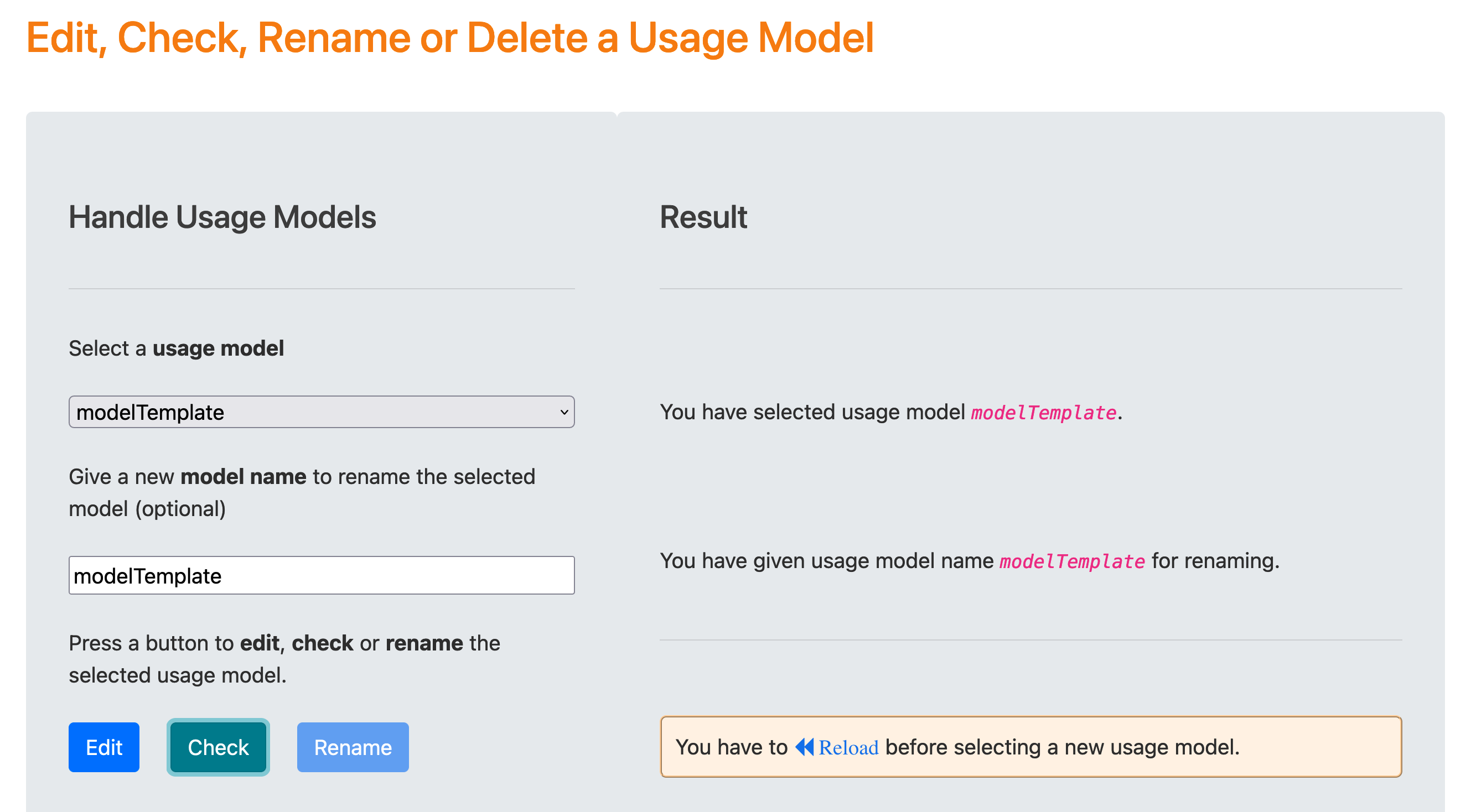
After reloading and selecting the new usage model modelTemplate__new the blue Edit button opens the diagrams.net editor to change the generic state and event names.
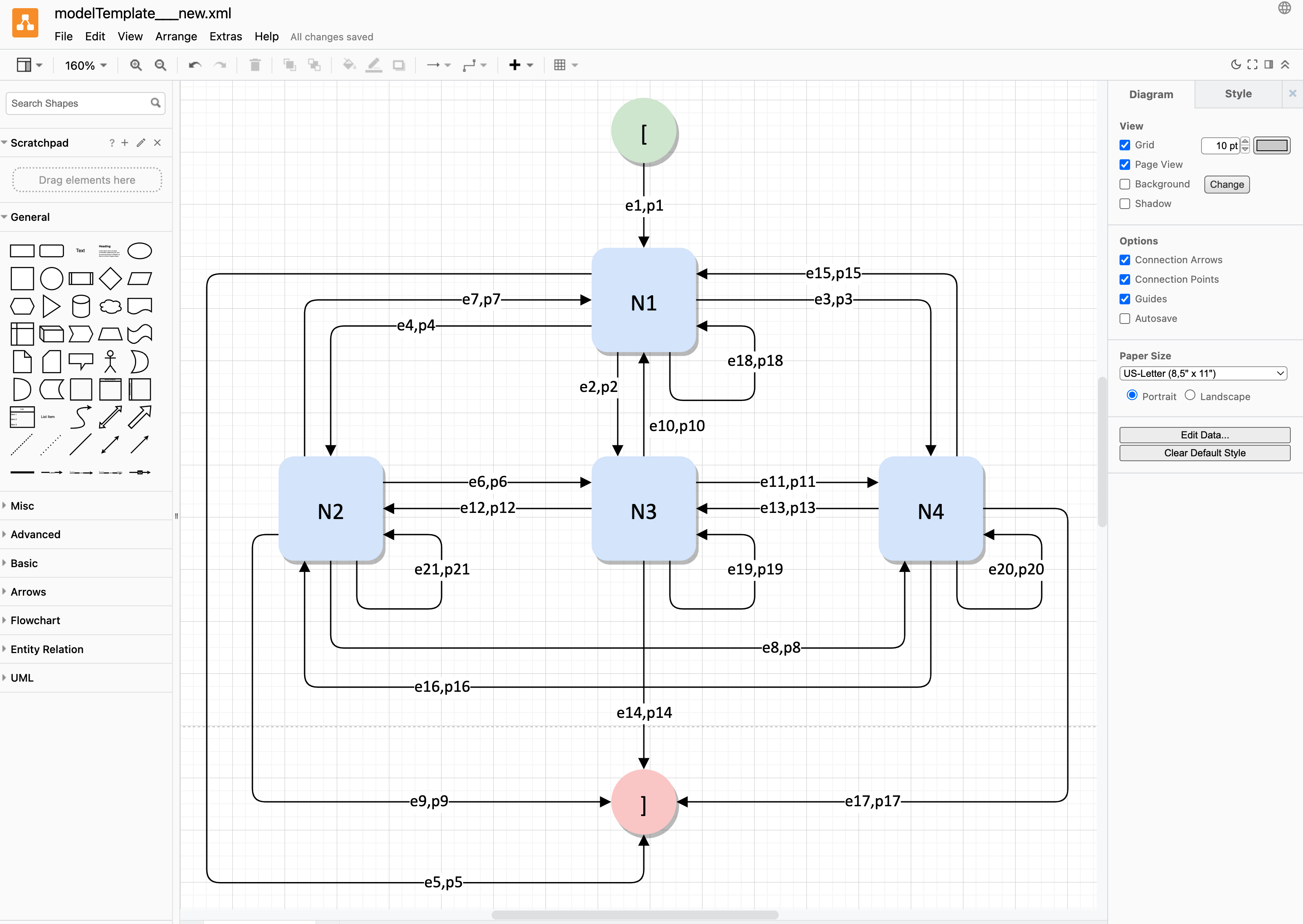
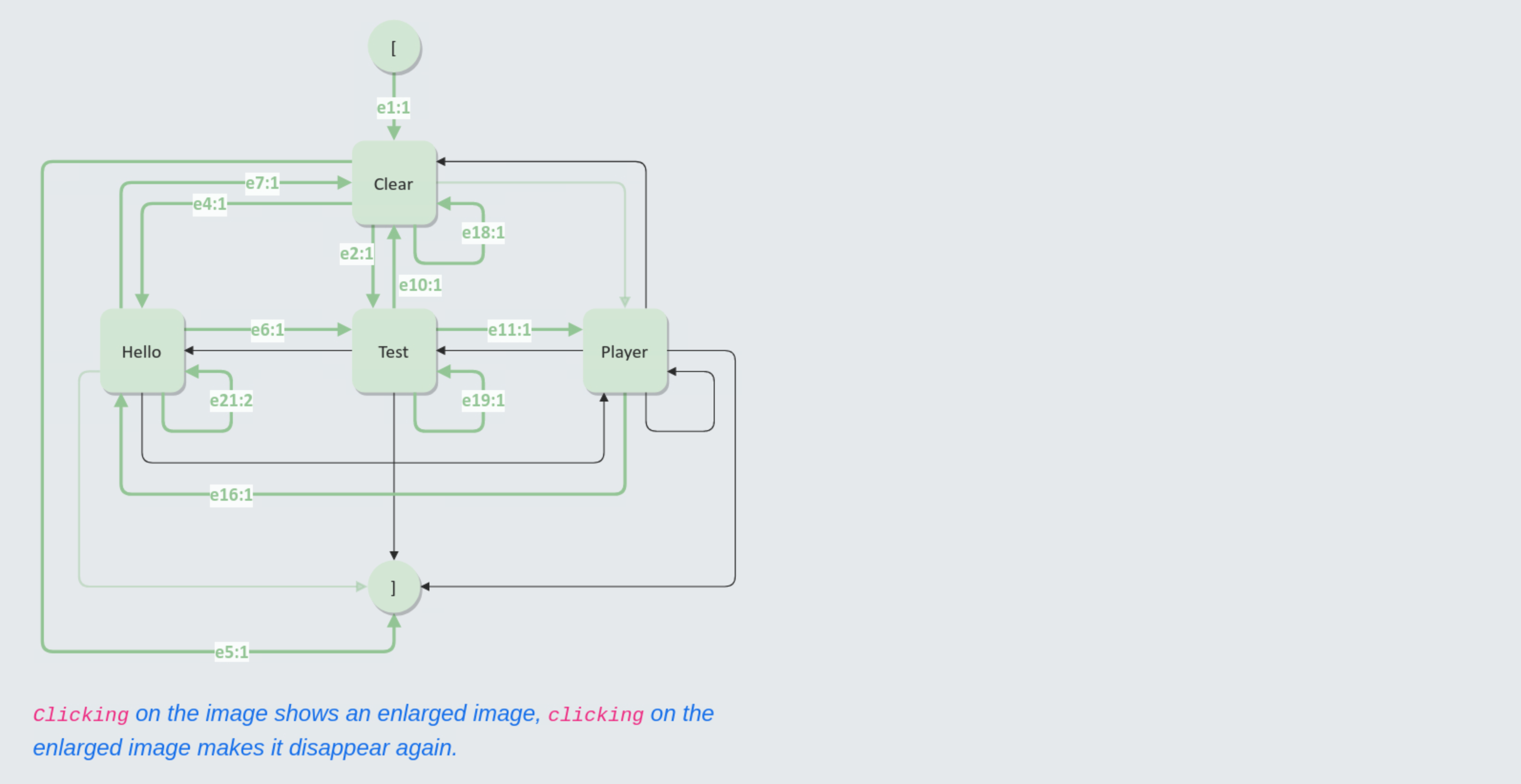
Now we can model the behavior and actions of users when they interact with the HelloTestPlayer web application. To do this, we change the state name N1 to Clear (Clear button), the state name N2 to Hello (Hello button), the state name N3 to Test (Test button) and the state name N4 to Player (Player button). The final end state ] is reached when the user presses the Bye button.
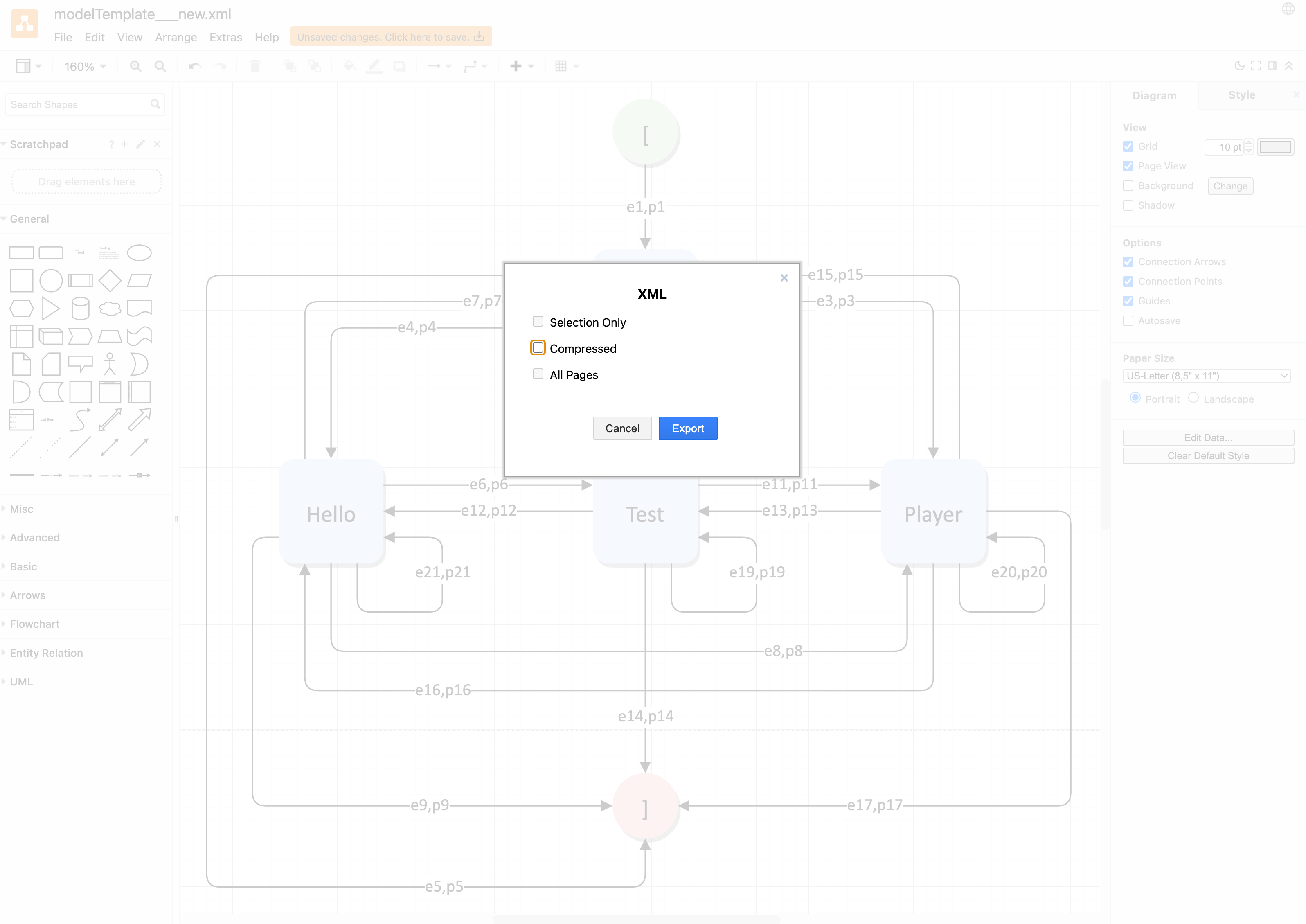
In our example, the generic transition label pairs (ei, pi for i=1..21 do not need to be modified. This results in the following modified usage model for testing the HelloTestPlayer app, which must be saved in order to use it for the automatic generation of test suites.
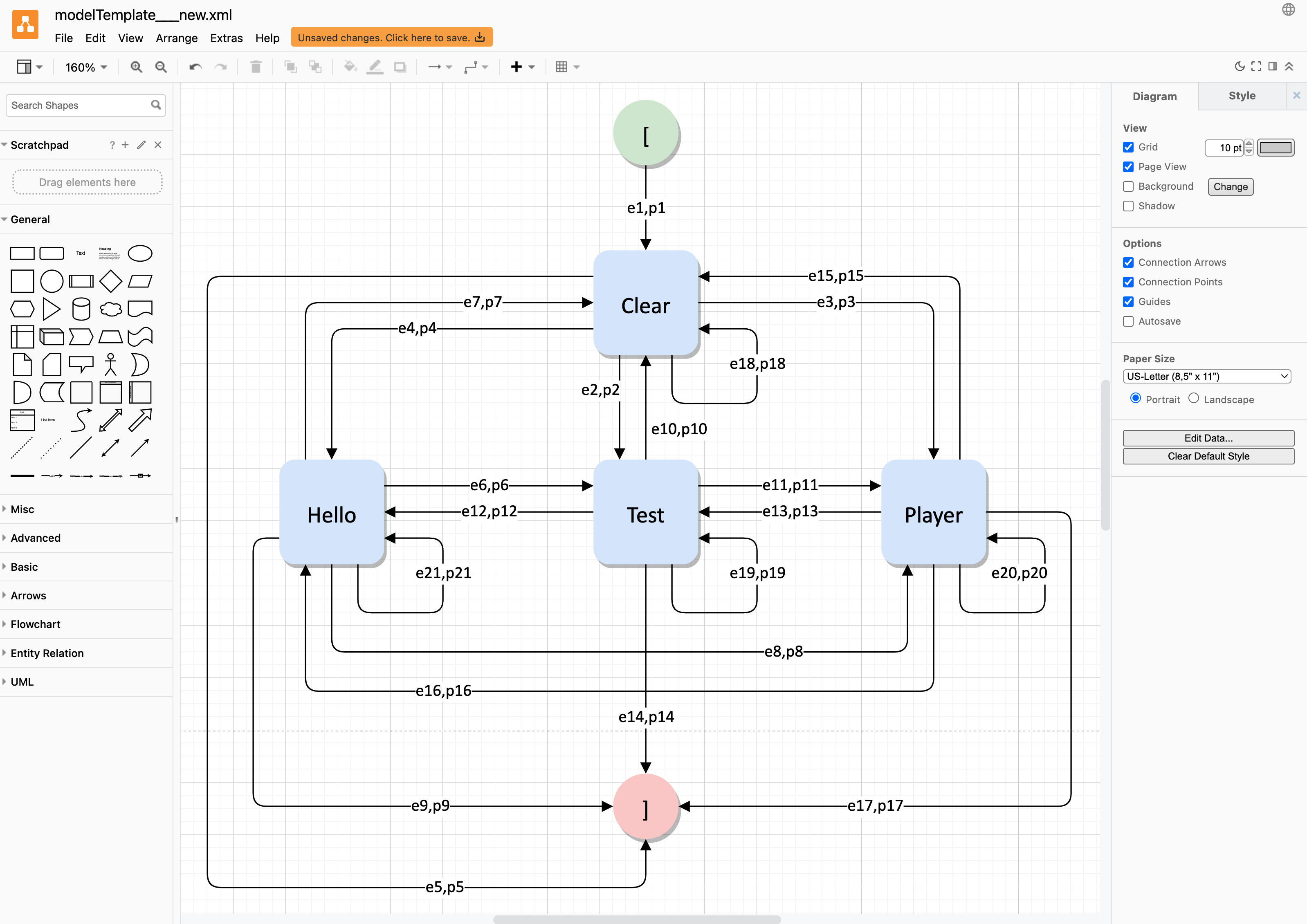
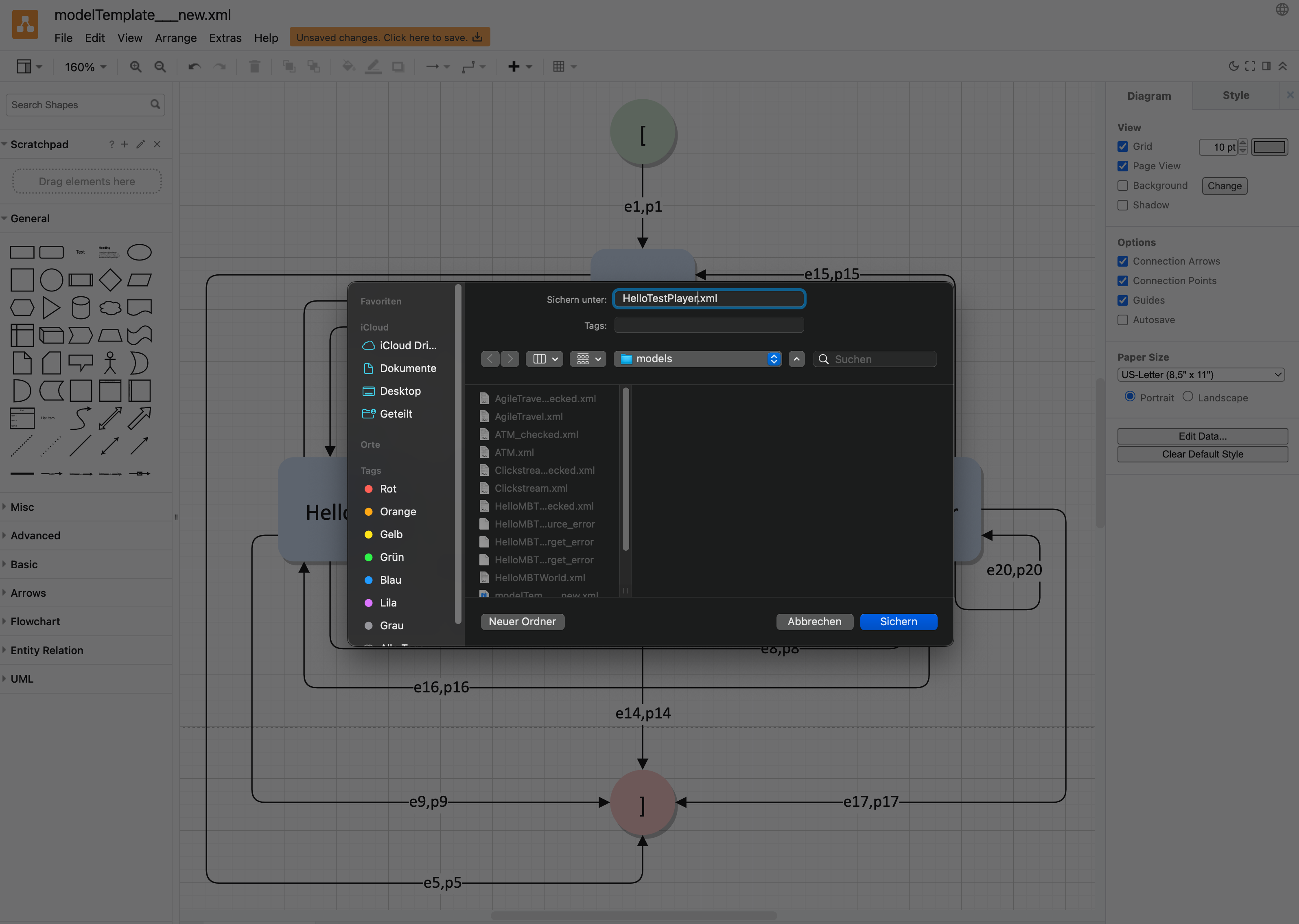
Since TestPlayer uses the uncompressed XML representation of the usage model, simply saving the file does not work, as diagrams.net automatically creates compressed files. Therefore, we need to Export the model as XML, uncheck the Compressed tag and specify the preferred file name, which in our case is HelloTestPlayer.
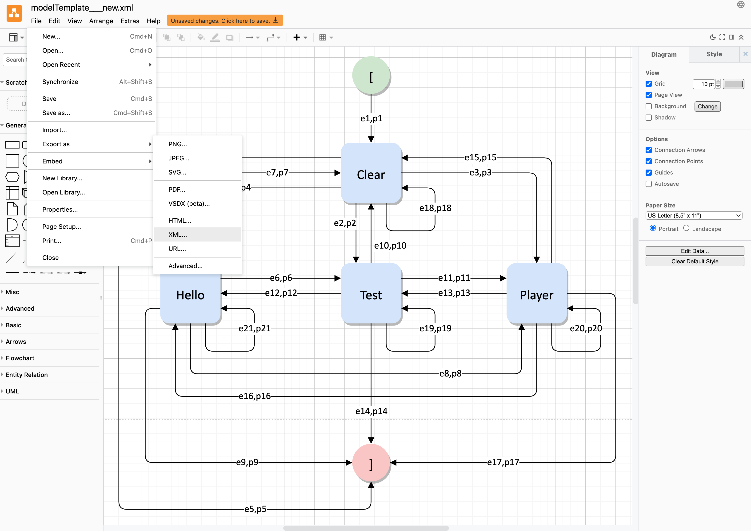
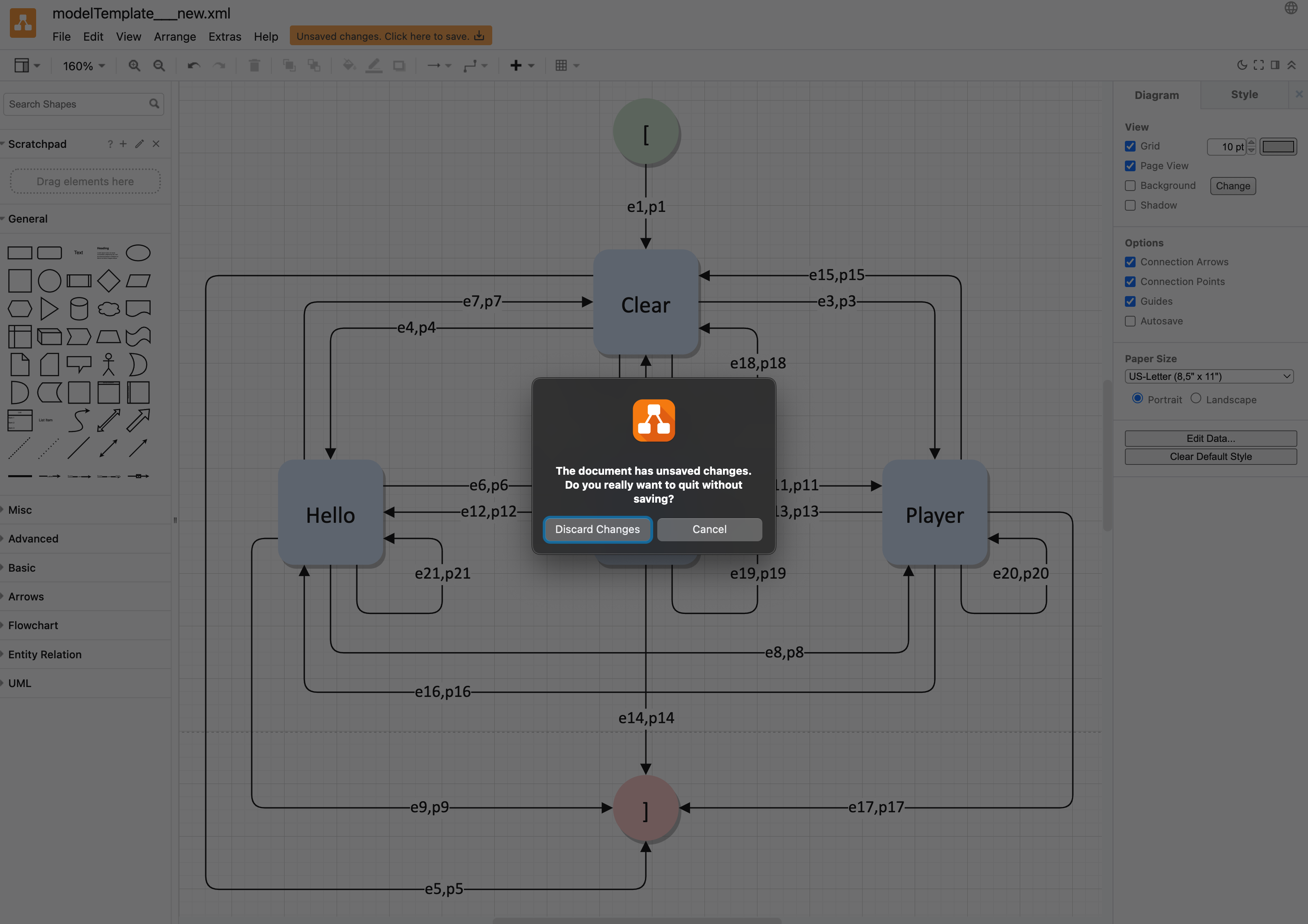
When you close the diagrams.net editor, a message informs you of unsaved changes. In this situation you must select Discard Changes without saving the model first.
In the last step you can delete the newly created model named modelTemplate__new by pressing the red Delete button. Make sure you have selected the correct model, as the deletion cannot be undone.
Generation of Test Suites
The Test Suite Generation Wizard guides the user through the test suite generation process after providing suitable usage models in the first step.
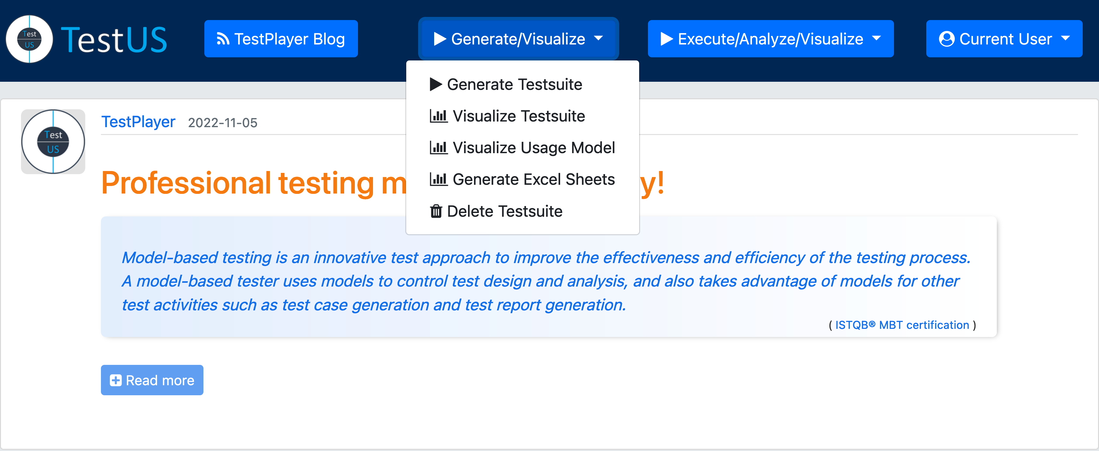
In the Navigate area, you can select specific tasks by clicking on the blue « Step links.
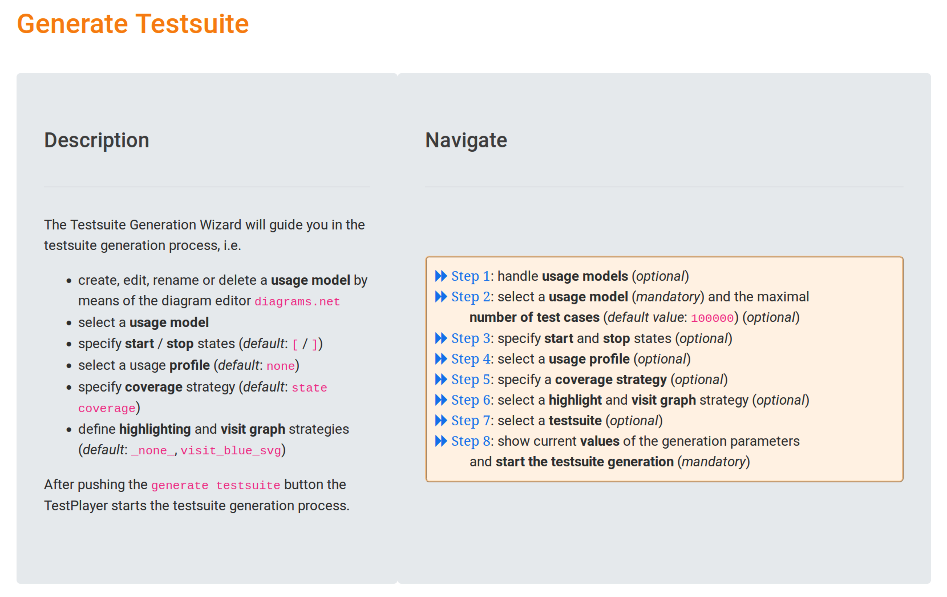
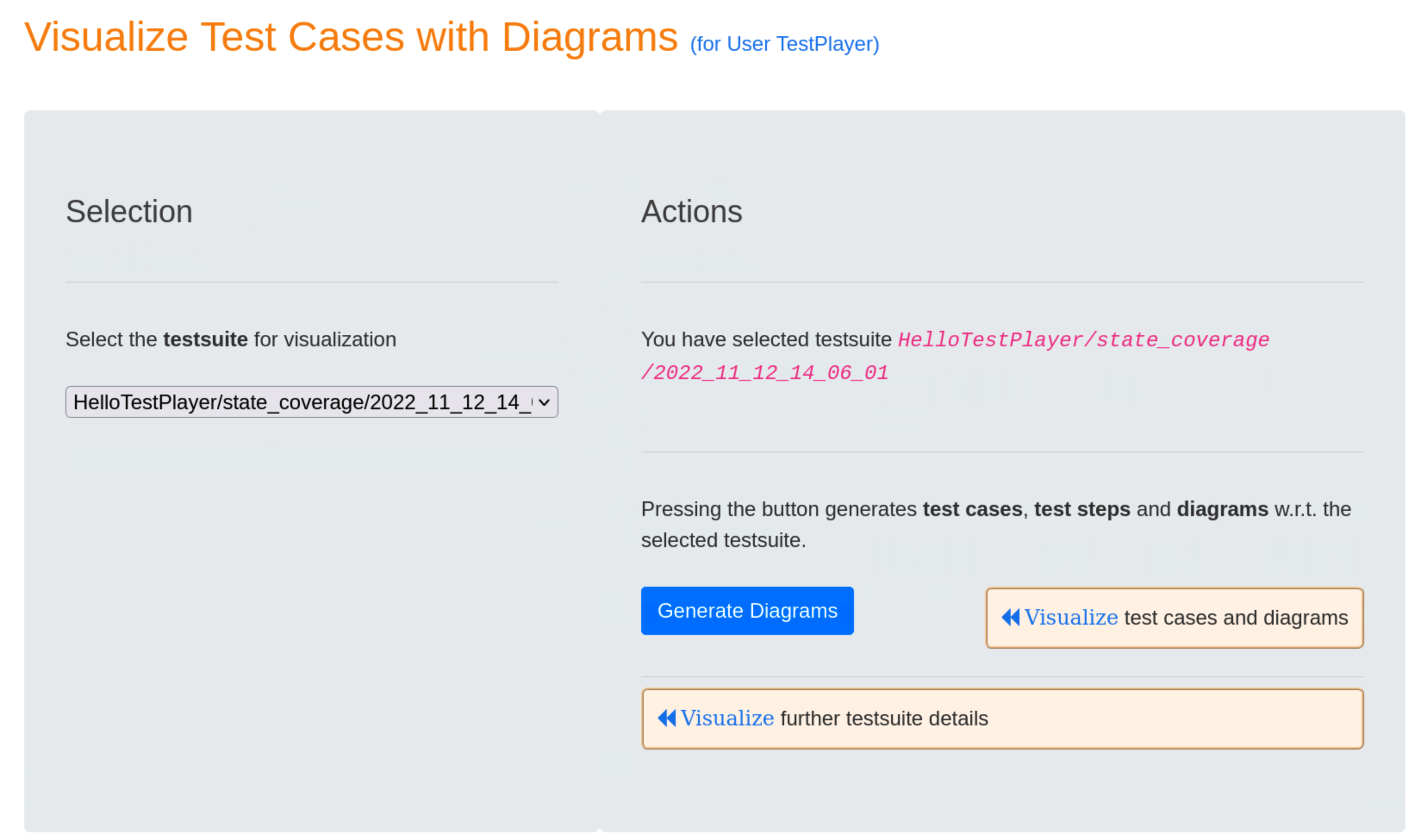
Step 2: select a usage model (mandatory) and the maximal number of test cases (optional)
In this step we select only the HelloTestPlayer usage model, the number of test cases remains unchanged. The result of our selection is displayed in the Result area:
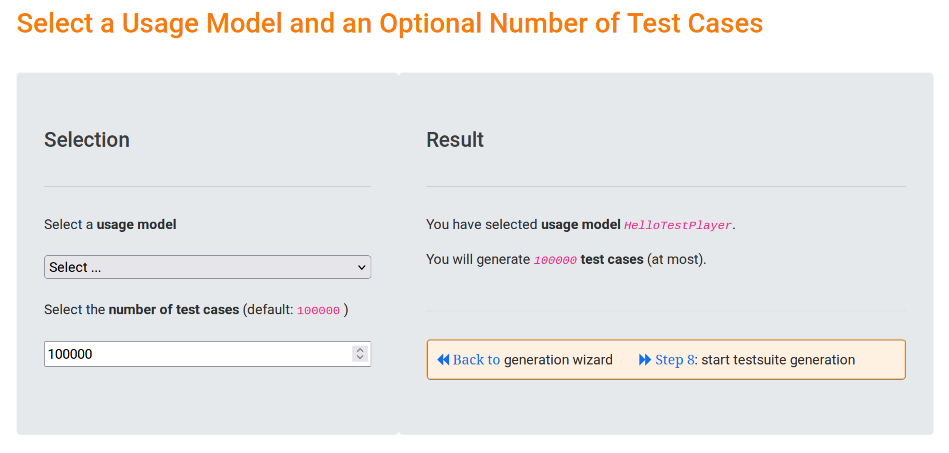
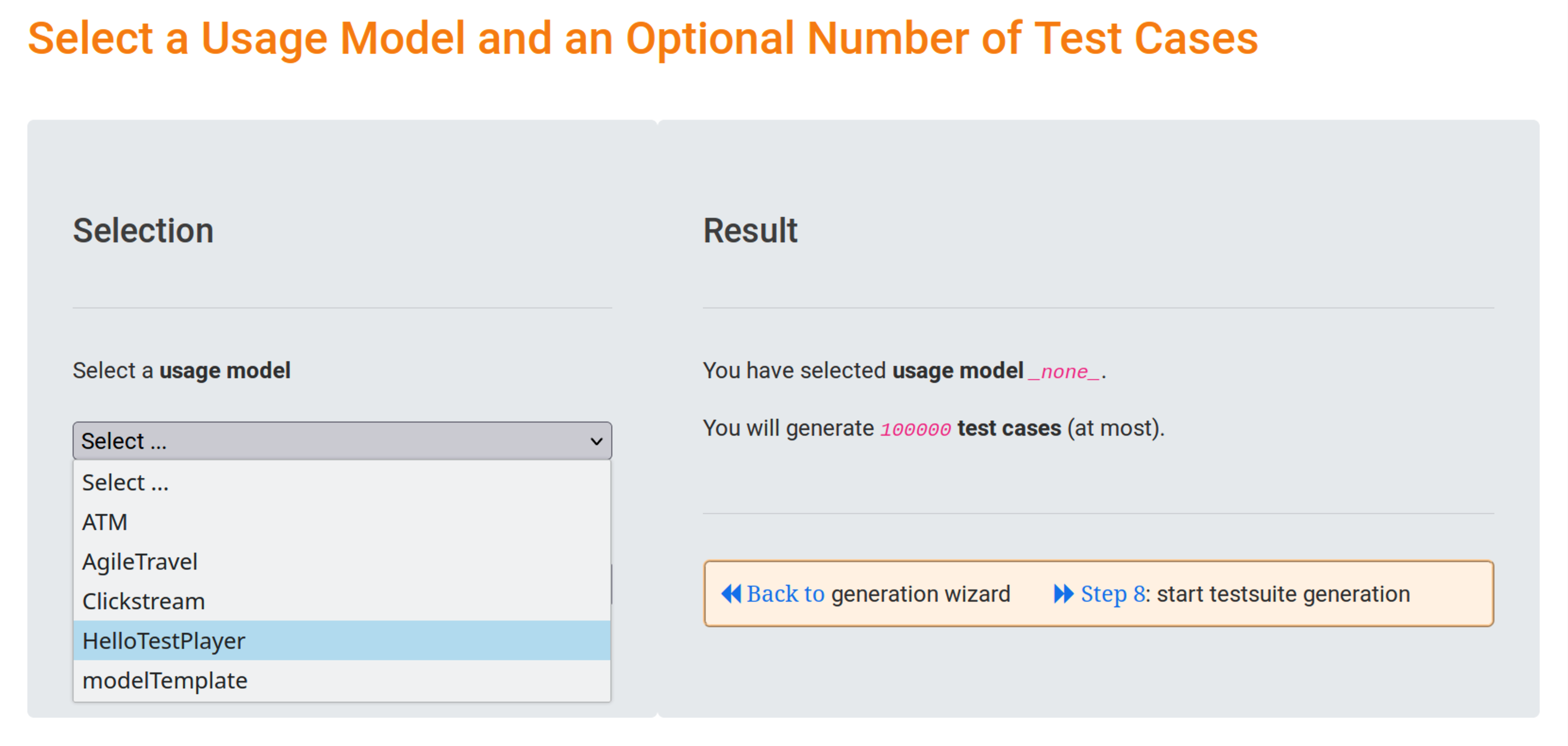

Clicking on the blue « Back to link will take you back to the Test Suite Generation Wizard. In our simple tutorial example, we can skip all other generation steps and use the existing default values. Clicking on the blue link « Step 8 instead lets us start the execution definition generation directly.
Step 8: show current values of the generation parameters and start the test suite generation (mandatory)
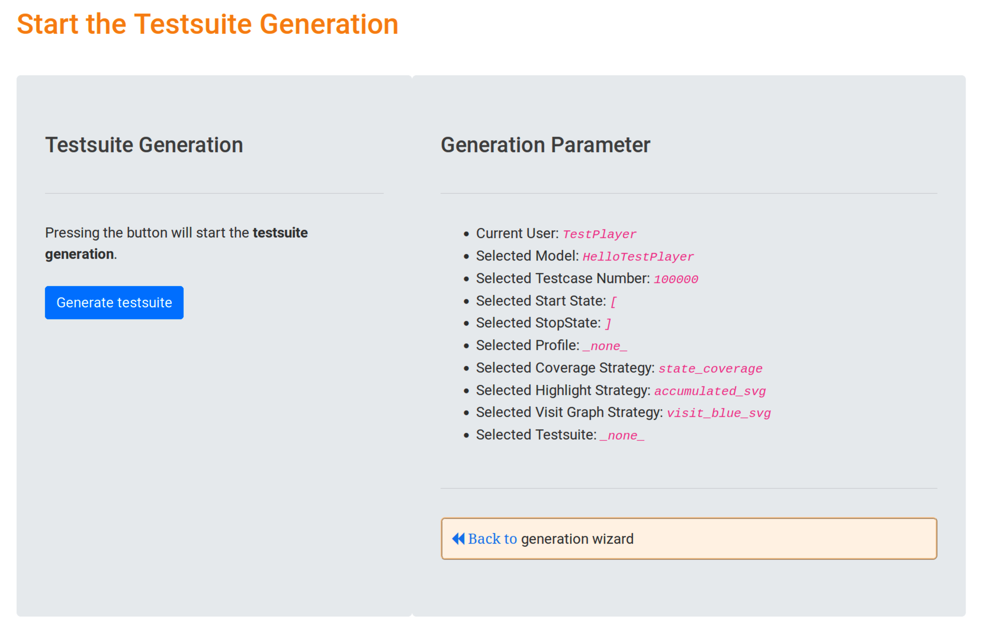
In the Generation Parameter area the test engineer can validate the selected parameter values for the test suite generation. In our case, we have selected the following
- Current User:
TestPlayer, this is the name of the current user who has logged in and and is used in combination with the model name and timestamp to identify the generated objects in theNeo4j graph database, i.e. test suite, test cases, test reports, diagrams etc. - Selected Model:
HelloTestPlayer, this is the name of the selected usage model - Selected Testcase Number:
100000, this is the default value for the maximum number of test cases created during the generation process, depending on the selected coverage strategy - Selected Start State:
[, this is the default value for the name of the start state in the usage model - Selected StopState:
], this is the default value for the name of the final state in the usage model - Selected Profile:
_none_, this means that we have choosen no usage profile (see example AgileTravel for more details) - Selected Coverage Strategy:
state_coverage, this is the default value for the coverage strategy, meaning that all states of the usage model will be visited at least once in the generated test suite - Selected Highlight Strategy:
accumulated_svg, this is the default value for the test suite visualization (see sectionTest Suite Visualization) - Selected Visit Graph Strategy:
visit_blue_svg, this is the default value for the visit graph visualization strategy - Selected Test Suite:
_none_, this means we will not use a previously generated test suite to generate additional visualization graphs
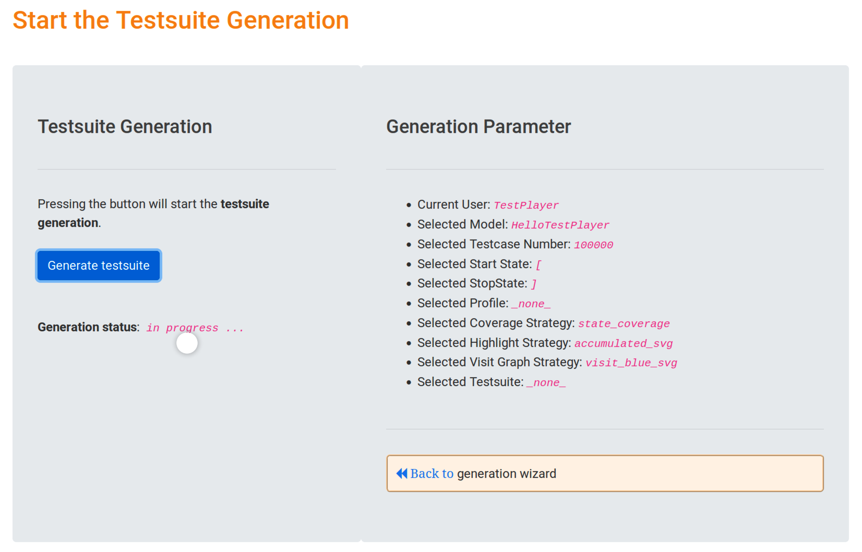
Clicking the blue Generate test suite button immediately starts the generation of the test suite generation and shows the progress.
Visualization of Test Suites
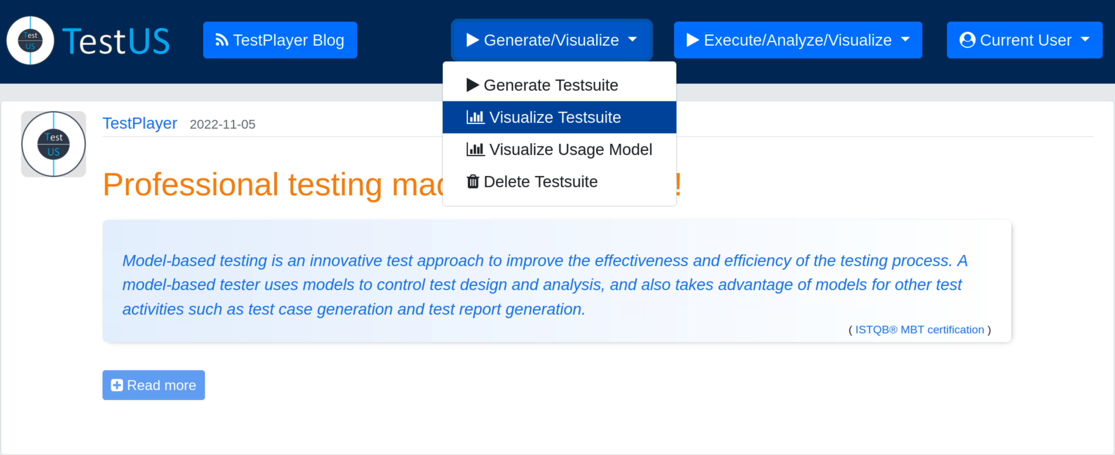
After a new test suite has been created, the test engineer can select the Visualize Test Suite tab and examine various TestPlayer© diagrams to gain further insight into various properties of the test suite.
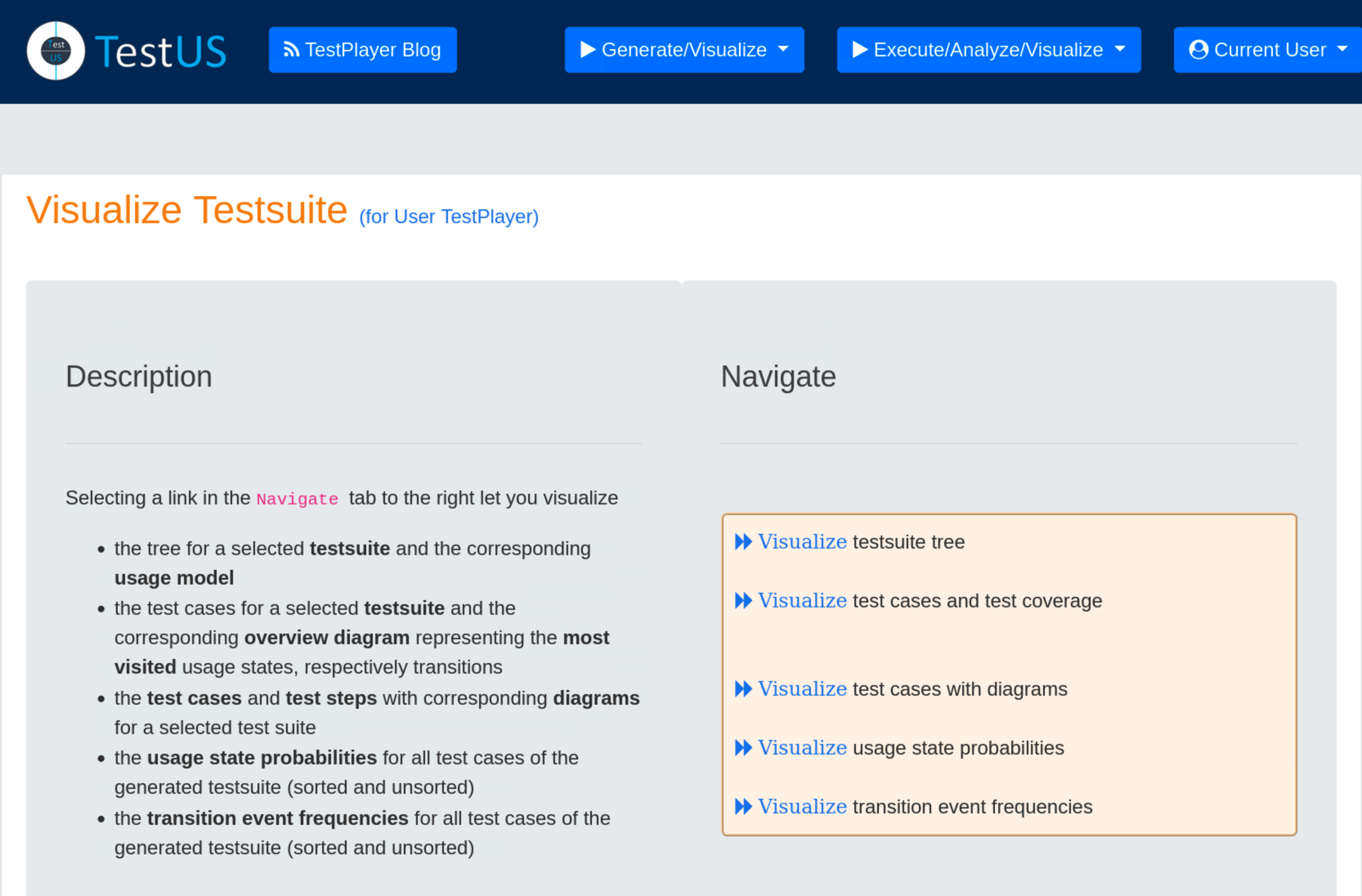
Visualization of the test suite tree
The object tree for a selected test suite and the corresponding usage model is visualized.
The root edge labels test suite.2022_11_12_14_06_01 as beeing generated with strategy state coverage, all other edges are labeled with relation names used in the Neo4j graph database:
- HAS_REPORT: test suite has 2 reports
- HAS_LOG: test suite has 1 log file
- HAS_JSON: test suite has 1 JSON file, containing the complete test suite, i.e. test cases and test steps
- HAS_DIAGRAM: test suite contains 7 diagrams in SVG format

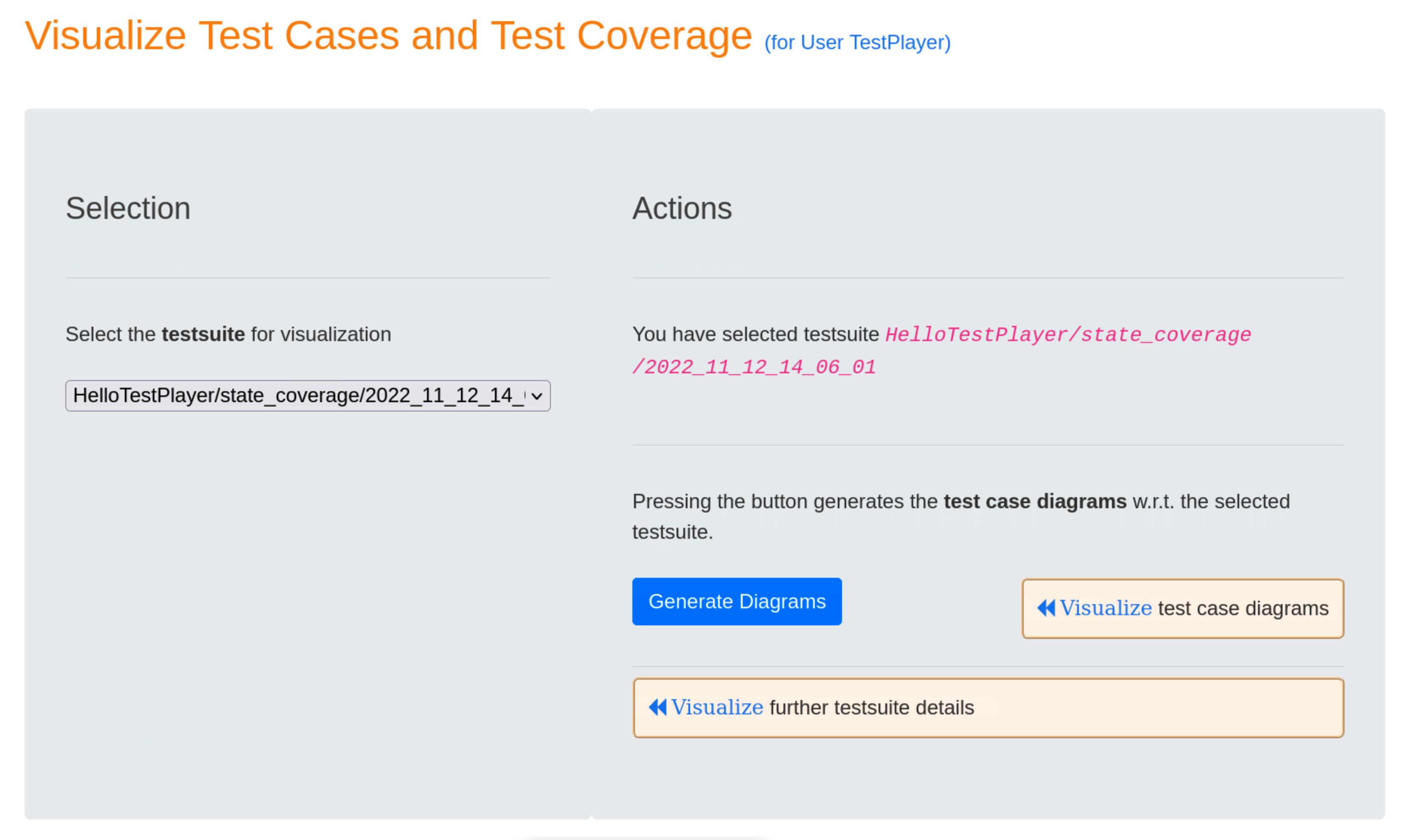
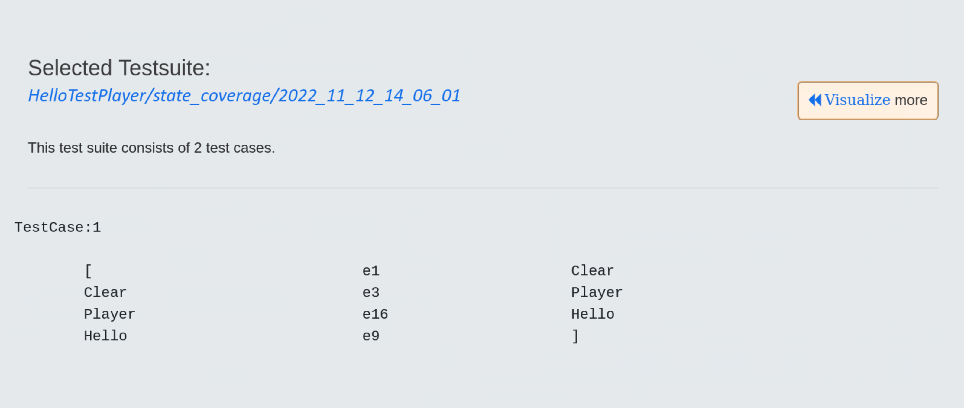
Visualization of test cases and the resulting test coverage
All test cases of the selected test suite and the corresponding overview diagram representing the frequency of visited usage states or transitions are visualized.
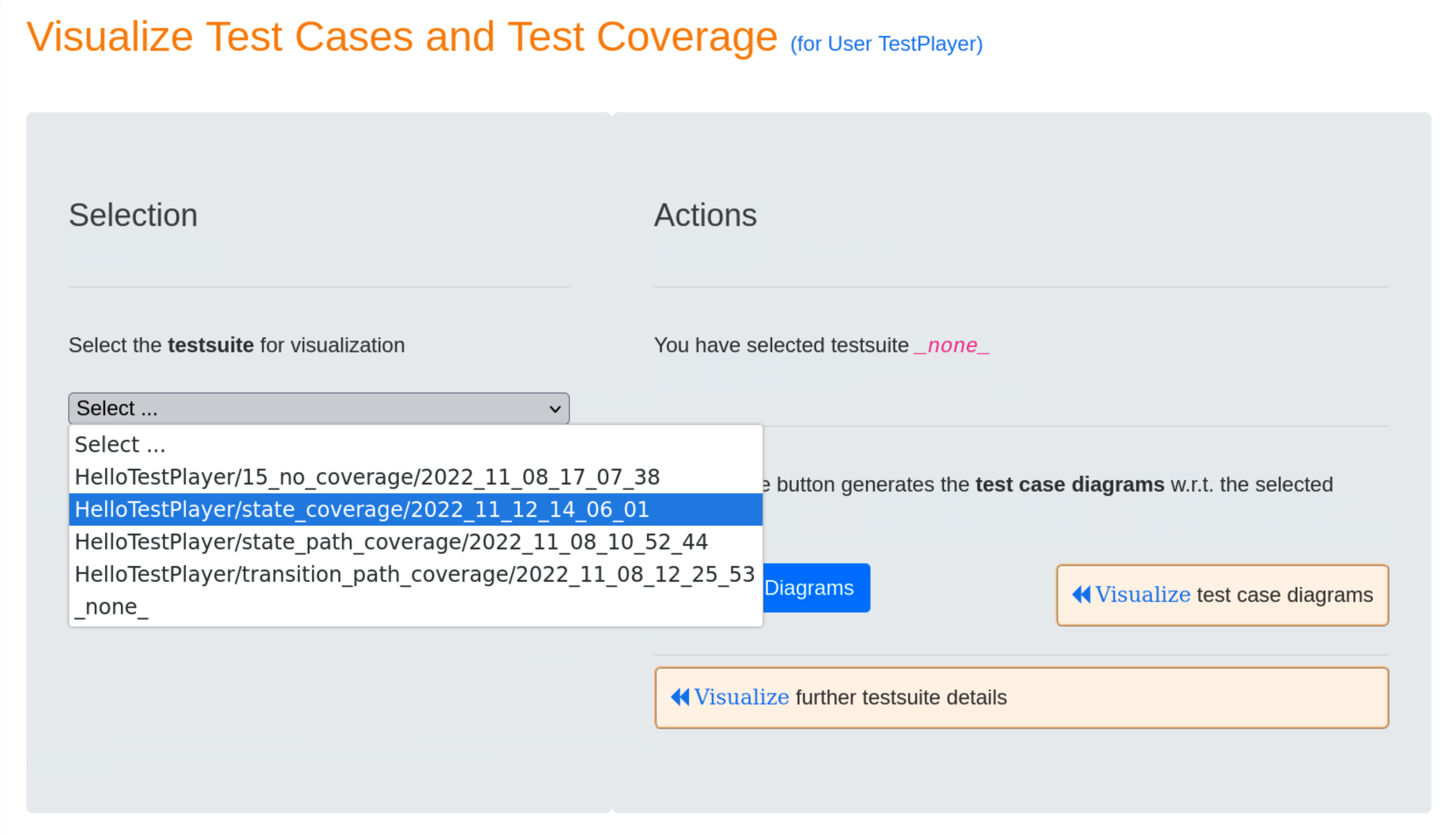
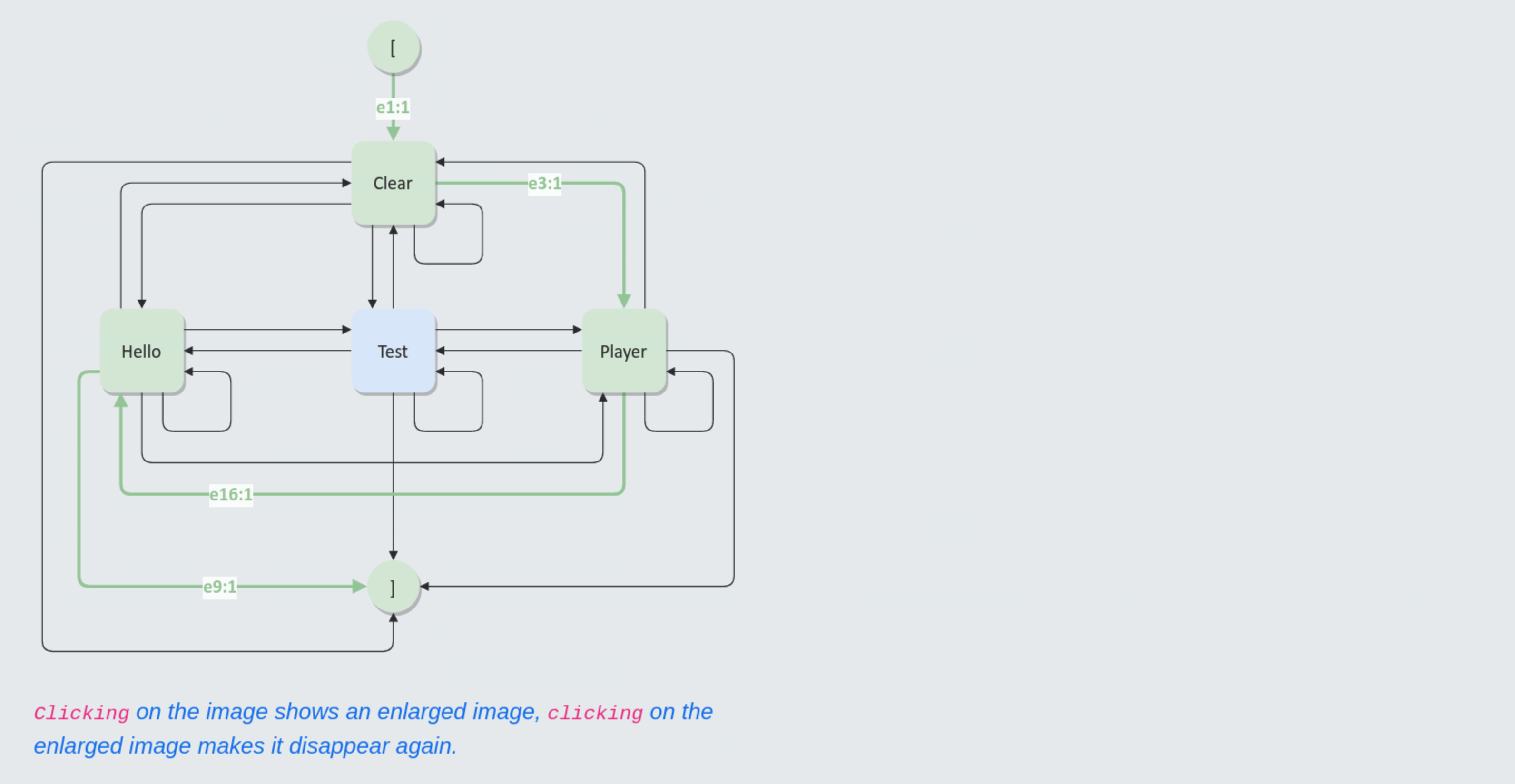
When the user presses the blue Generate Diagrams button, TestPlayer generates a series of diagrams that are displayed when the « Visualize test case diagrams link is selected.
In a test case diagram, an edge (ei:n) has the meaning that event ei is triggered n times during the execution of the test case. A dark green edge is included in the current test case, a light green edge indicates in the accumulated highlighting strategy that the edge was already included in a previous test case. Black edges mean that the edge is not yet included in a test case.
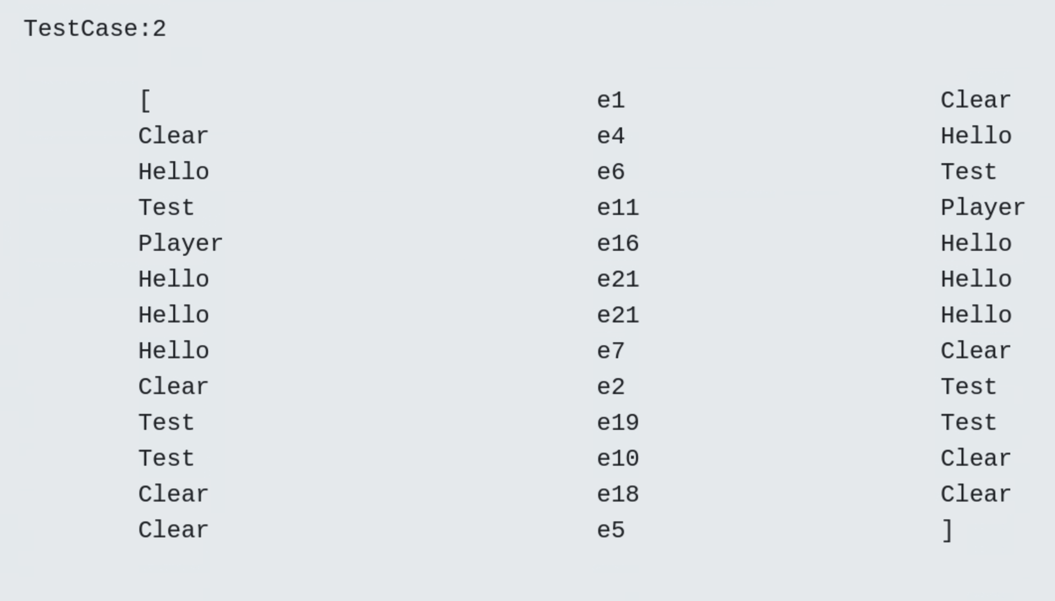
- Test Case 1

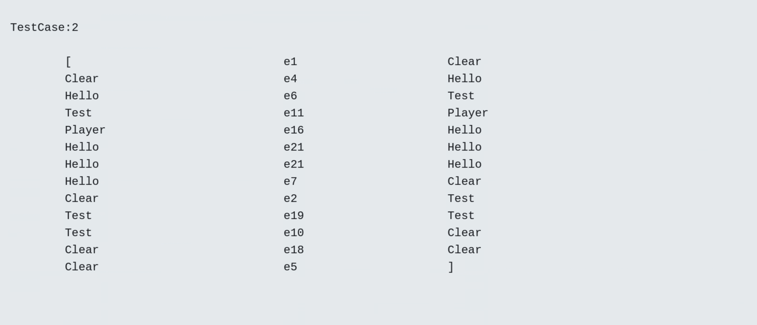
- Test Case 2

- Frequency diagram
In a frequency diagram the darkness of the blue colour indicates the frequency of a visited state, respectively transition, i.e. the darker the colour the more visits. The white colour indicates that the state, respectively transition will not be visited.

Visualization of test cases with corresponding diagrams
For a selected test suite, all test cases and test steps are visualized with corresponding diagrams.
- Test Case 1
- Test Case 2
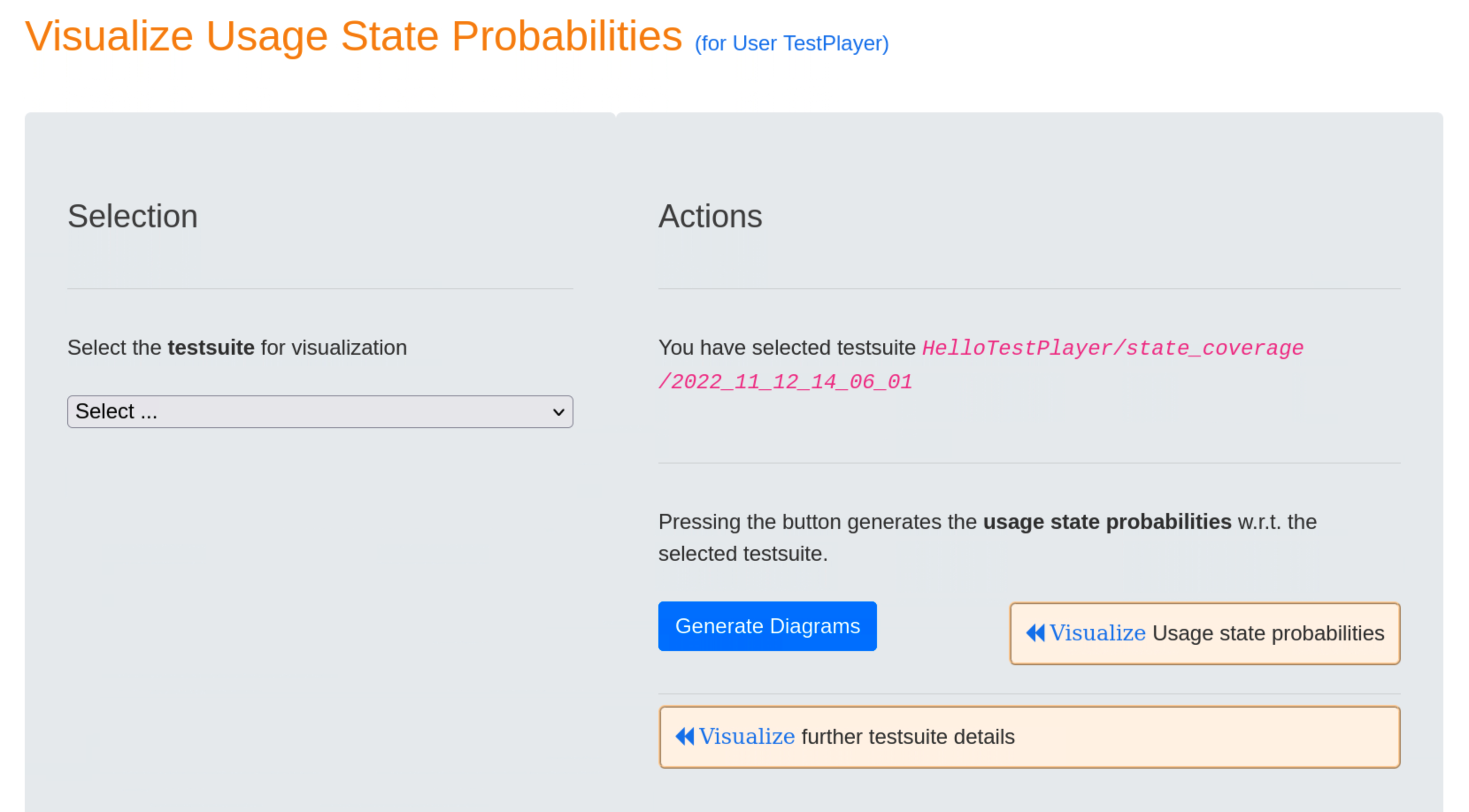
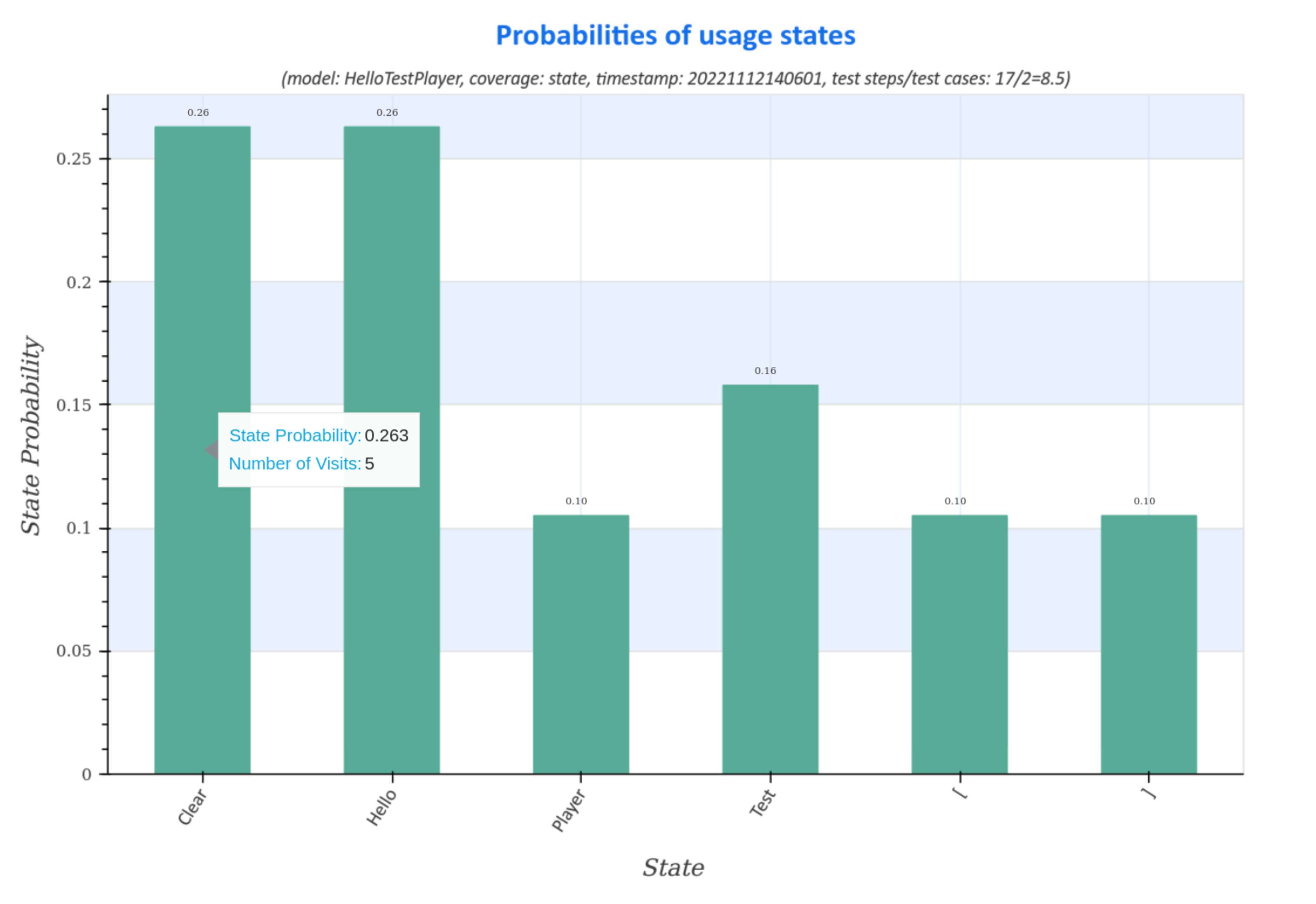
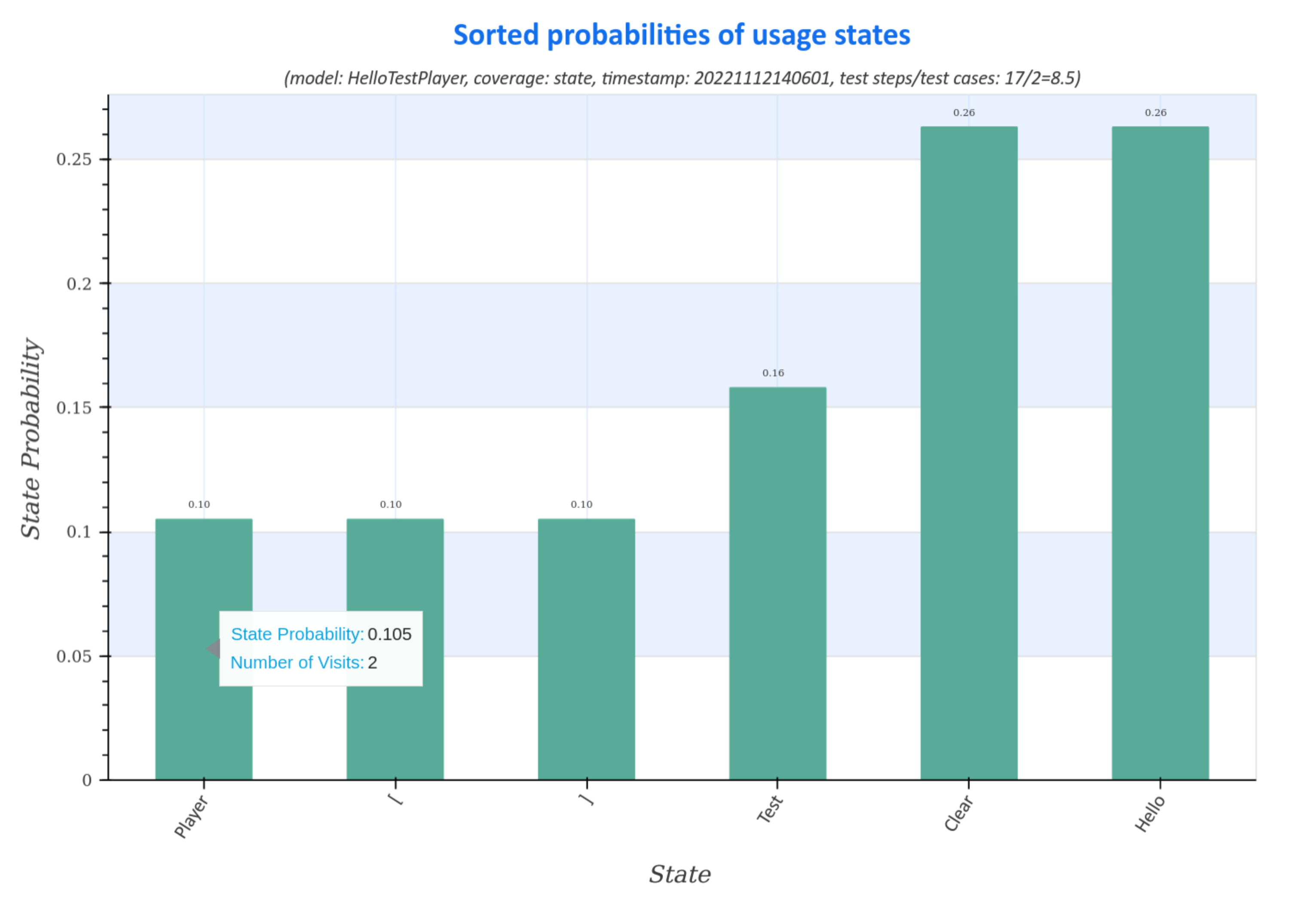
Visualization of usage state probabilities
Usage state probability diagrams of the generated test suite represent the distribution (sorted and unsorted) of usage states for all test cases.
The diagrams contain information about
- model: name of the usage model
- coverage: strategy for generating the test suite
- timestamp: time, when the test suite was generated in the form
<yyyymmddhhmmss>fory:year,m:month,d:day,h:hour,m:minuteands:second - ratio of test step to test cases:
number of test steps / number of test cases. Large numbers represent test cases with a large number of test steps, which may indicate a longer execution time of the test suite during the test.
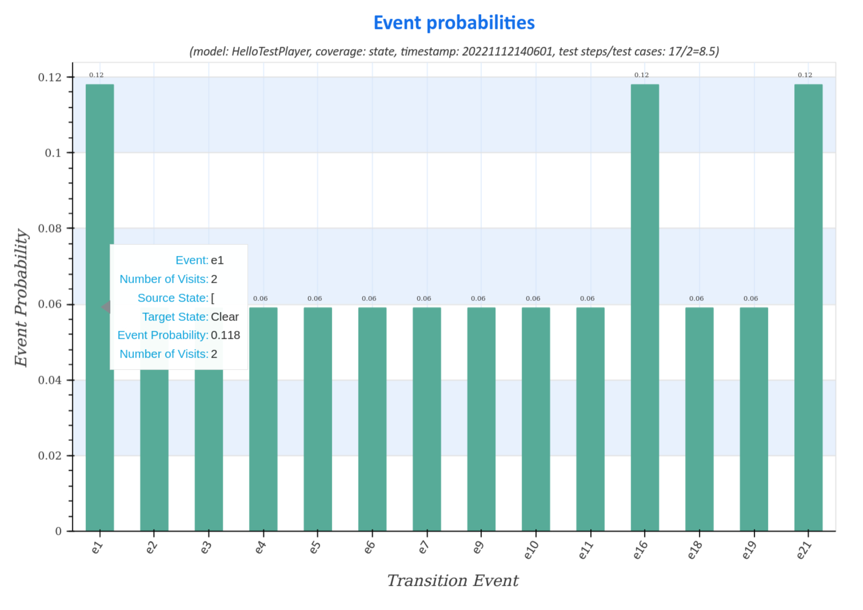
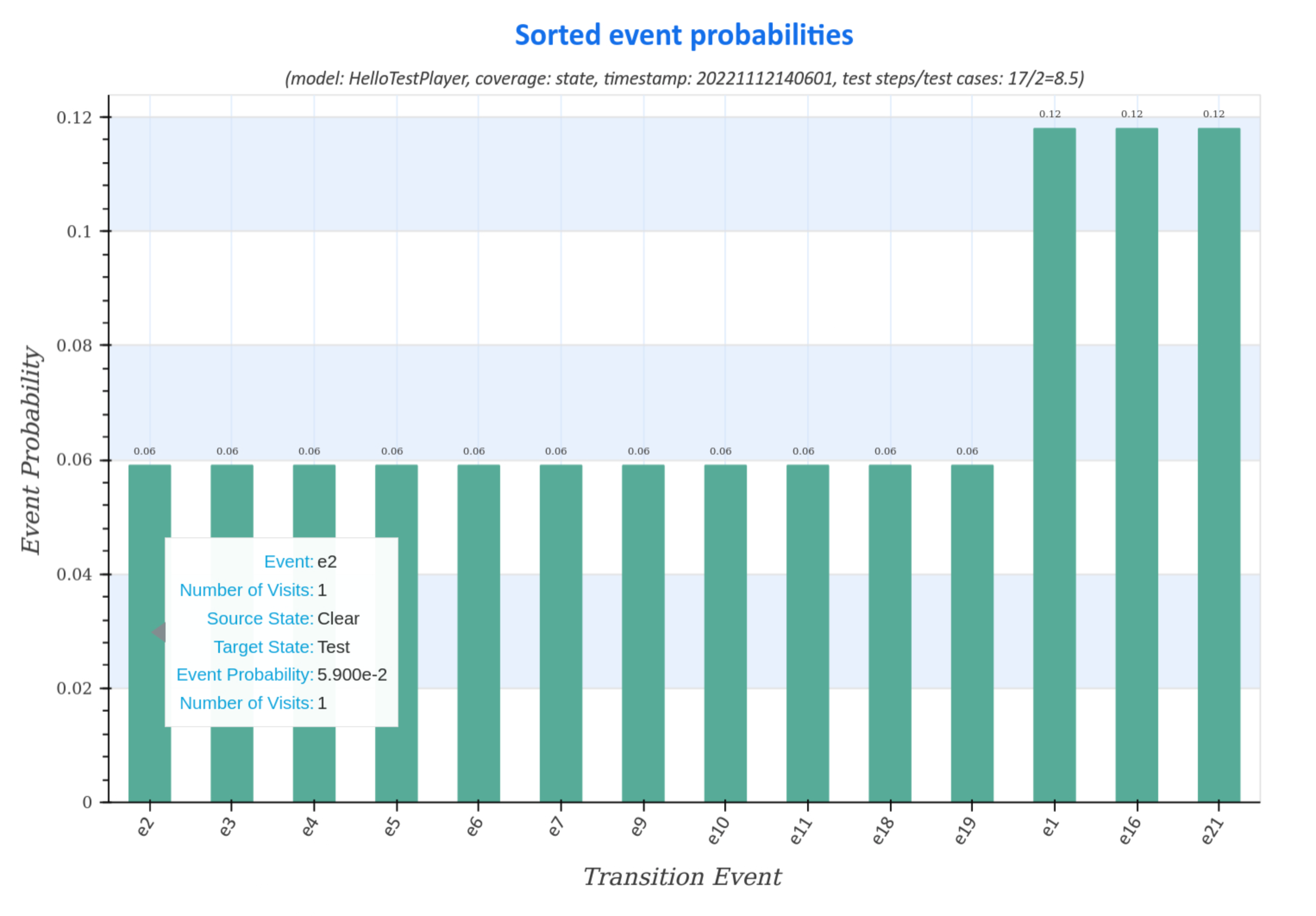
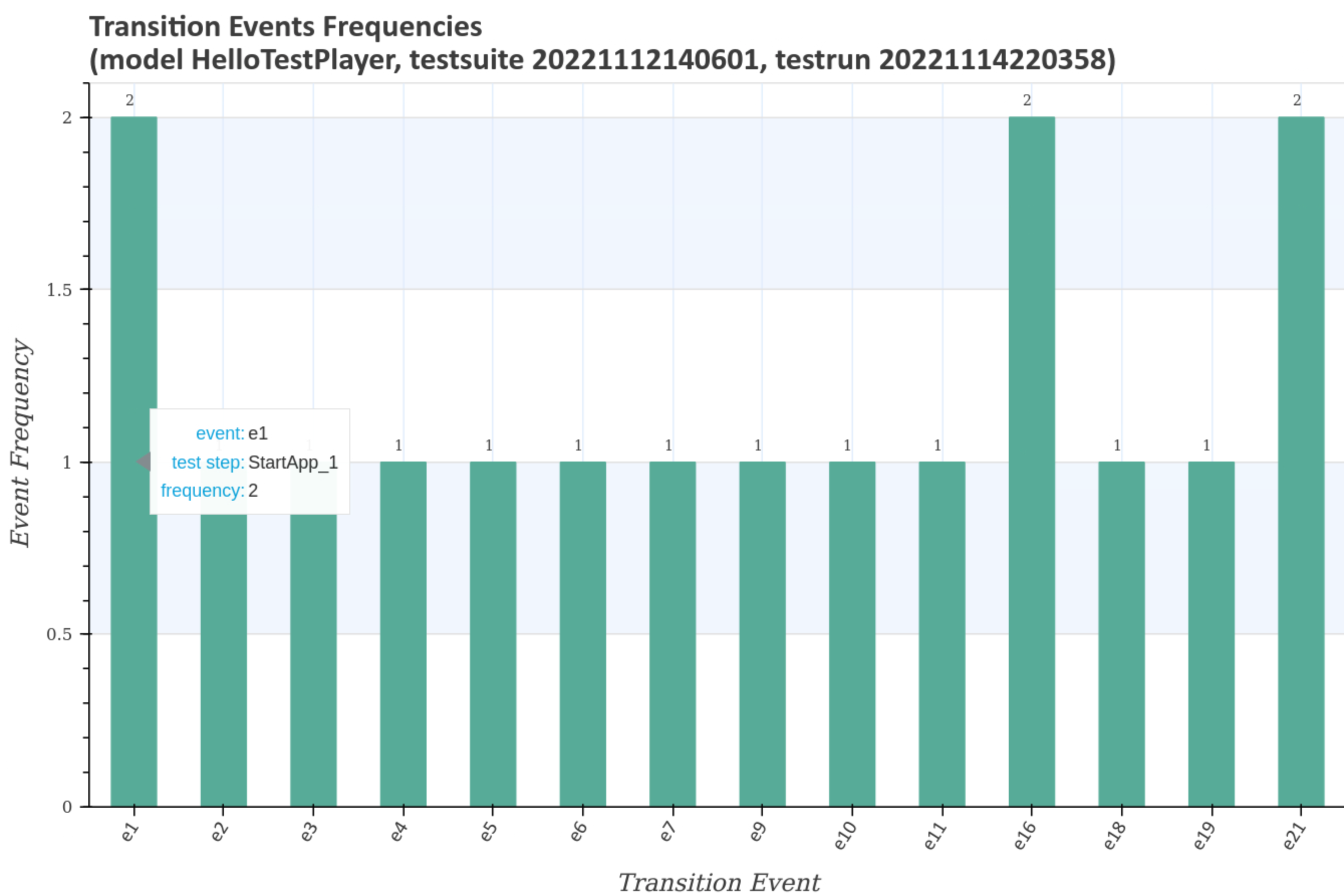
Visualization of transition event frequencies
Transition event frequency diagrams of the generated test suite represent the distribution (sorted and unsorted) of state transitions and the corresponding transition events for all test cases.
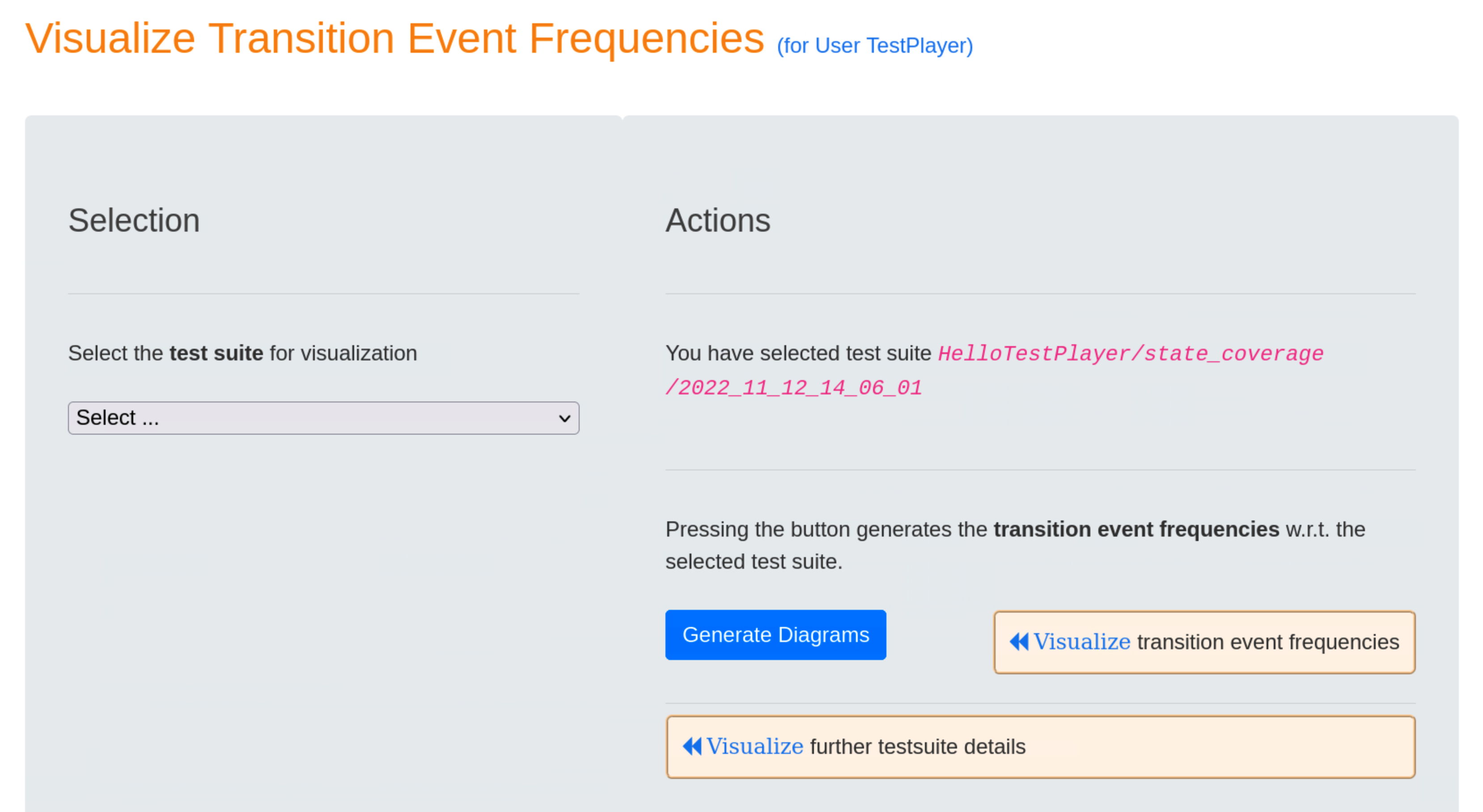
Moving the cursor over the graphs displays additional data, such as the actual number of visits during the test, the transition event and the source, respectively target usage states.
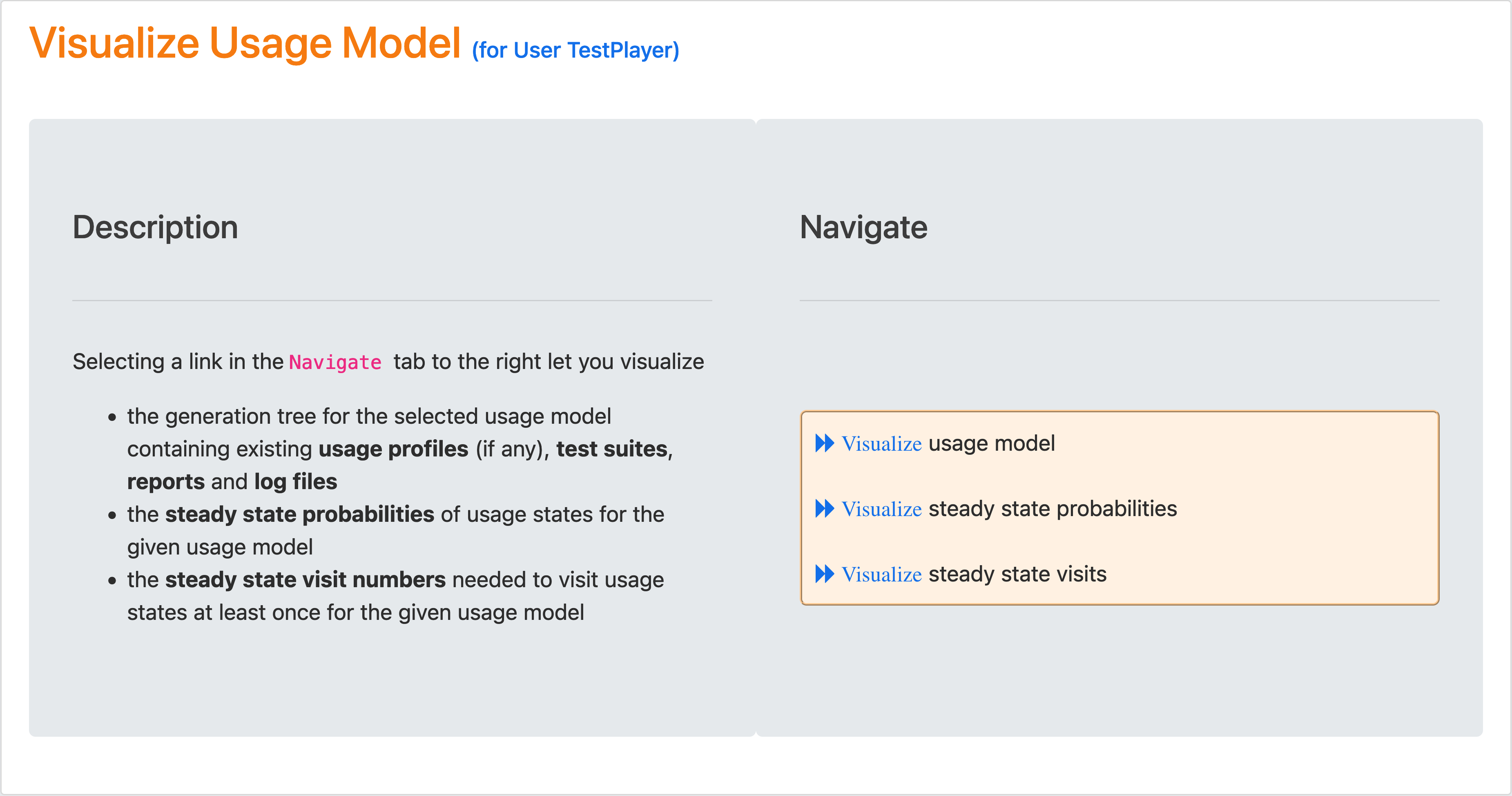
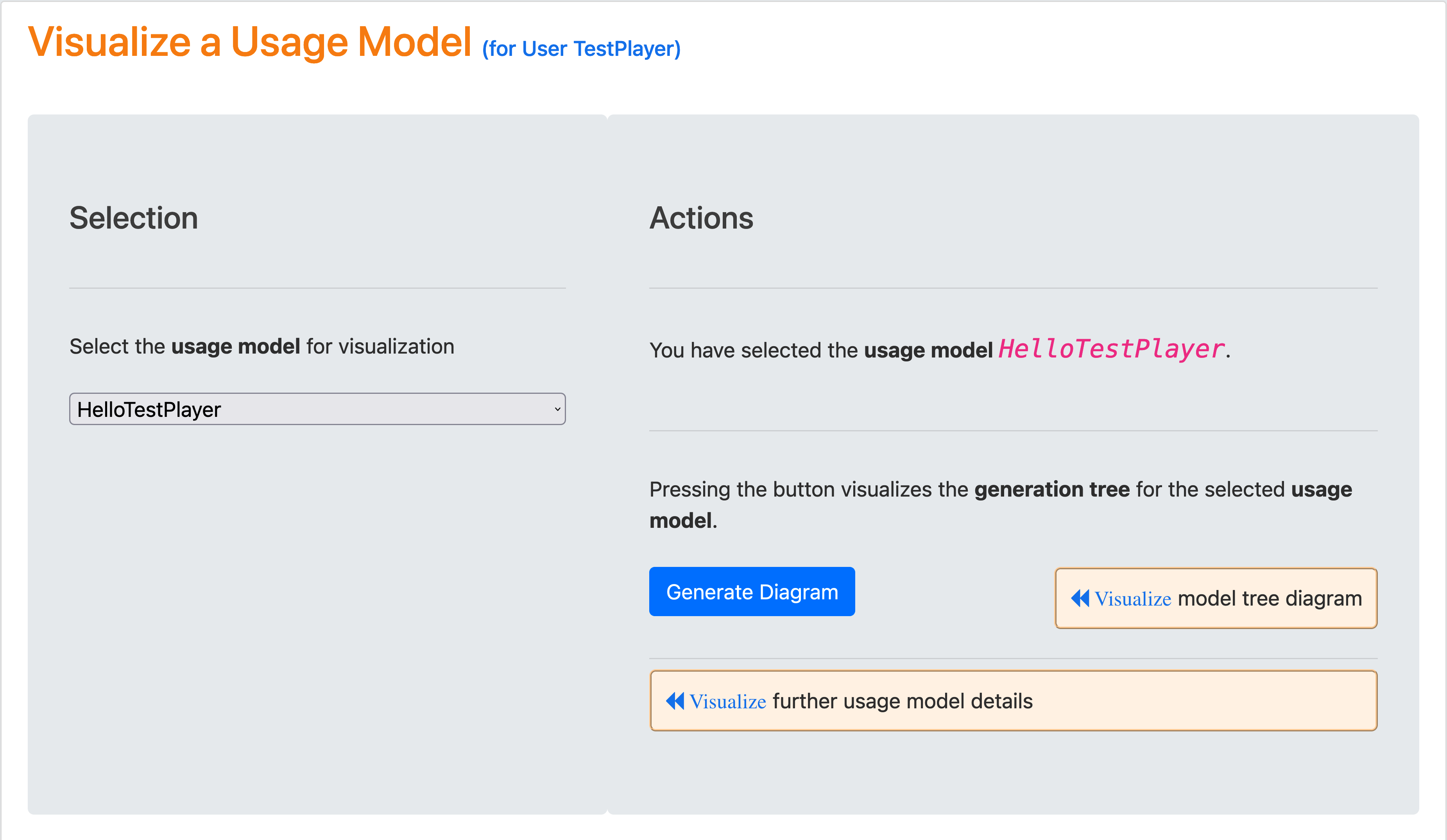
Visualization of Usage Models
After a new test suite has been created, the test engineer can select the Visualize Test Suite tab and examine various TestPlayer© diagrams to gain further insight into various properties of the test suite.
Visualization of the generation tree
After selecting a usage model and pressing the blue Generate Diagram button, the test suite tree for the selected usage model is visualized when the blue Visualize model tree diagramm link is clicked.
The edge labels show the coverage strategy used to generate test suites, e.g. test suite.2022_12_04_22_40_27 was generated with strategy state coverage, as well as the type of relationship used to generate the other nodes, i.e. HAS_REPORT, HAS_LOG and HAS_JSON. Relation EXTENDS is not shown in the diagram because there are no usage profiles for usage model HelloTestPlayer.

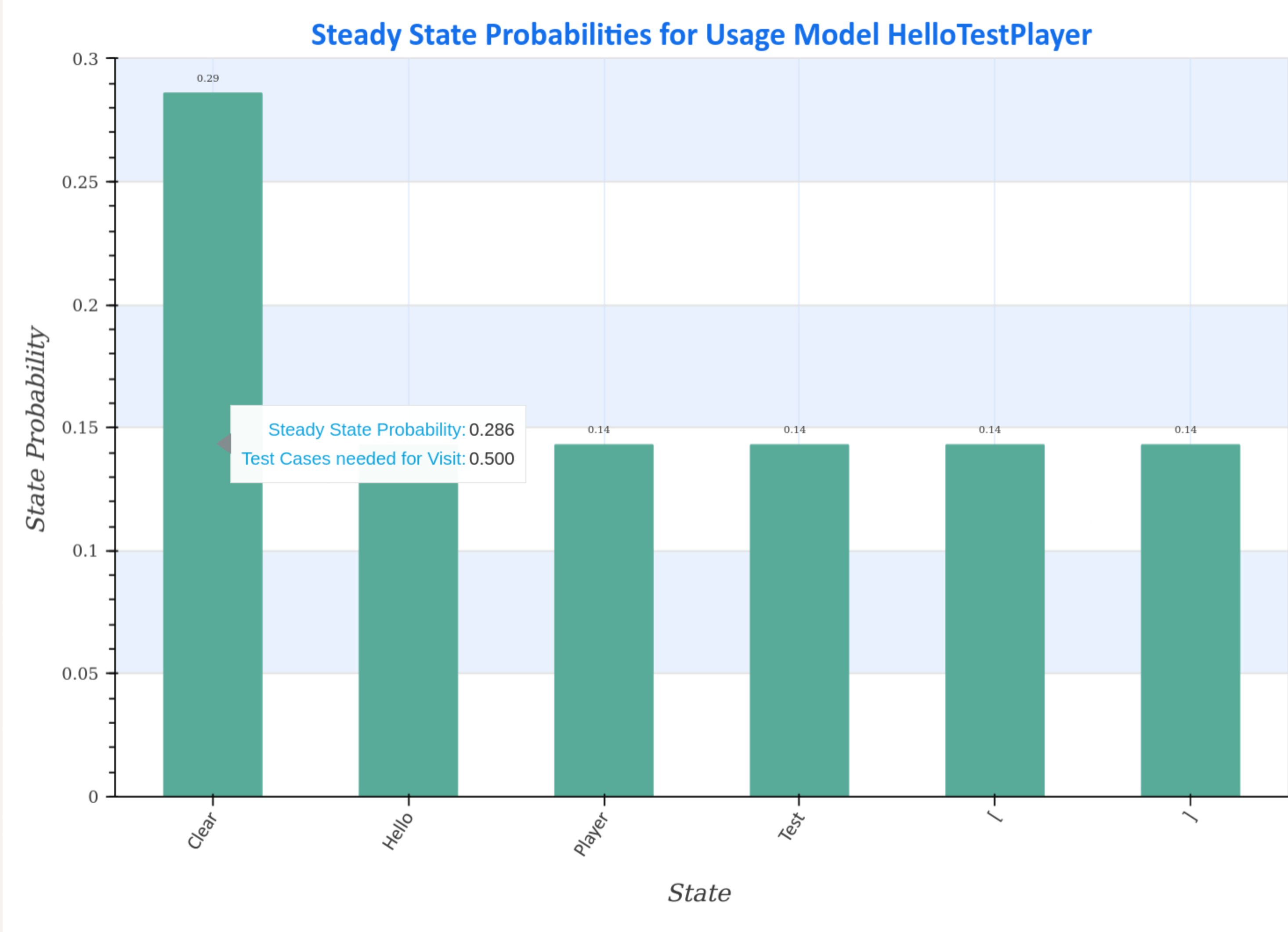
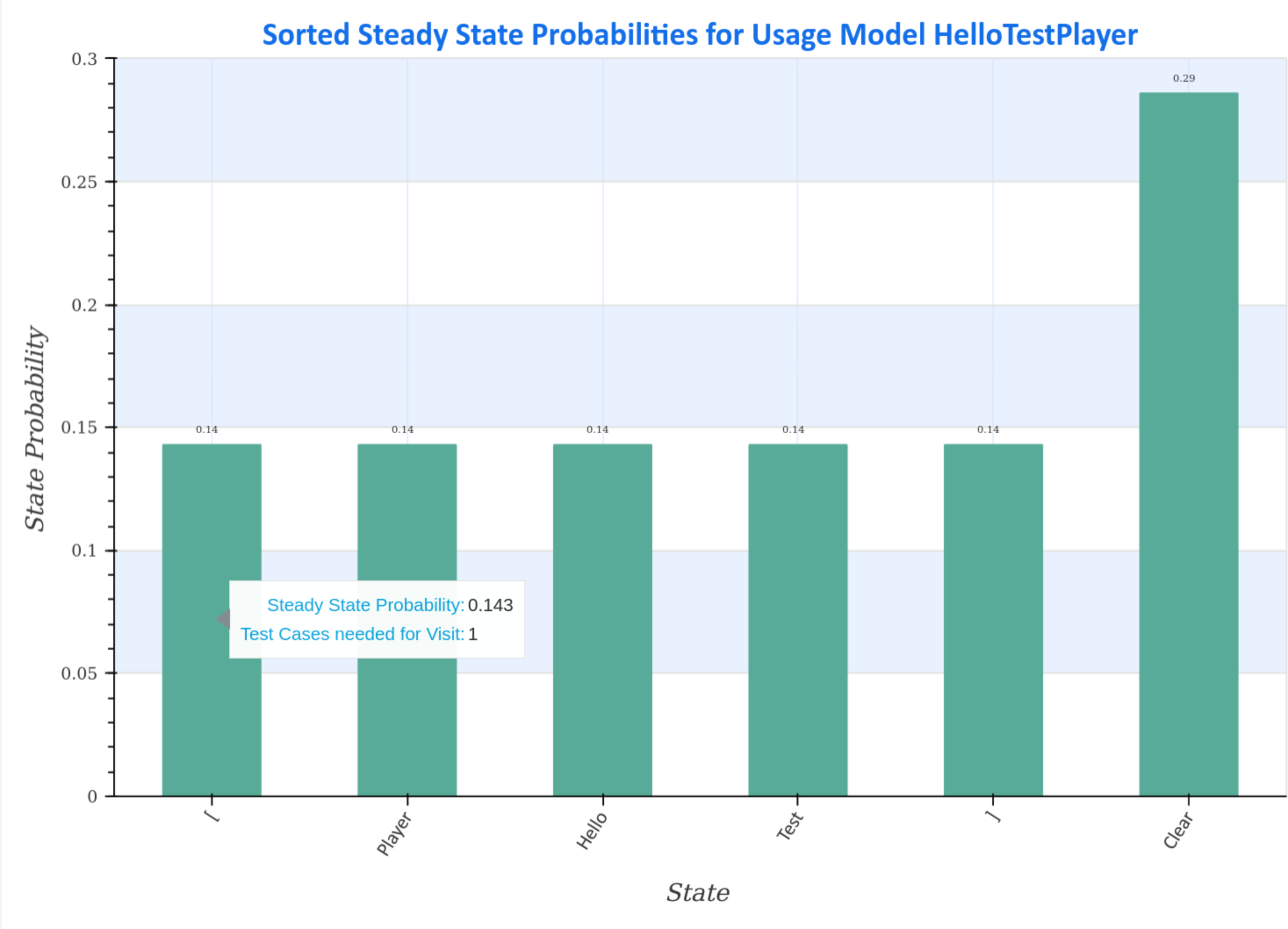
Visualization of steady state probabilities
Steady-state probability plots of the selected usage model show the steady-state distribution (sorted and unsorted) of the Markov chain.
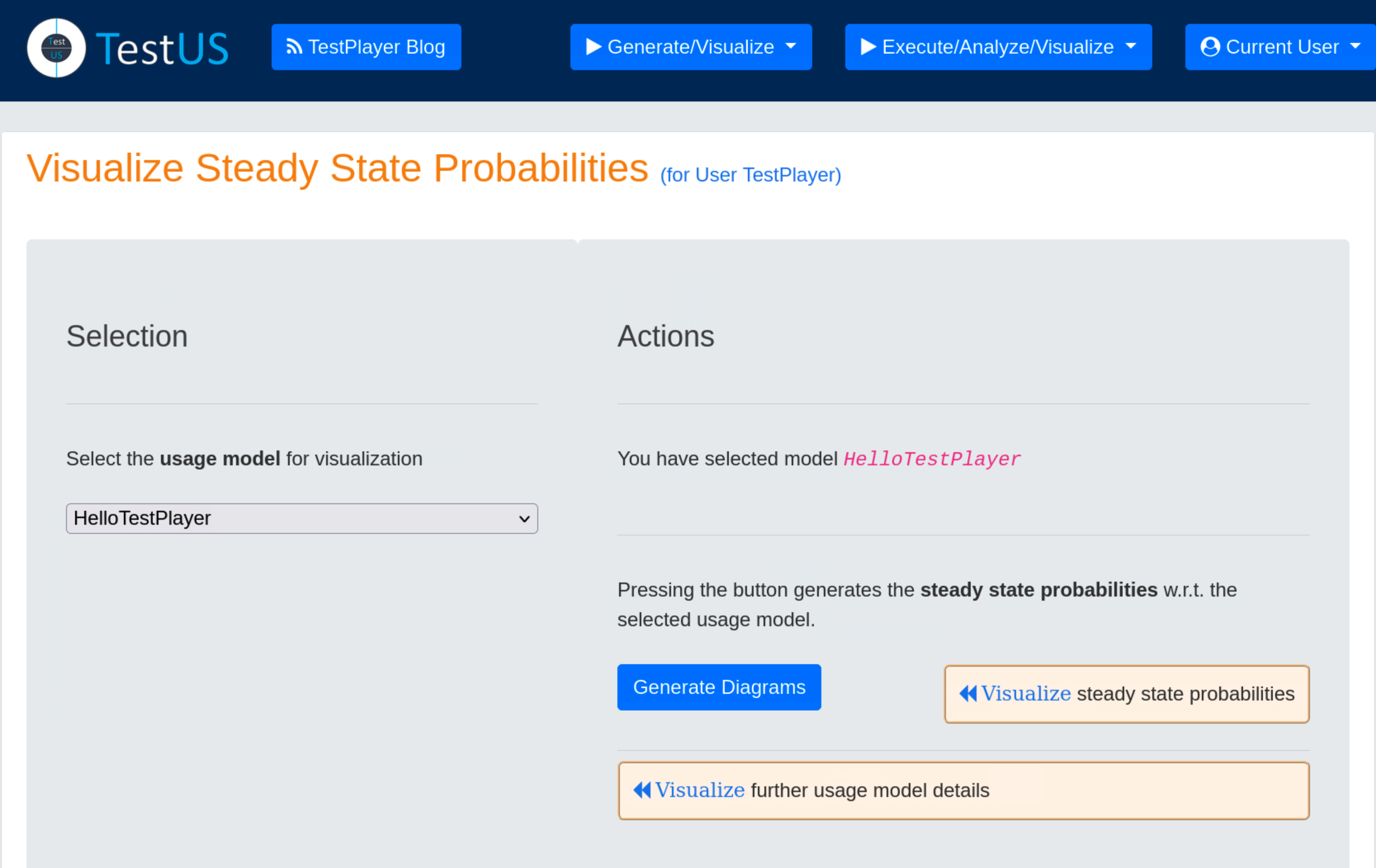
Hovering the mouse pointer over the charts displays additional data, such as the average number of test cases required to visit the state during a test.
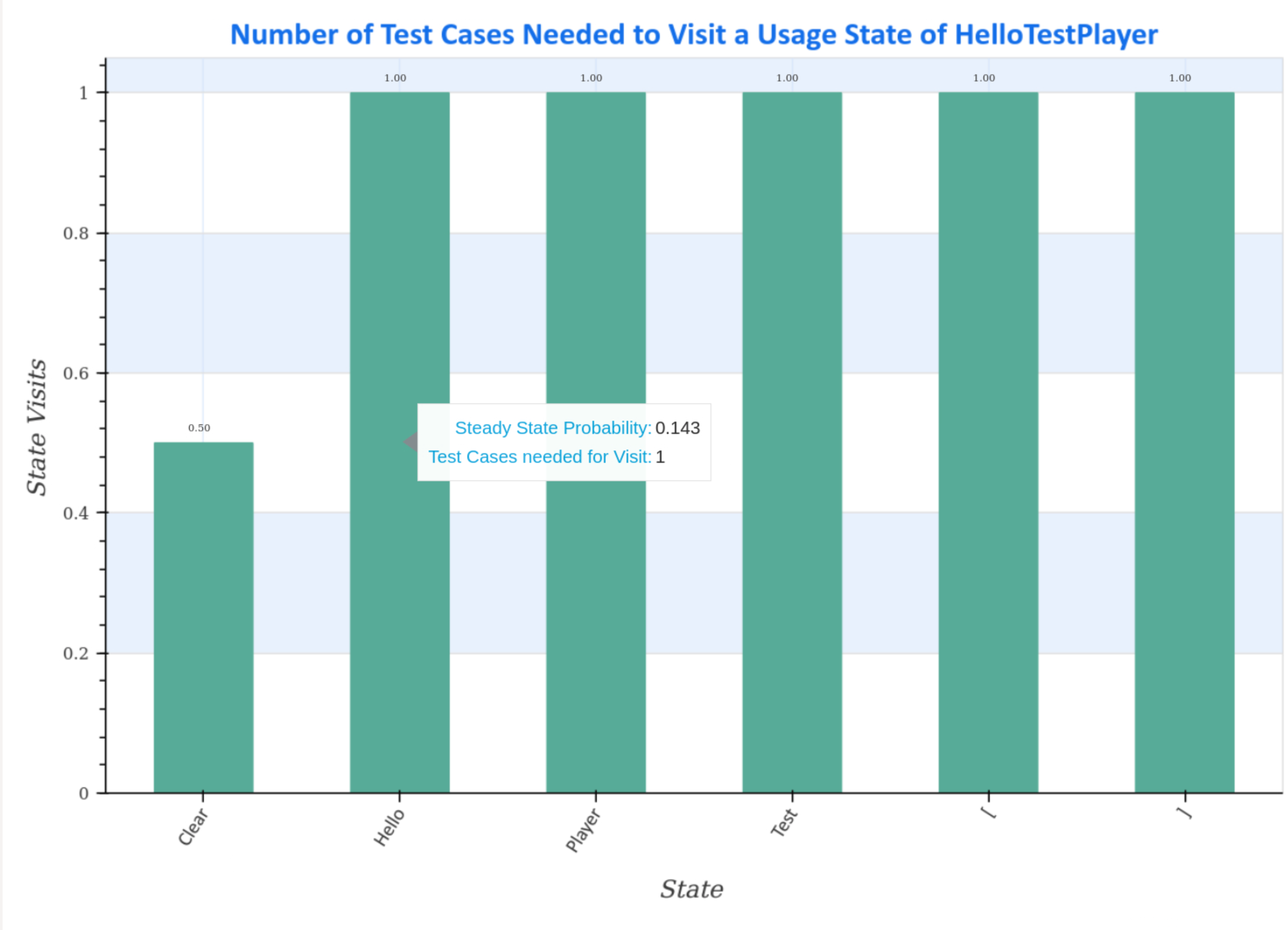
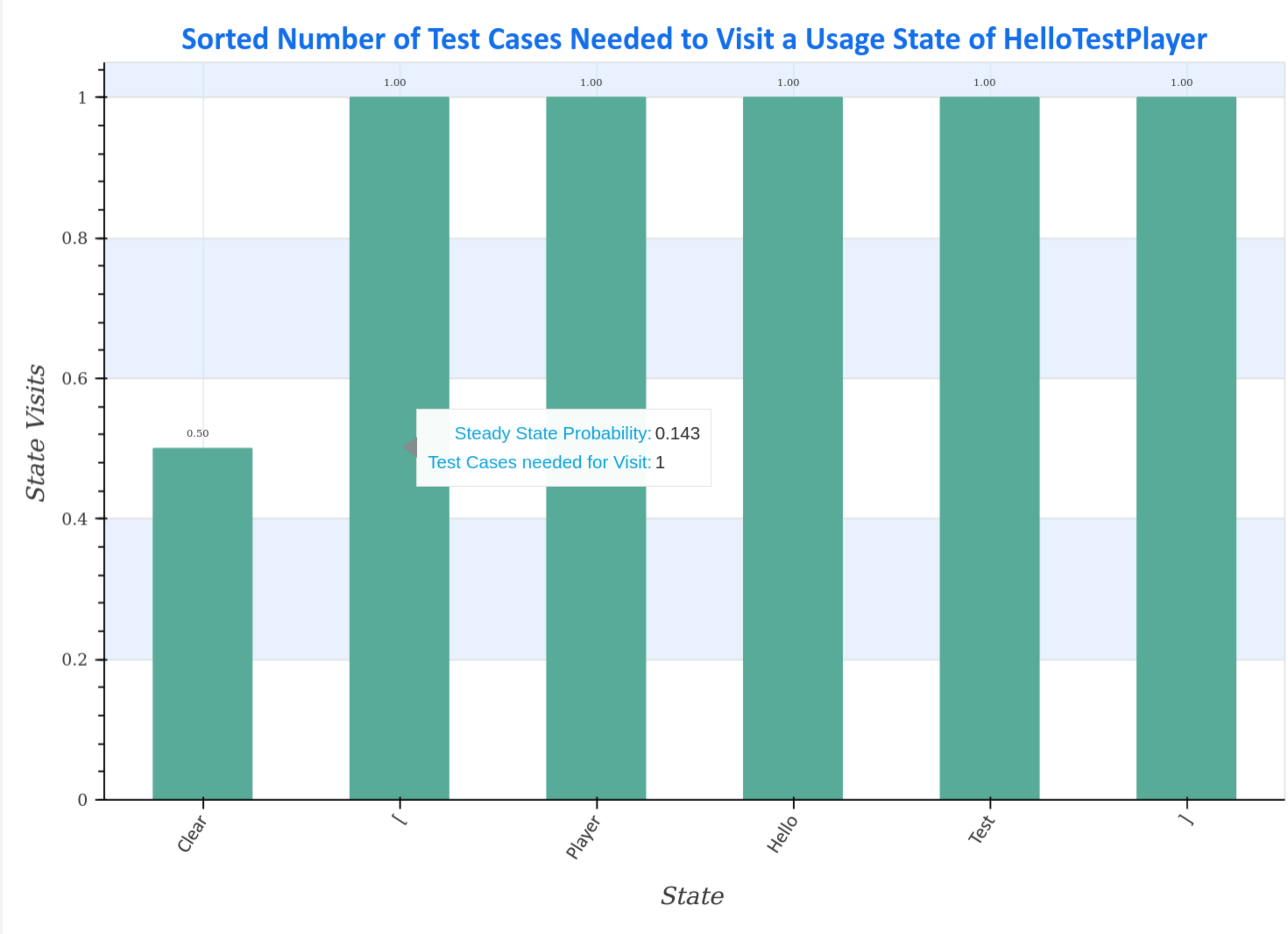
Visualization of steady state visits
Steady-state visit diagrams (sorted and unsorted) represent how many test cases are required to visit a usage state at least once for the given Markov chain usage model.
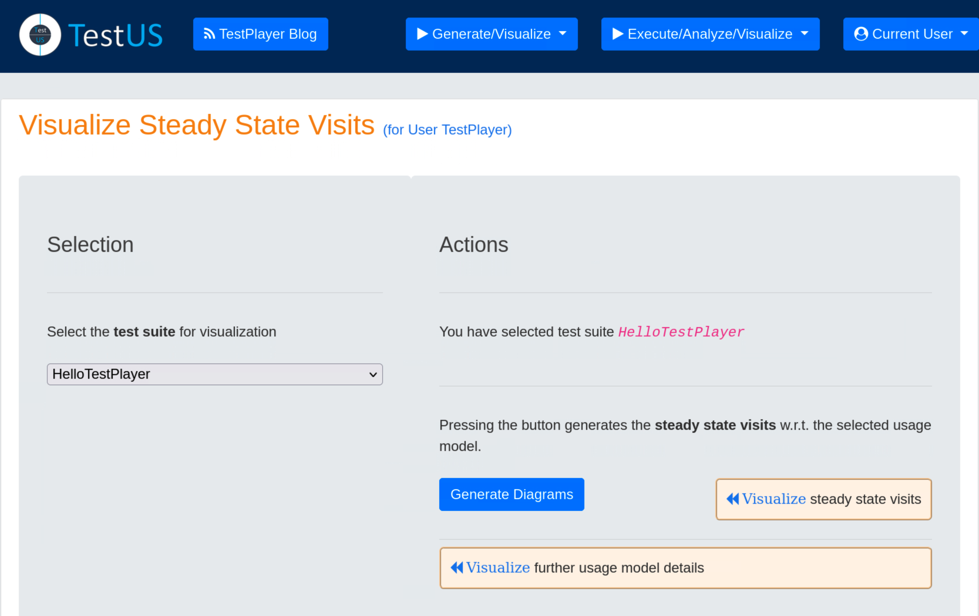
Hovering the mouse pointer over the charts displays additional data, such as the average number of test cases required to visit the state during a test.
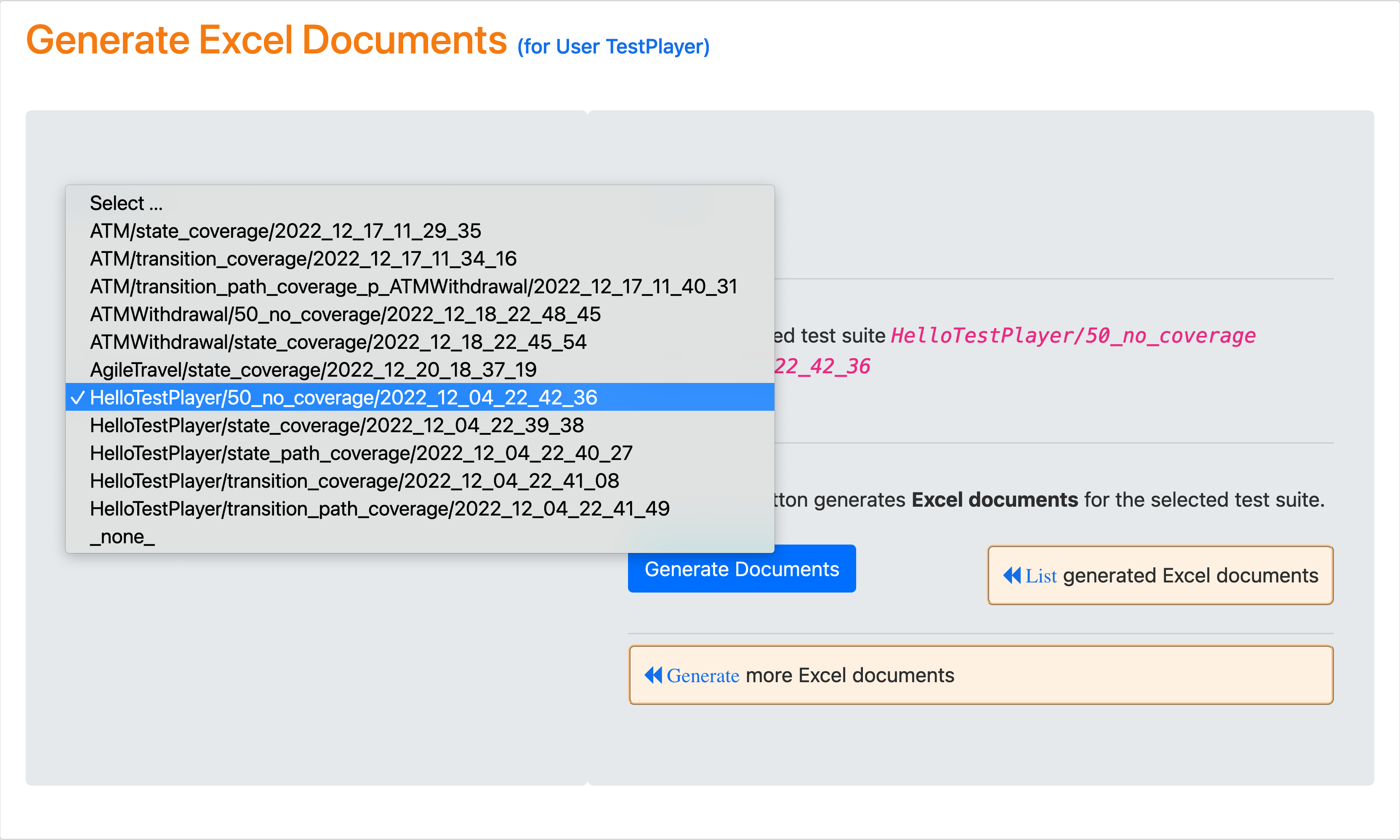
Generate Excel Documents
After visualizing the detailed characteristics of the test suite and the usage model, several Excel documents can be created that contain frequency spreadsheets and compare the steady-state probabilities of usage model states with the reciprocals of the transition frequencies.
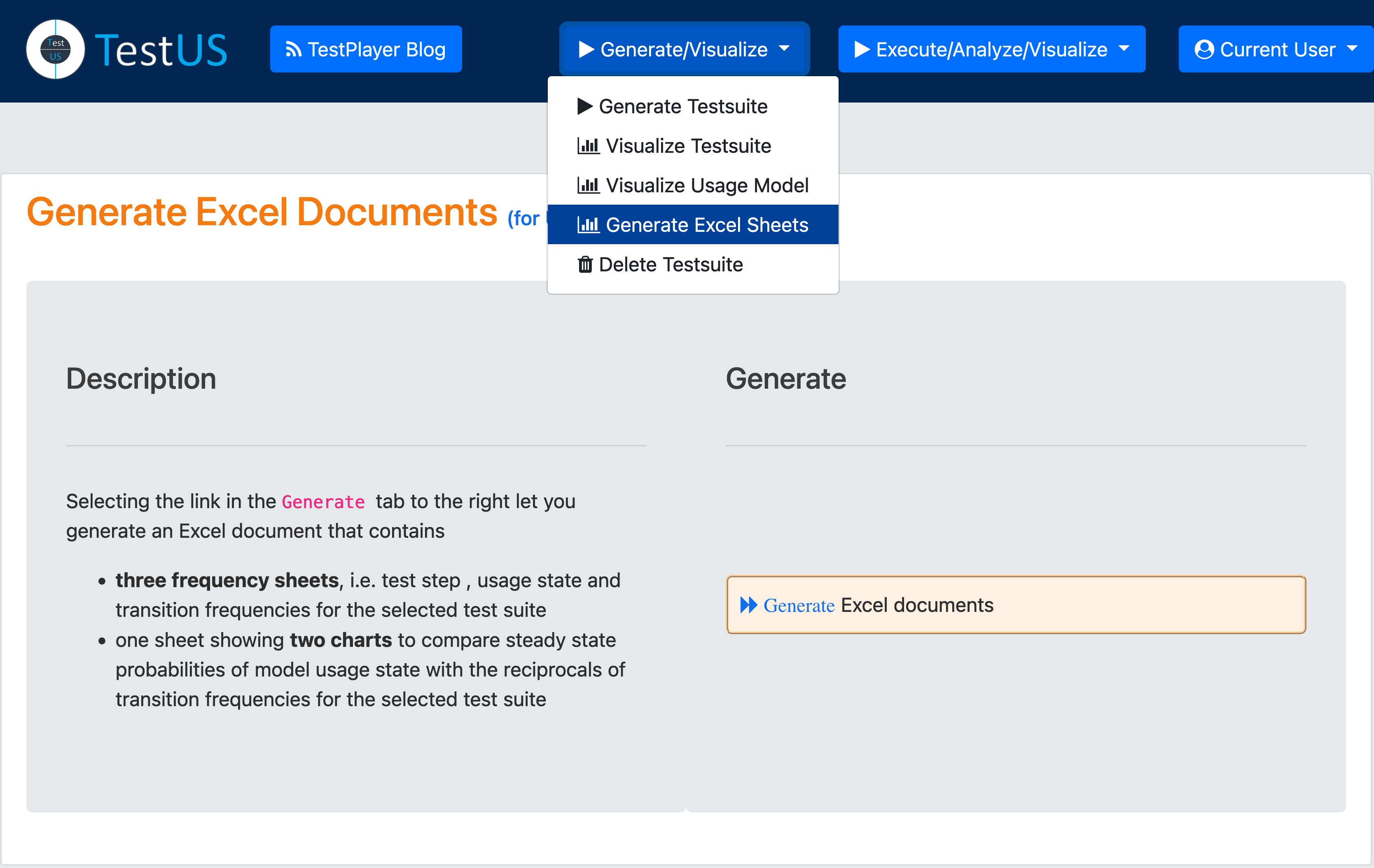
Having selected a test suite and pressing the blue Generate Sheets button, the Excel sheets for the selected usage model are listed when the blue List generated Excel documents link is clicked.
List Generated Excel Documents
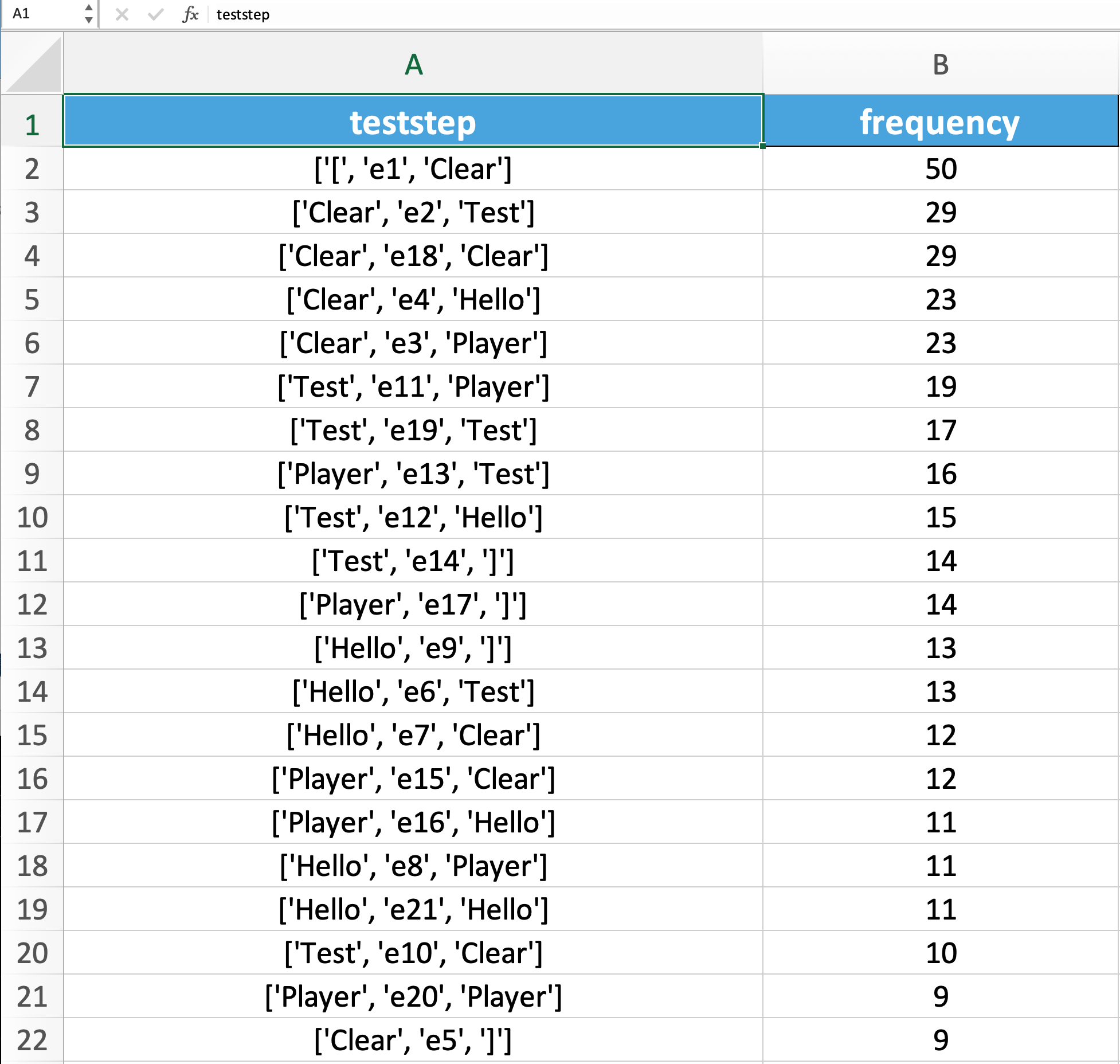
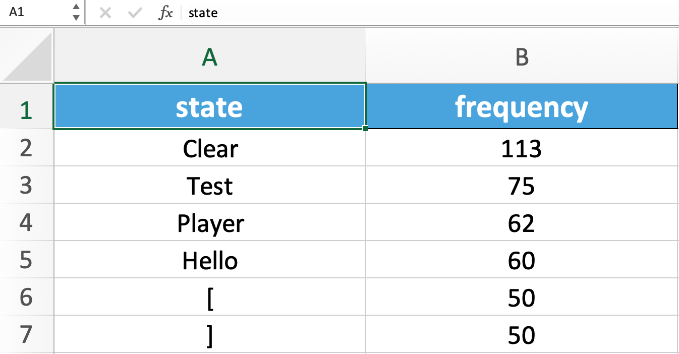
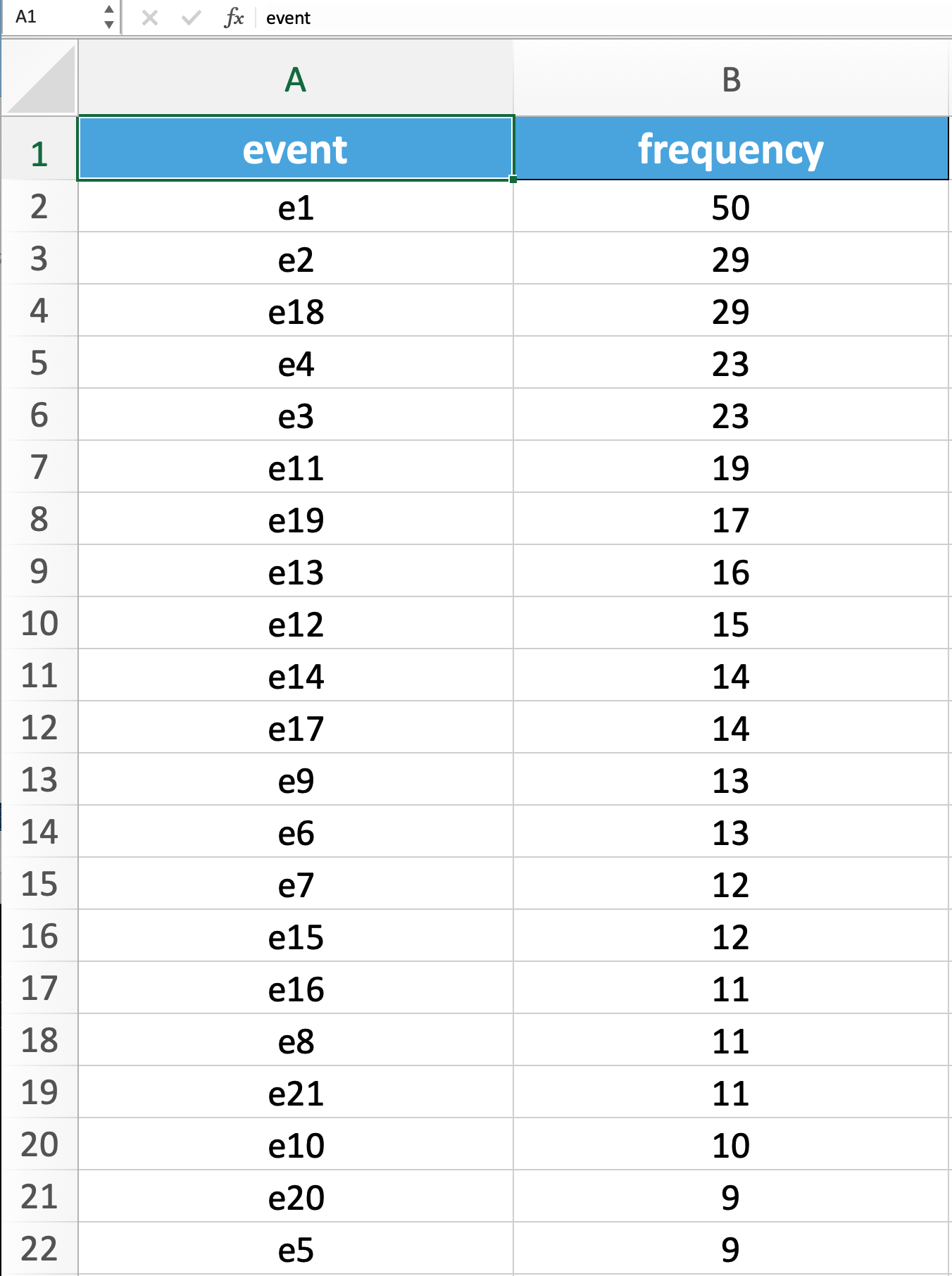
The following shows the result for a test suite with the timestamp 2022_12_04_22_42_36, which consists of 50 test cases.
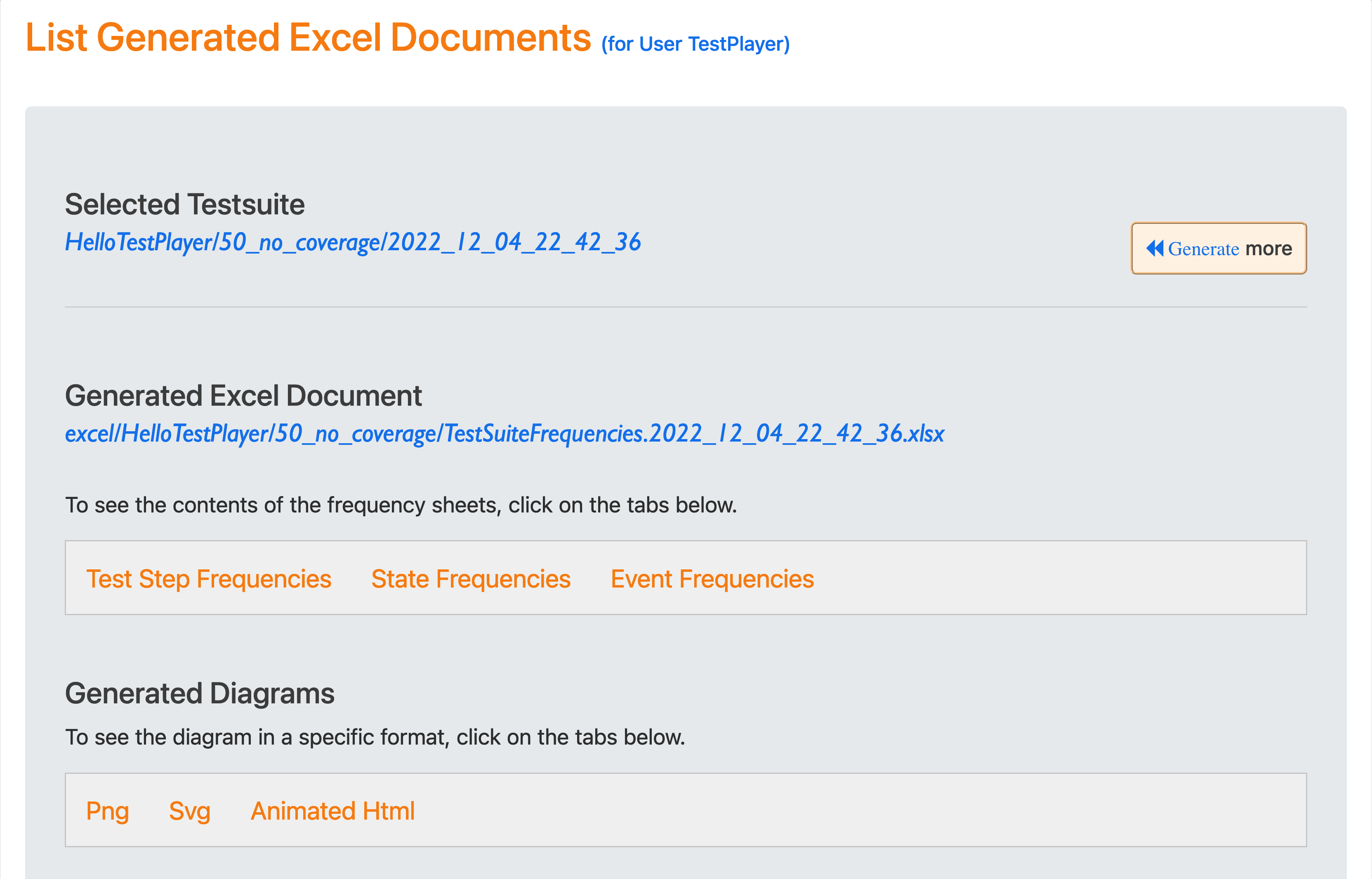
The selected Excel document TestSuiteFrequencies.2022_12_04_22_42_36.xlsx contains three spreadsheets that can be viewed by clicking on the tabs.
-
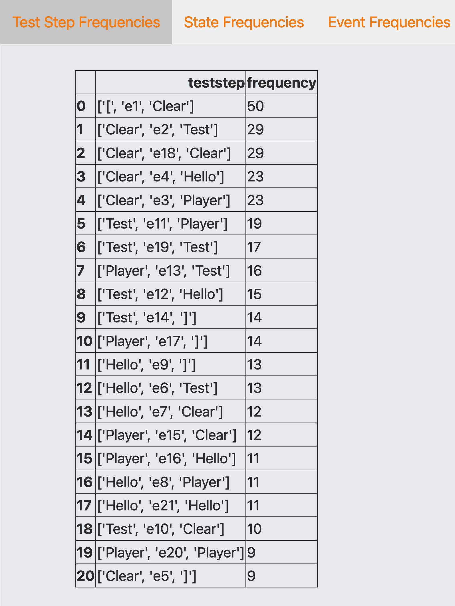
Test Step Frequencies, where each test step consists of a triple (
Source Usage State,Transition Event,Target Usage State)
-
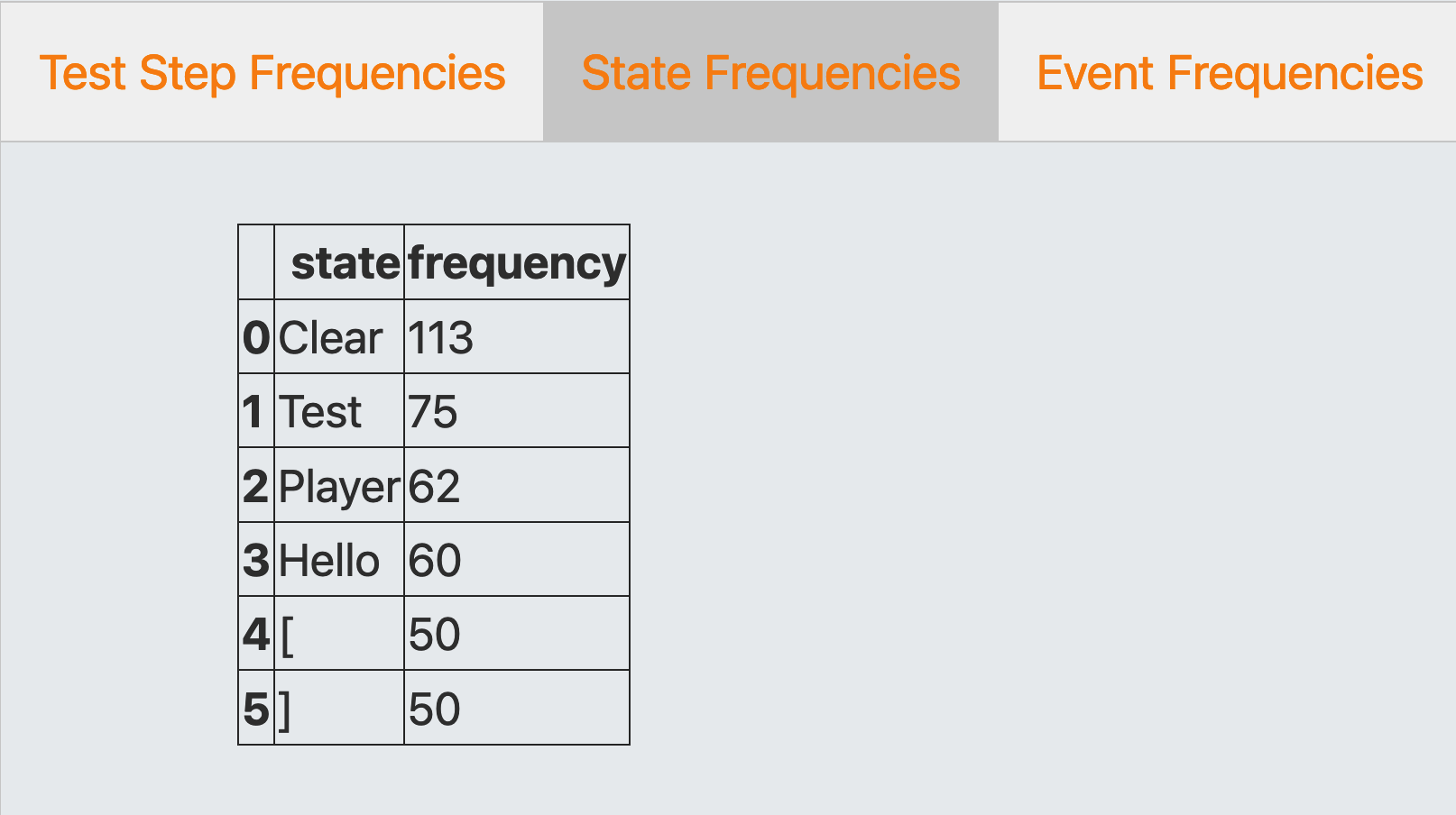
State Frequencies, where each state is either a source or a target usage state
-
Event Frequencies, where events are transition events between source and target usage states
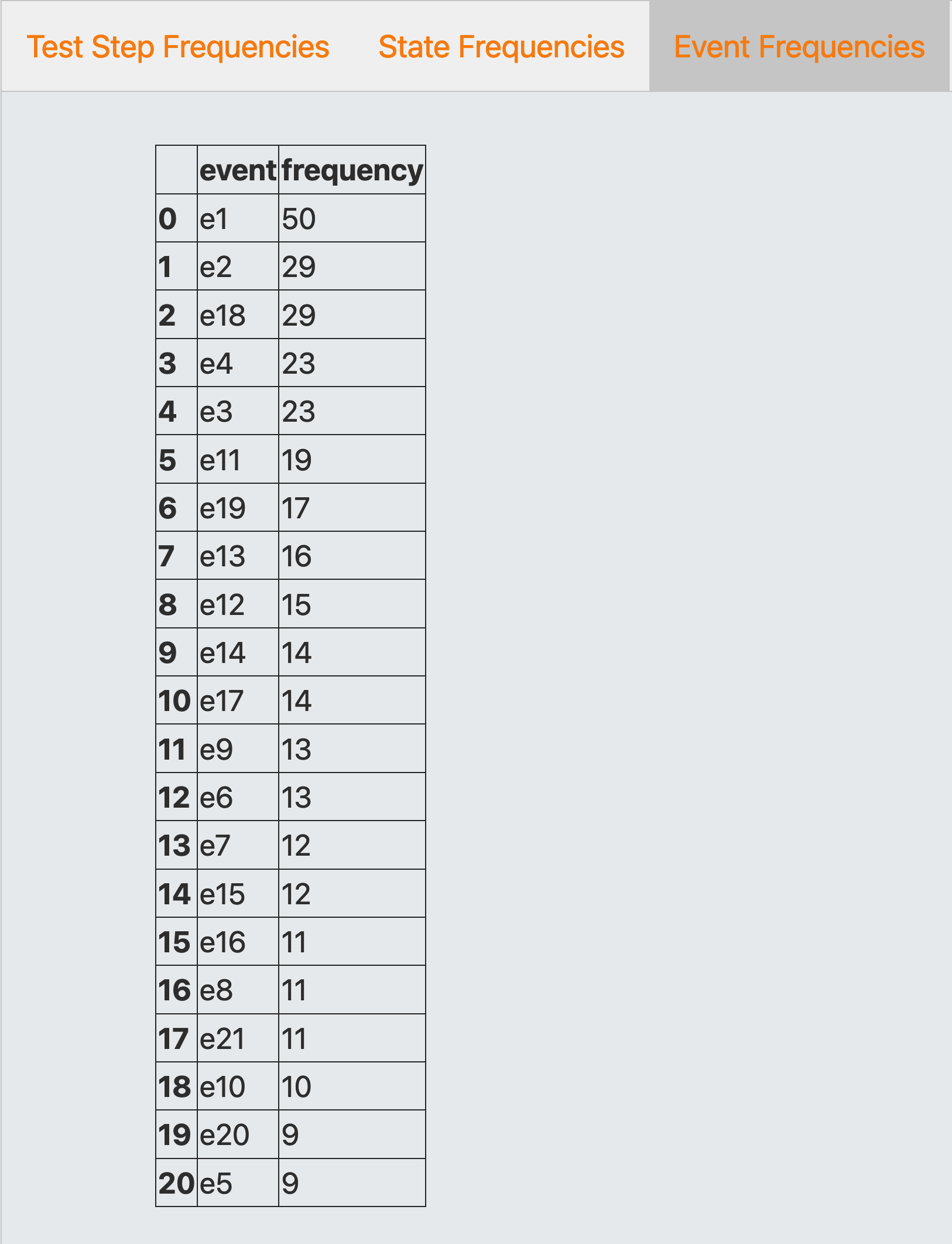
When you open document TestSuiteFrequencies.2022_12_04_22_42_36.xlsx in Microsoft Excel or other office software that can read xlsx documents, the spreadsheets are displayed as follows:
Test Step Frequencies
State Frequencies
Event Frequencies
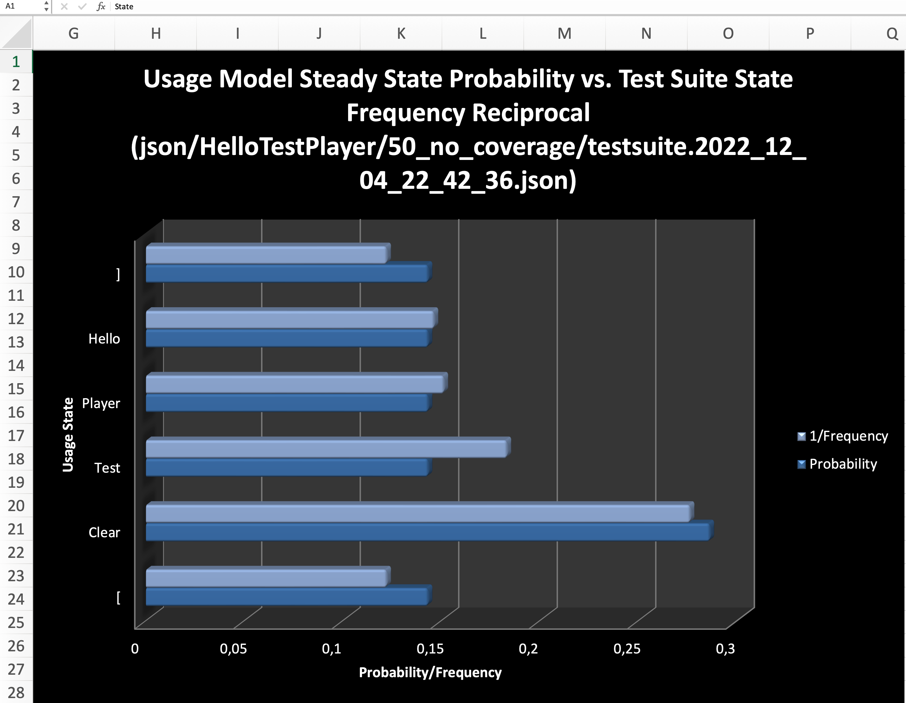
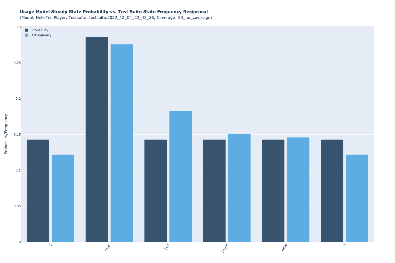
Steady State Probabilities vs. Test Suite State Frequencies
Probabilities vs. Frequencies, two diagrams are displayed in vertical and horizontal mode, comparing the steady-state probabilities of the states of the usage model with the reciprocals of the state frequencies of the selected test suite:
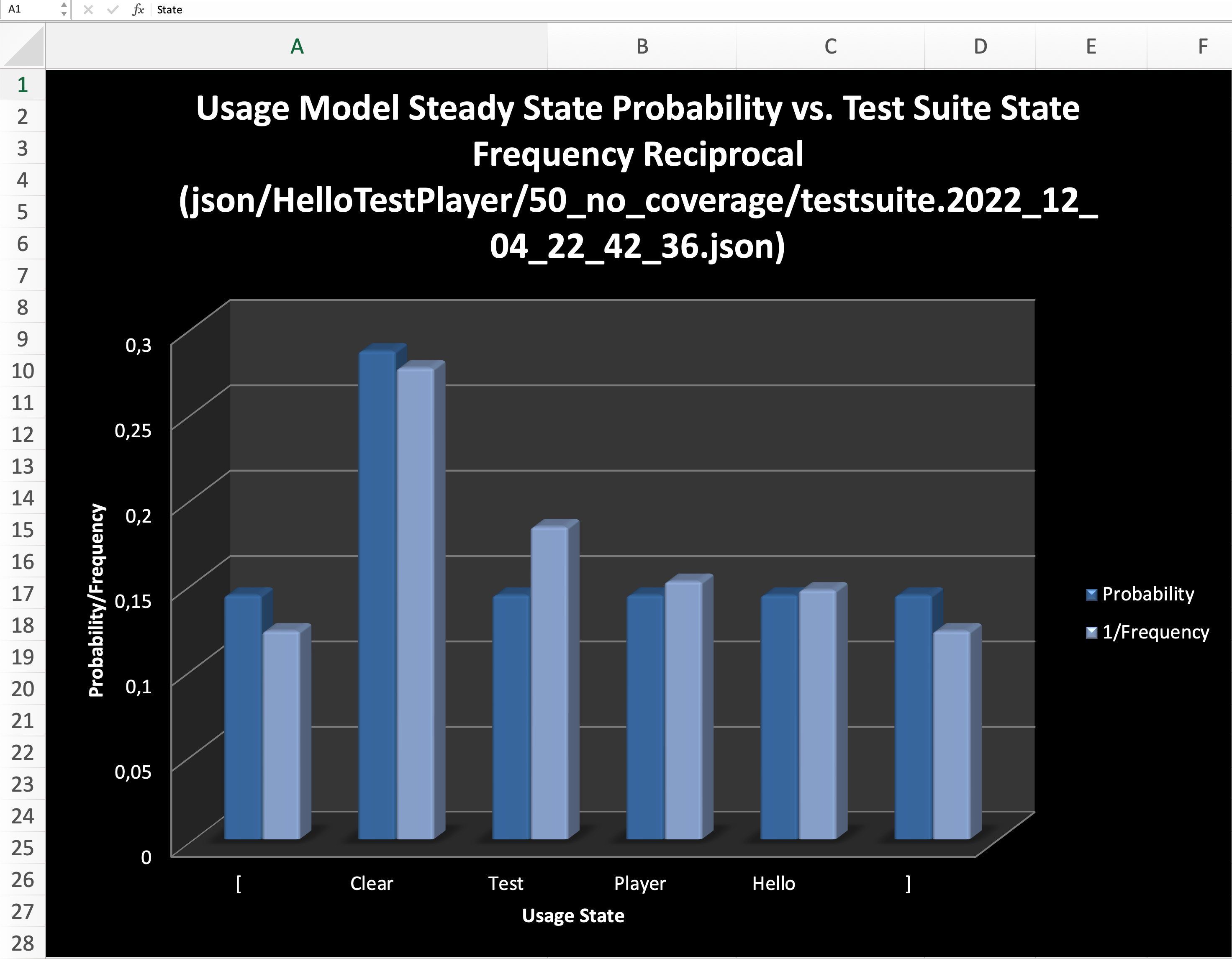
Both diagrams show that the test suite reflects the usage model very well during the execution of the test. That is, the expected number of visits for a given usage state during the test execution is fairly close to the theoretical Markovian steady state solution for the usage model in the long run (see Example: Markov chain usage model).
The main advantage in using Excel documents is their widespread use and easy customization of special presentation forms. In addition the diagram in vertical mode can be visualized directly in the TestPlayer in three different graphic formats when selecting one of the diagram tabs
-
Png -
Svg -
Animated Html
Png
Svg

Animated Html
Click here to show
Execute, Analyze and Visualize Tests
After the automatic generation of a test suite, the TestPlayer© Extension offers the tester the possibility to execute, analyze and visualize executable test cases. Furthermore, detailed test reports can be displayed.
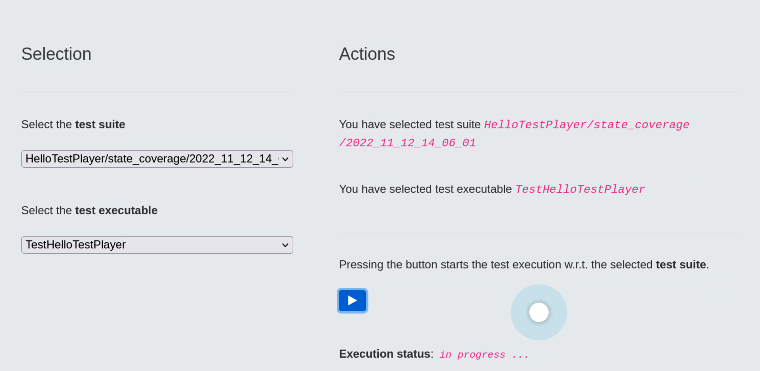
Execute Test Run
Once the specific test suite and a suited test executable have been selected, the TestPlayer© Extension starts a robot browser (Firefox, Google, etc.) and executes the test suite automatically.
The real magic happens inside the test executable.
For every transition of the usage model a corresponding assertion must be evaluated. This is very similar to the execution of a unit test.
The following code snippet shows how a transition event can be tested and validated in principle:
-
The
StartApp_1test step becomes active whenever the usage state[, which indicates the start of a test case, is exited. The only possible edge has transition labele1and leads to the next usage stateClear. During the transition, a timer must first be started to monitor the trace of transition events. The current time is extracted usinggetInfo()and written to the output trace. The assertion validates that the title of the web app is exactlyHello TestPlayer©!otherwise an error message is generated. -
Test step
ClickHello_4is active, when theClearusage state is exited because the user clicked theHellobutton. The current time is extracted usinggetInfo()and written to the output trace. The assertion validates that the label of the usage stage isHellootherwise an error message is issued.
global startURL
global driver

# set global timer for test case monitoring
start_time = 0

def StartApp_1(self):

    global firstTimestamp
    global firstTestCase

    # start time (in ns) of the test case
    Test_Steps.start_time = time.monotonic_ns()

    # calibration done by first test case
    if firstTestCase:

        # timestamp needed for timestamp calibration
        firstTimestamp = Test_Steps.start_time

    # set driver URL to app
    driver.get(startURL)

    # <Frameinfo> contains web site start time
    print(getInfo())

    if firstTestCase:
        firstTestCase = False

    # assert <Hello Test Player>
    self.assertEqual("Hello TestPlayer©!", driver.title)

    elem = driver.find_element("id","Label")
    self.assertIn("App start: Click a button!", elem.text)

def ClickHello_4(self):
    print(getInfo())

    driver.find_element("id","Hello").click()
    elem = driver.find_element("id","Label")
    self.assertIn("Hello", elem.text)

...
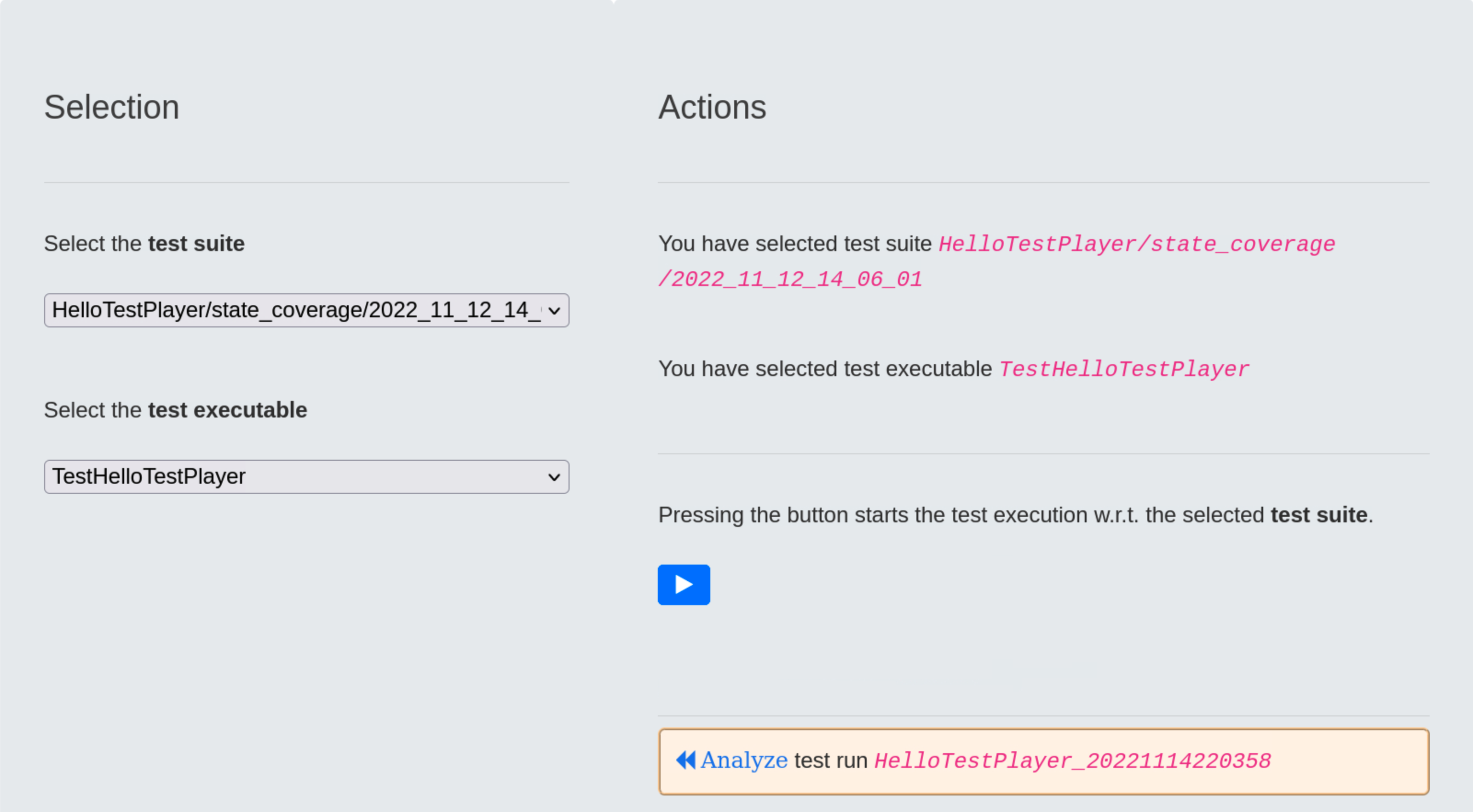
Analyze Test Run
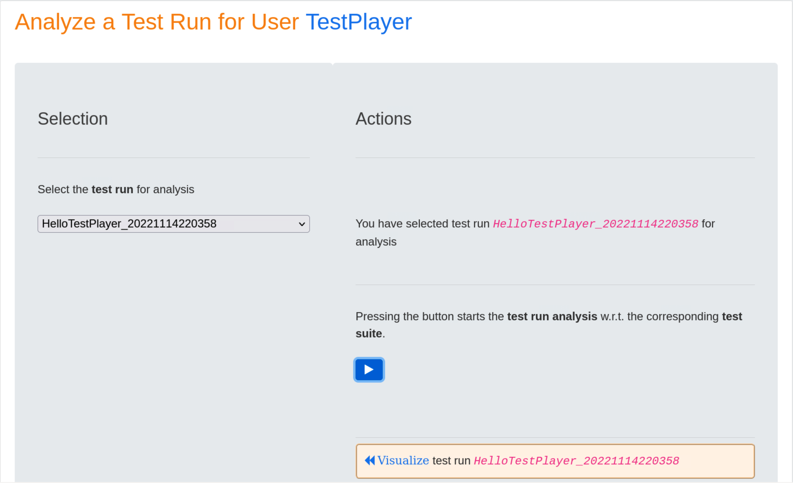
When the test run is completed, it receives a timestamp, in our case 2022114220358, which the test engineer must use to start the test run analysis.
Pressing the blue ⏵ button starts the test run analysis in relation to the corresponding test suite. The result is a series of diagrams used to visualize various aspects of selected test run.
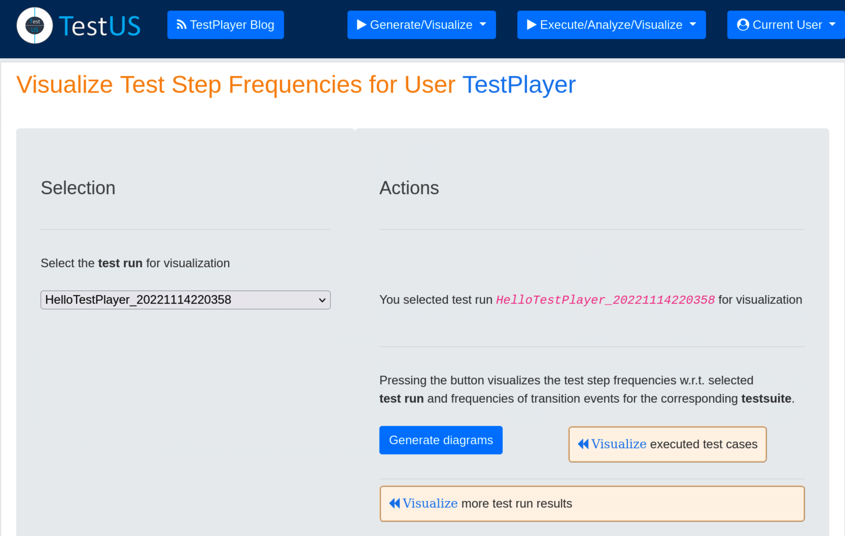
Visualize Test Run
Upon completion of the test run analysis, the TestPlayer© Extension provides various diagrams and test reports. The tester is able to evaluate characteristic properties and the quality of the SUT by evaluating
- test step execution times of individual test cases in relation to the selected test run and the associated test suite
- frequencies of test steps with respect to the selected test run and frequencies of transition events for the corresponding test suite
- various metrics of test step execution times with respect to the selected test run, e.g. minimum, average and maximum values of execution times.
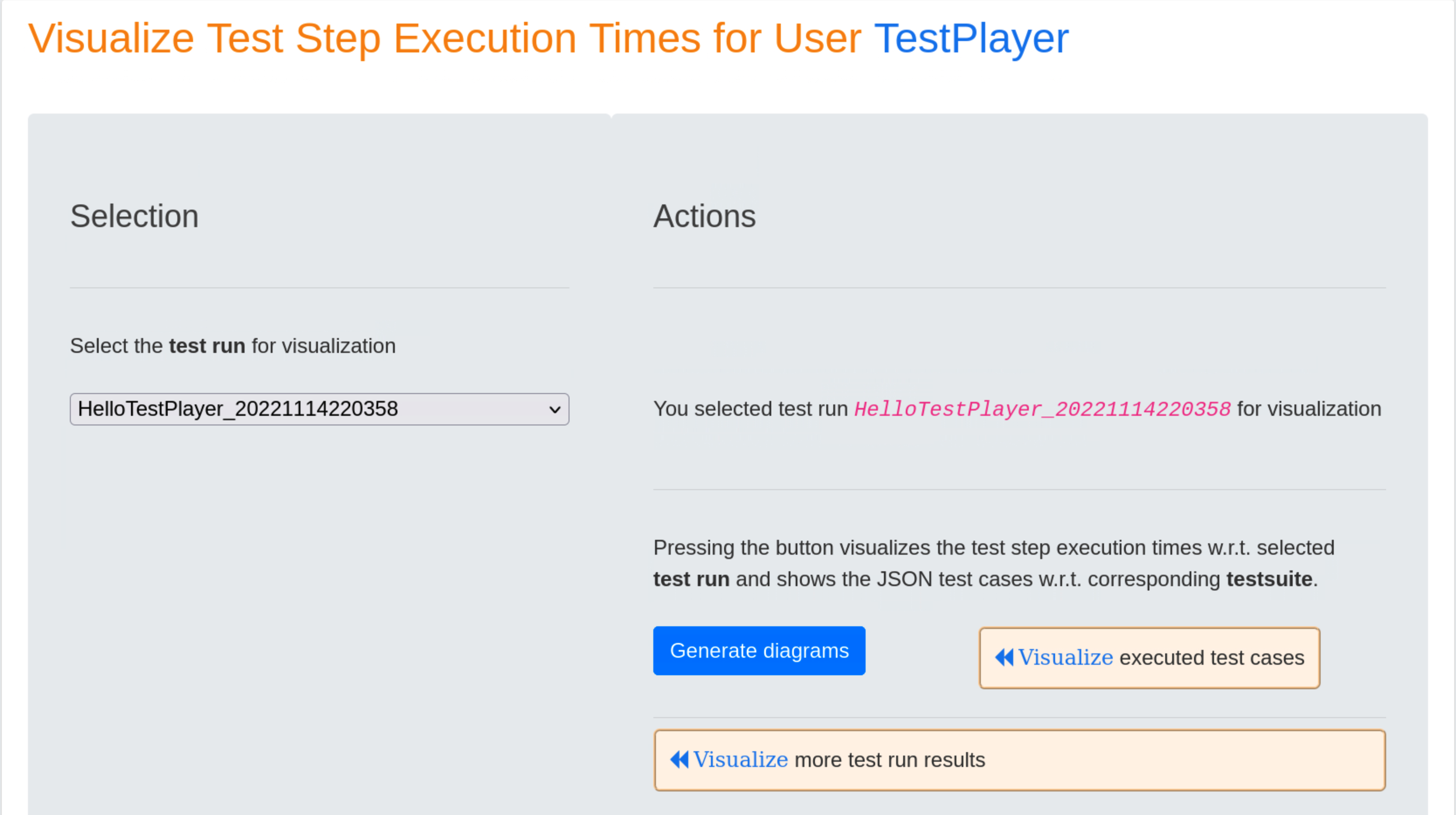
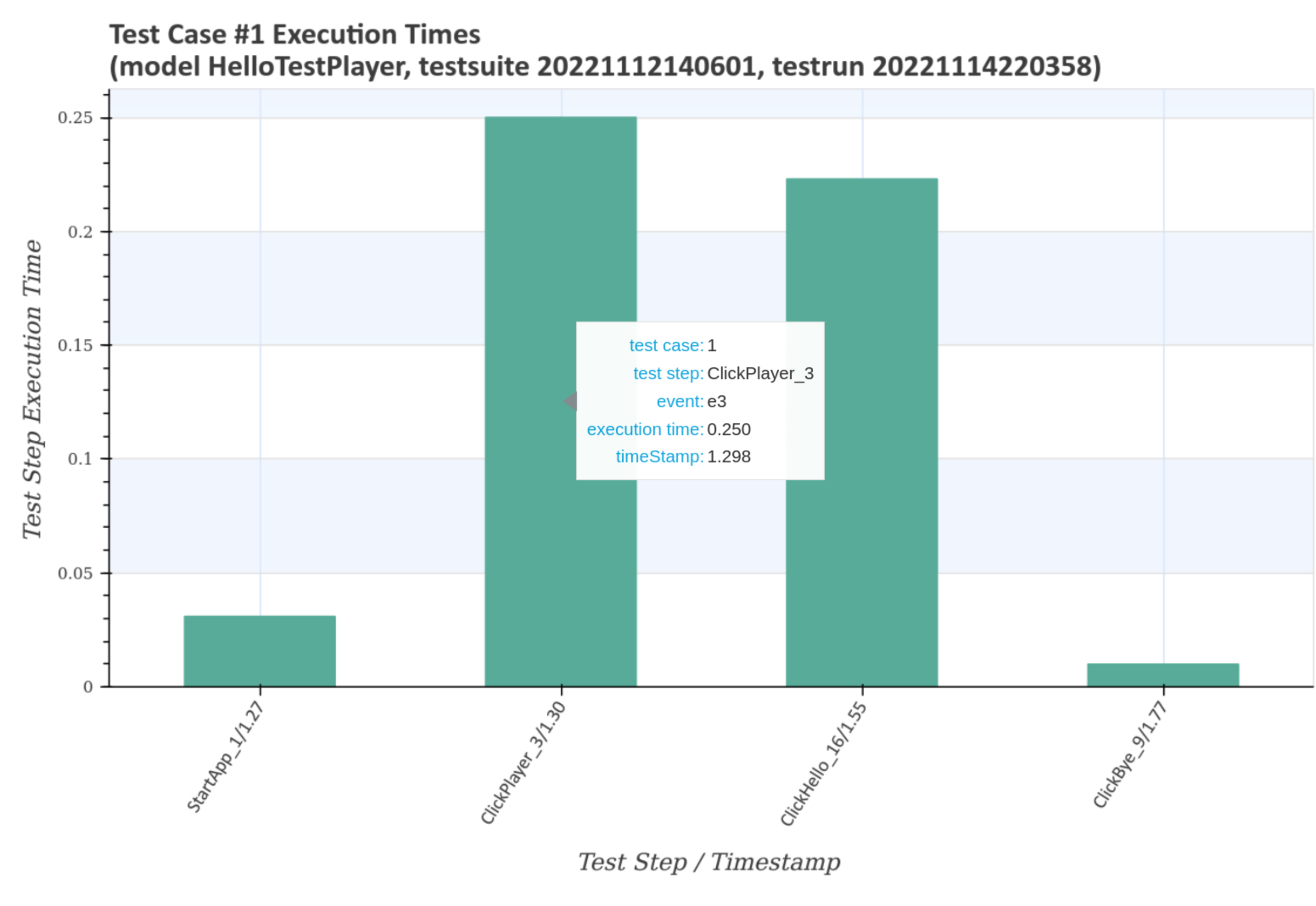
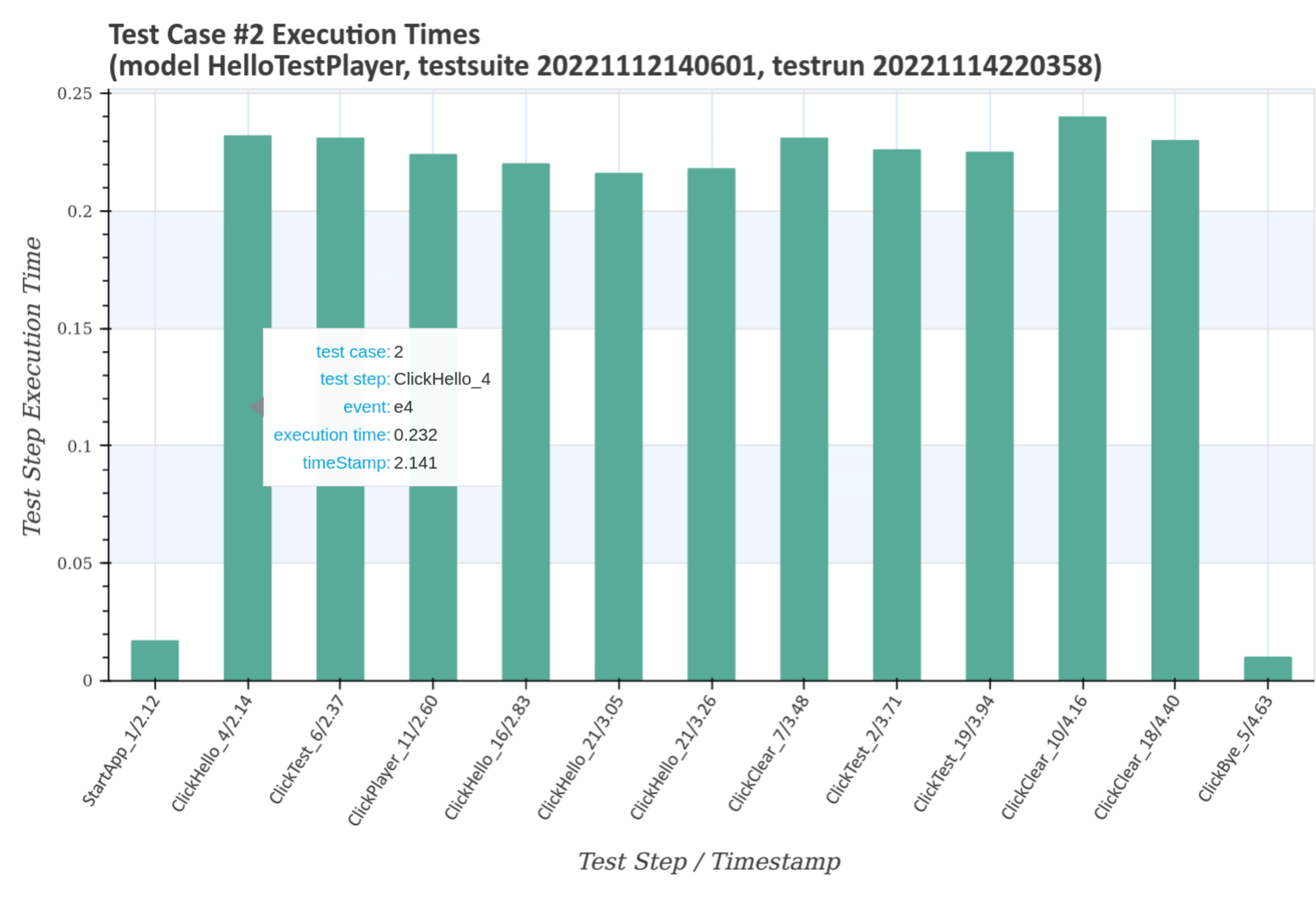
Visualize test step execution times
Test step execution times of individual test cases in relation to the selected test run and the associated test suite are visualized after pressing the blue Generate diagrams button and the Visualize link.
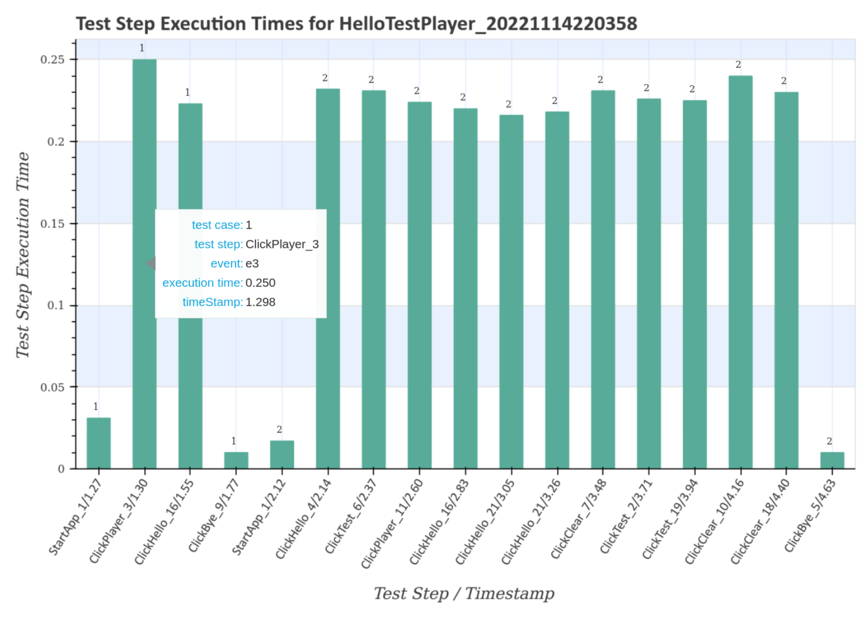
The first diagramm gives an overview of the execution times of the test steps for the complete test suite with the unique timestamp 20221112140601. Double-clicking on the image shows an enlarged image with more details when you move the mouse pointer over it.
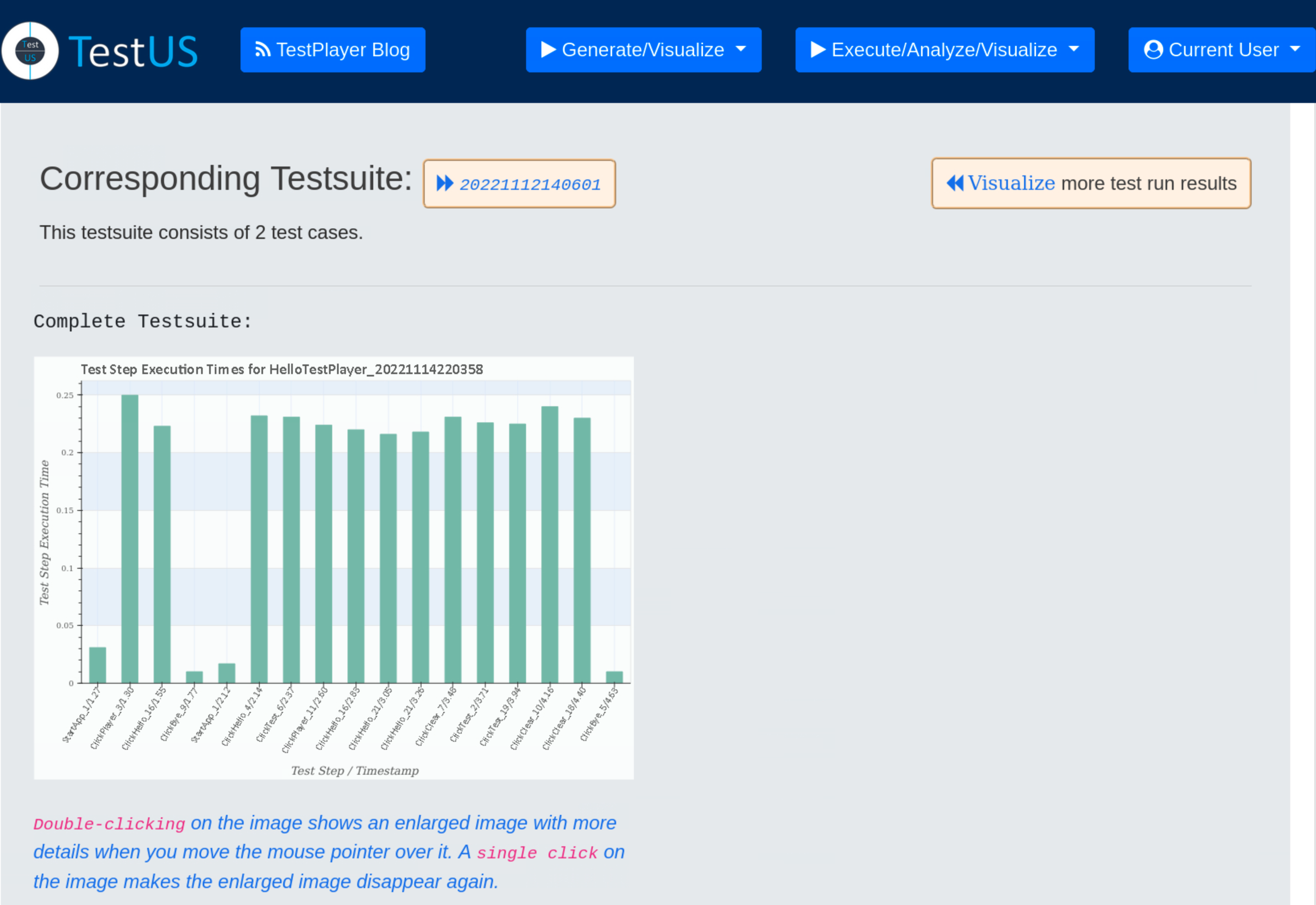
The larger diagram shows the test case numbers and transition events associated with the test steps, as well as the corresponding execution time and timestamp.
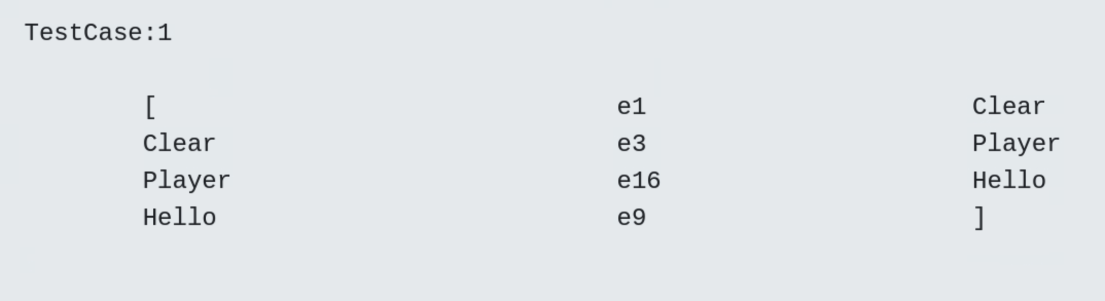
Subsequently, all test steps of all test cases are displayed together with the corresponding detail diagram.
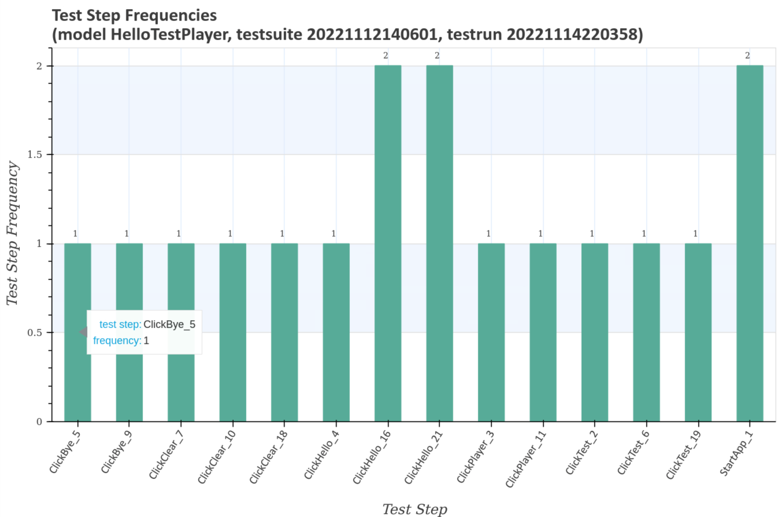
Visualize test step frequencies
Test step and transition event frequencies of individual test cases in relation to the selected test run and the associated test suite are visualized after pressing the blue Generate diagrams button and the Visualize link.
The first diagramm gives an overview of the transition event frequencies for the test suite with the unique timestamp 20221112140601. Double-clicking on the image shows an enlarged image with more details when you move the mouse pointer over it.
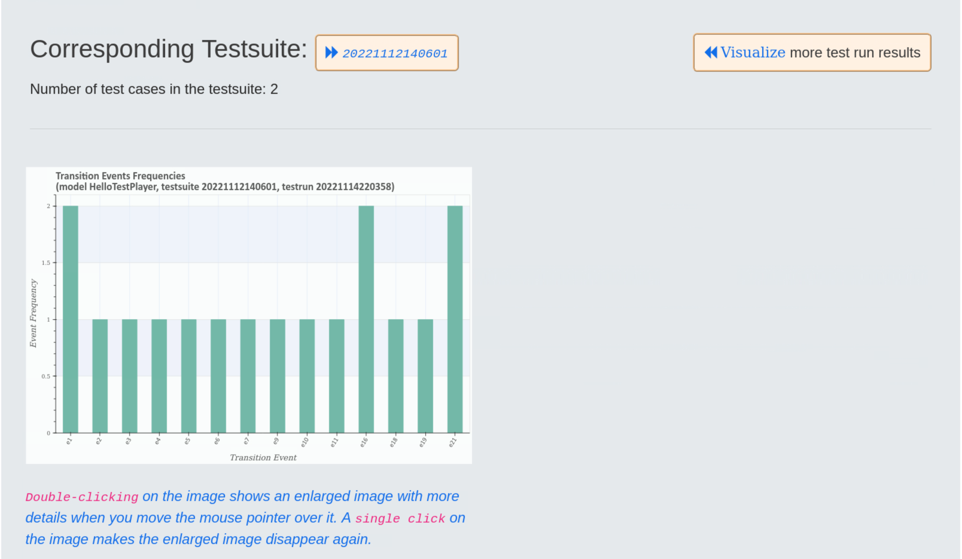
The larger diagram shows the transition event frequencies and the test steps associated with the transition event.
The next larger diagram shows the test step frequencies and the transition events associated with the test steps.
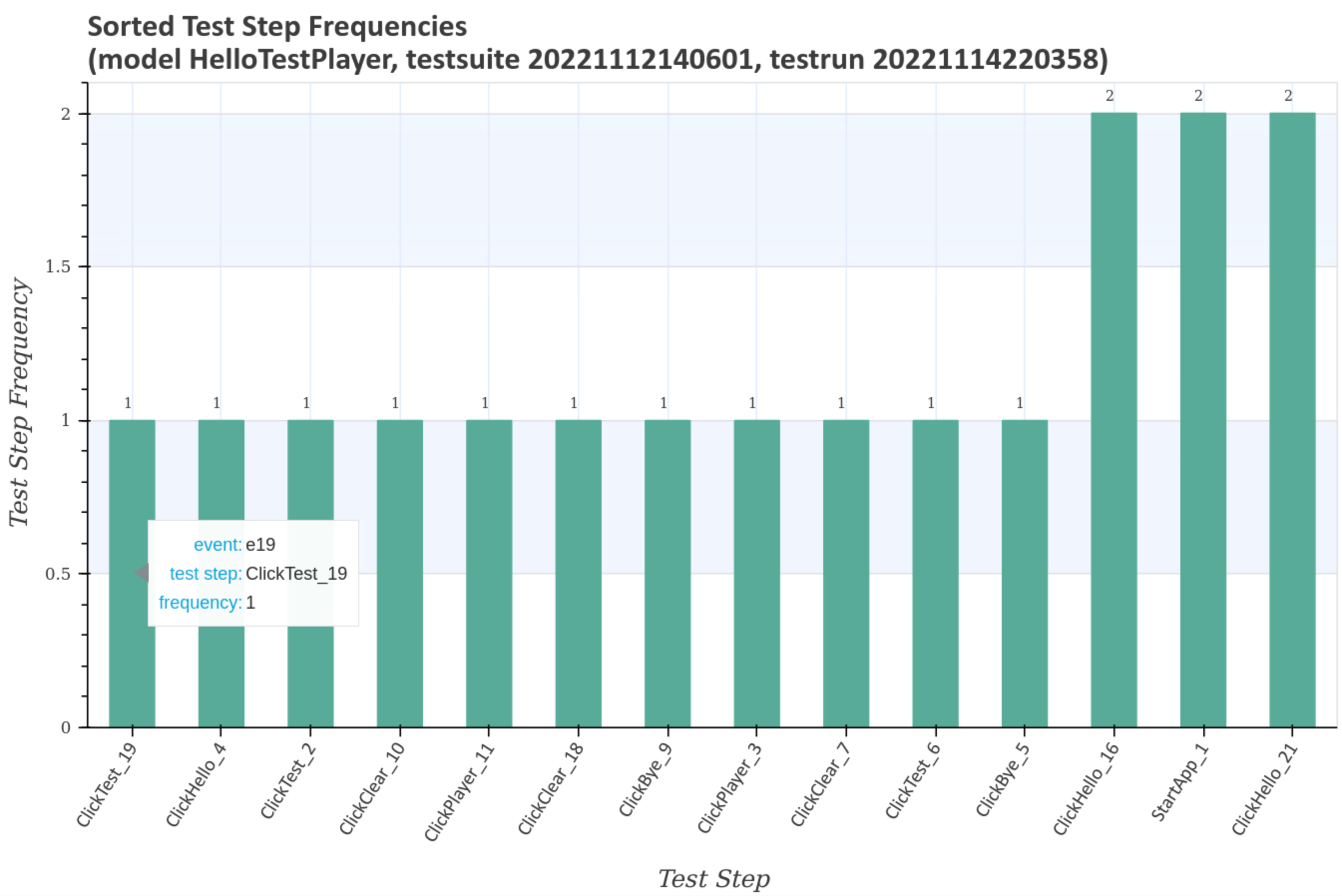
The last enlarged diagram shows the sorted test step frequencies and the transition events associated with the test steps.
Visualize Test Step Runtime Metrics
Test step and transition event frequencies of individual test cases in relation to the selected test run and the associated test suite are visualized after pressing the blue Generate diagrams button and the Visualize link.
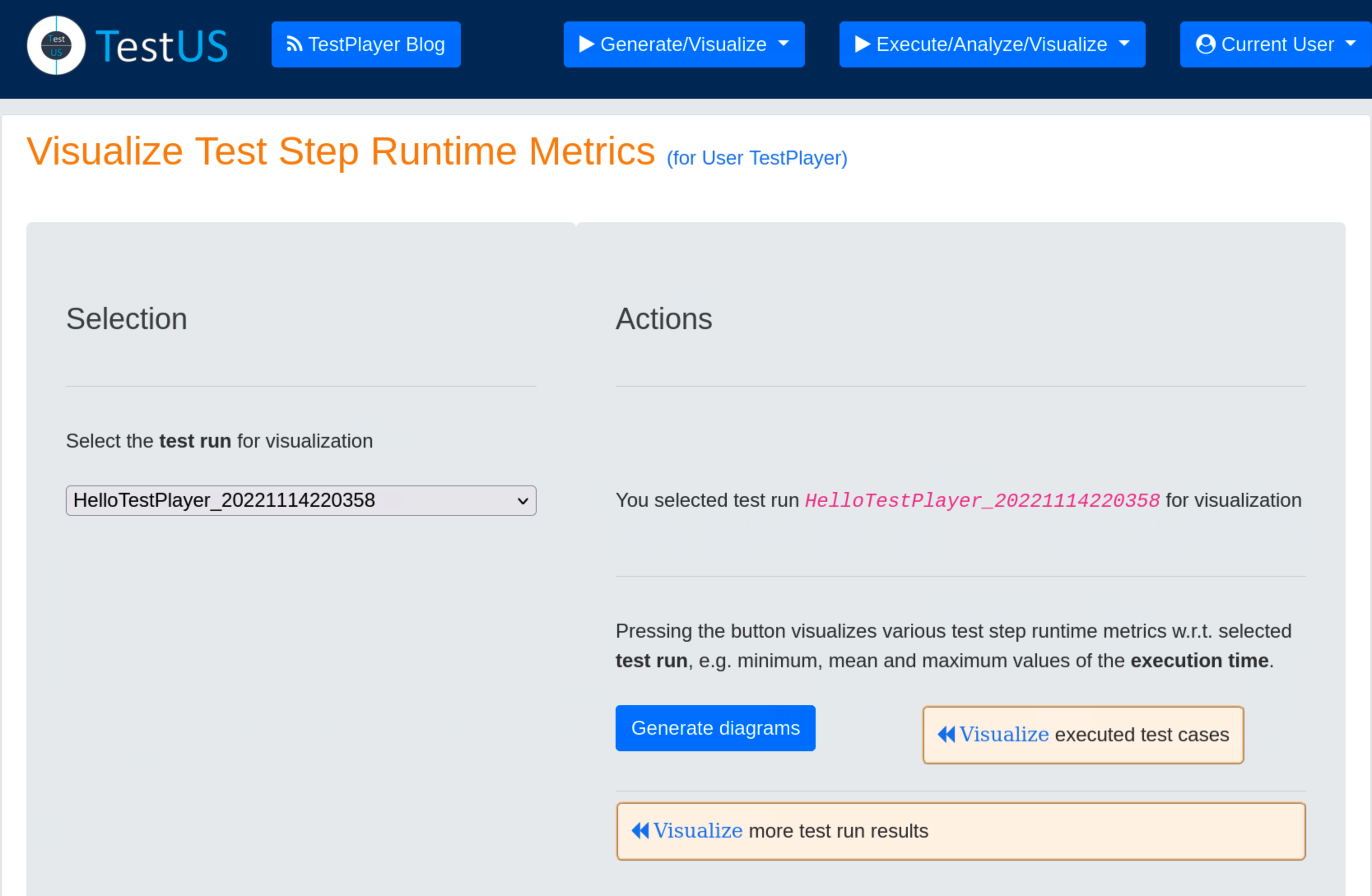
The first three graphs show mean, minimum and maximum of the test step execution times for the test run with the unique timestamp 202211114220358 and the associated test suite with the unique timestamp 20221112140601. All three graphs look very similar and show a characteristic pattern for the test run.


The following diagramm shows the sorted frequencies of the test steps for the test run with the unique timestamp 202211114220358 and the associated test suite with the unique timestamp 20221112140601. As can be seen, three test steps are executed twice.

The next two charts contains the sum and the sorted sum of the test step execution times for the test run with the unique timestamp 202211114220358 and the associated test suite with the unique timestamp 20221112140601. This is particularly interesting for finding candidates for application performance optimization, e.g. ClickHello_21 or ClickHello_16.


The last diagramm shows the sorted mean of the test step execution times for the testrun with the unique timestamp 202211114220358 and the associated test suite with the unique timestamp 20221112140601. This chart is also interesting for finding candidates for application performance optimization, e.g. ClickPlayer_3.

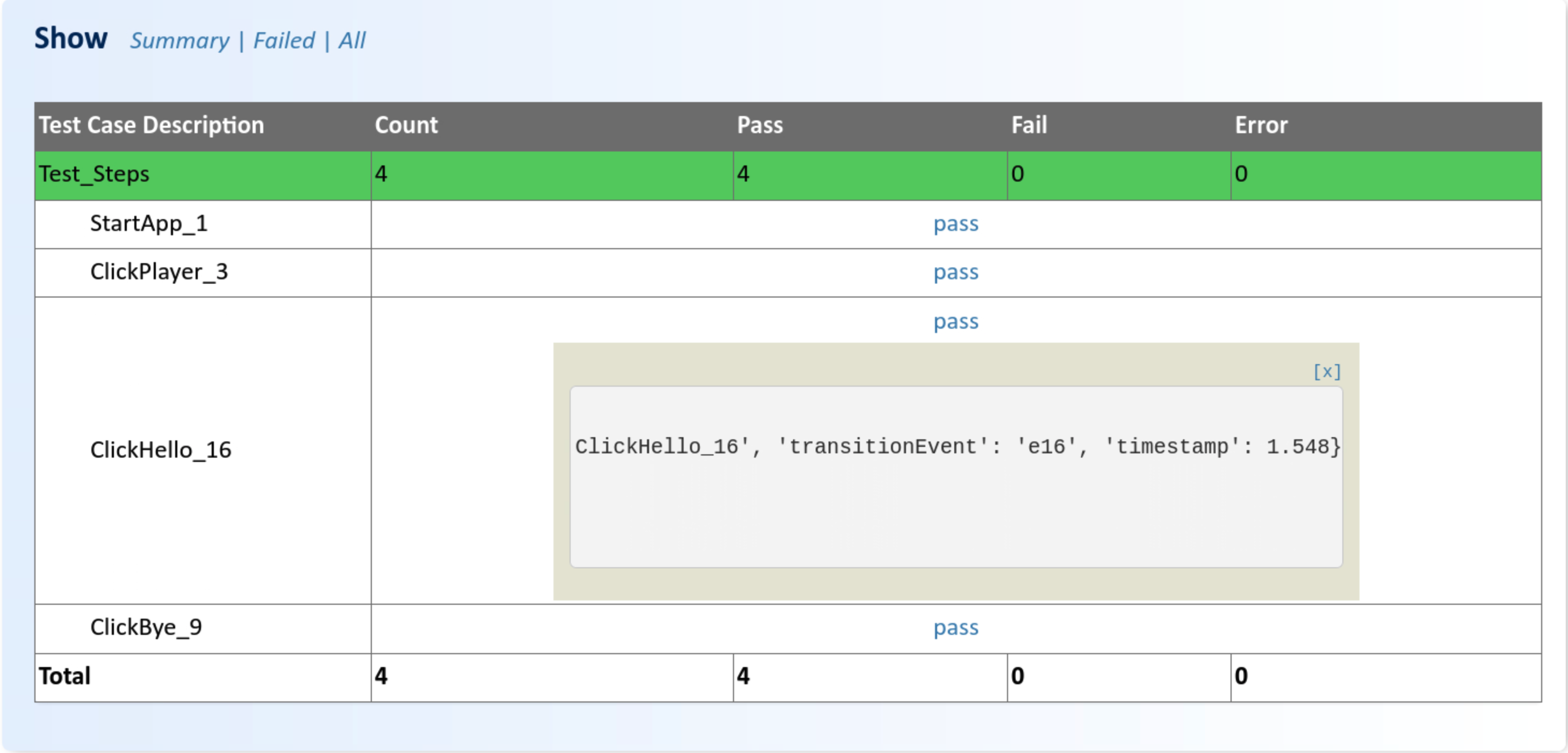
Show Test Report
During a test run, a detailed test report on the results of the execution of the test suite is automatically generated. This can subsequently be retrieved and reviewed by the test engineer.
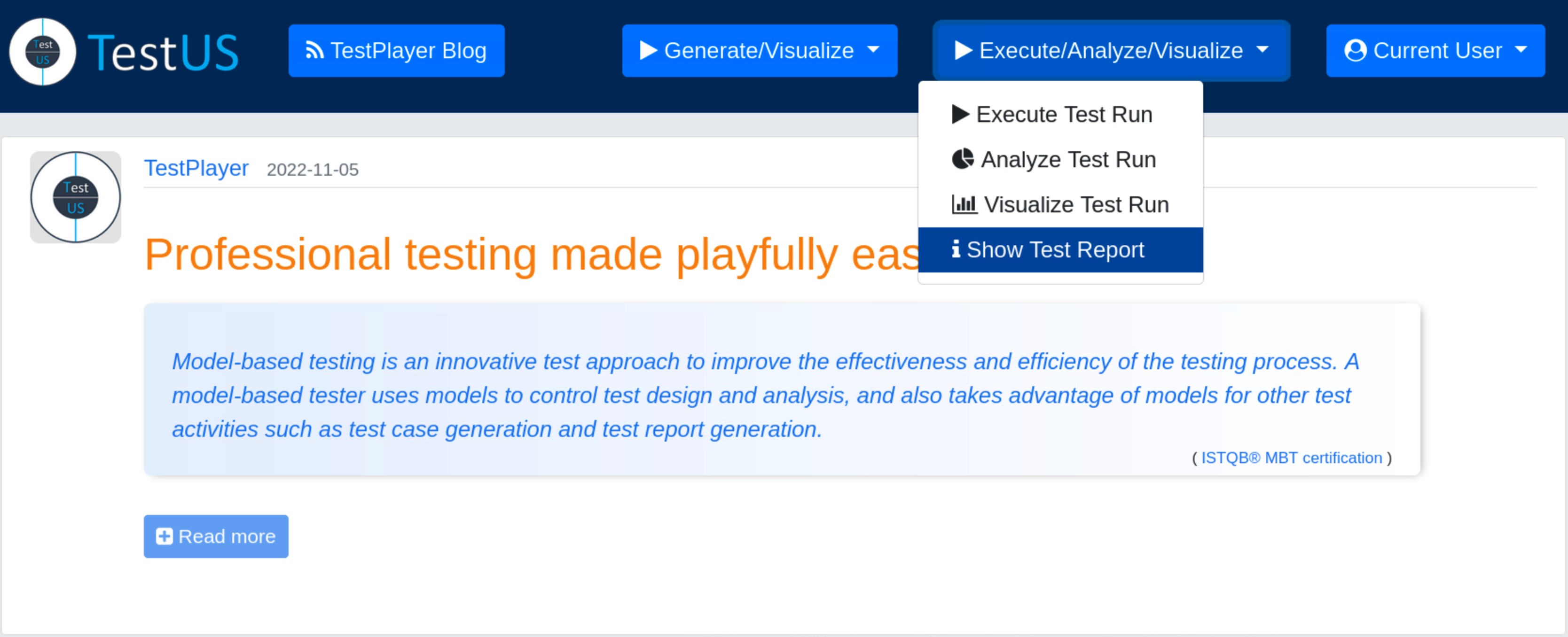
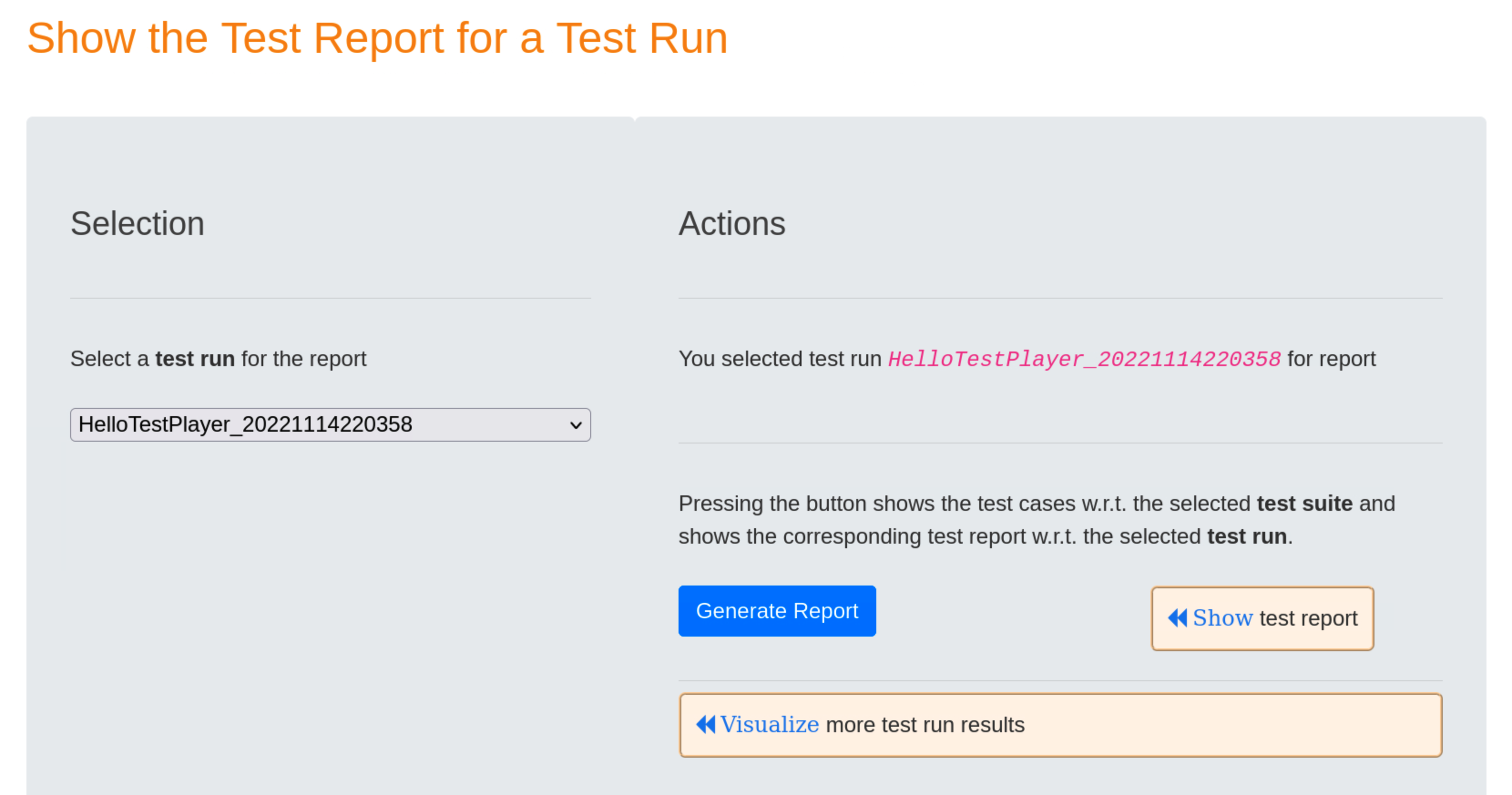
Once a test run has been selected, pressing the blue Generate Report button will result in displaying a detailed report after the « Show Test Report link has been selected.
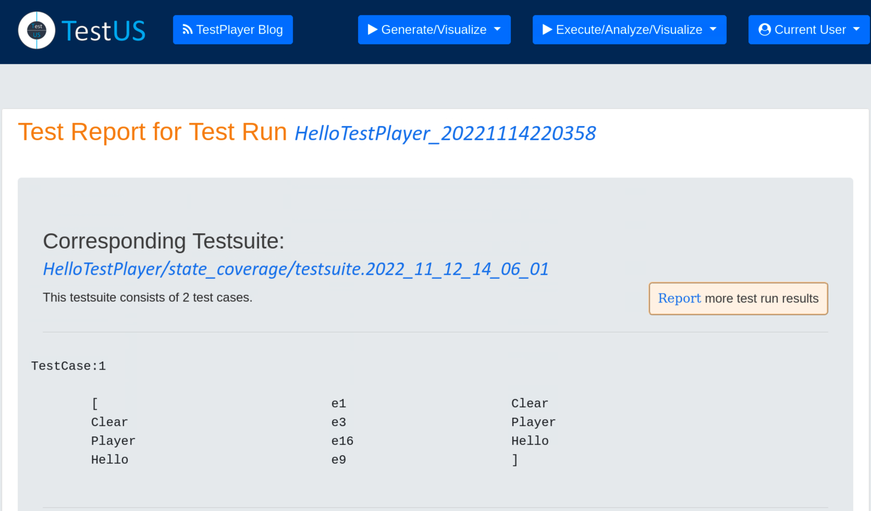
The test report includes
- the unique test run
- the unique test suite
- for each test case the specific test steps and a detailed test verdict
Summary mode displays a summary of the test report, showing the test case number,start time, duration and result (Pass or Failed) of the test case.
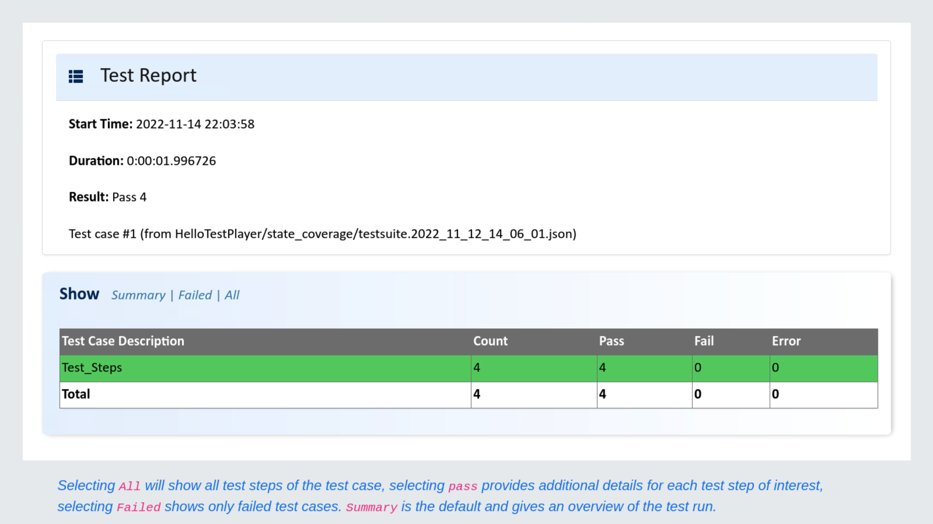
The All mode shows more details for each of the test steps in the test case.
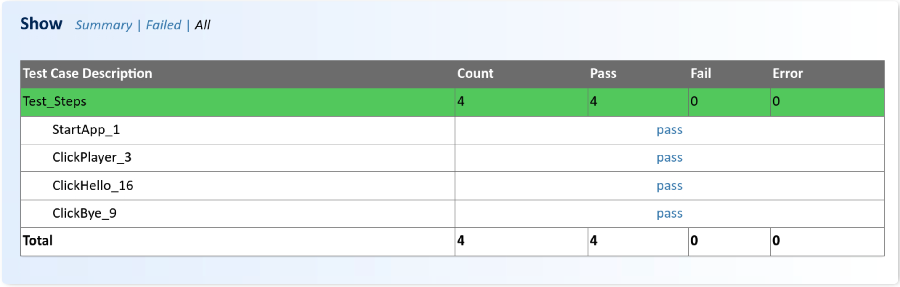
Additional data for each test step, i.e. test case number, transition event and timestamp when the test step was executed, is displayed by pressing on the test verdict pass.