Agile Travel
Using the web application Agile Travel, the standard example from Zhimin Zhan's book Practical Web Test Automation, we show how the TestPlayer© framework can extend modern testing methods.
The Agile Travel User Interface
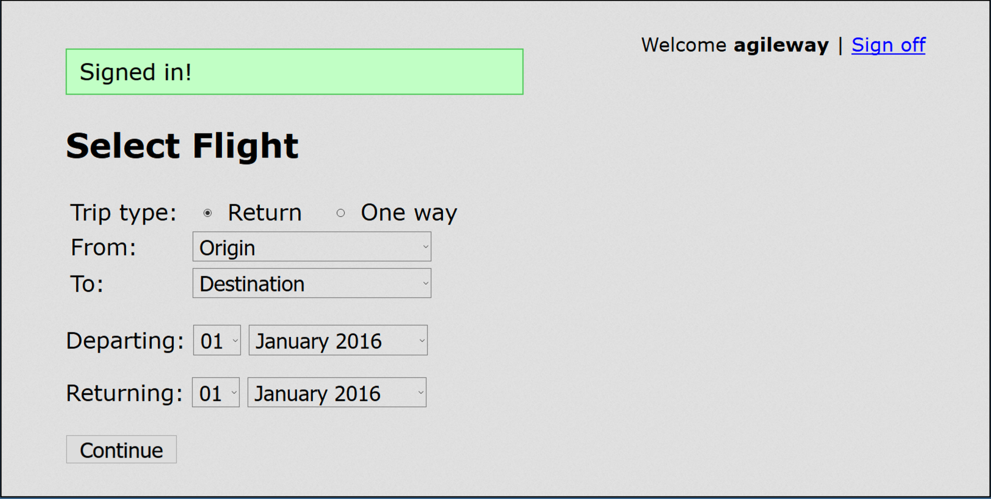
The Agile Travel application simulates a flight booking system and is launched directly from this URL. The user interface then displays the following view:
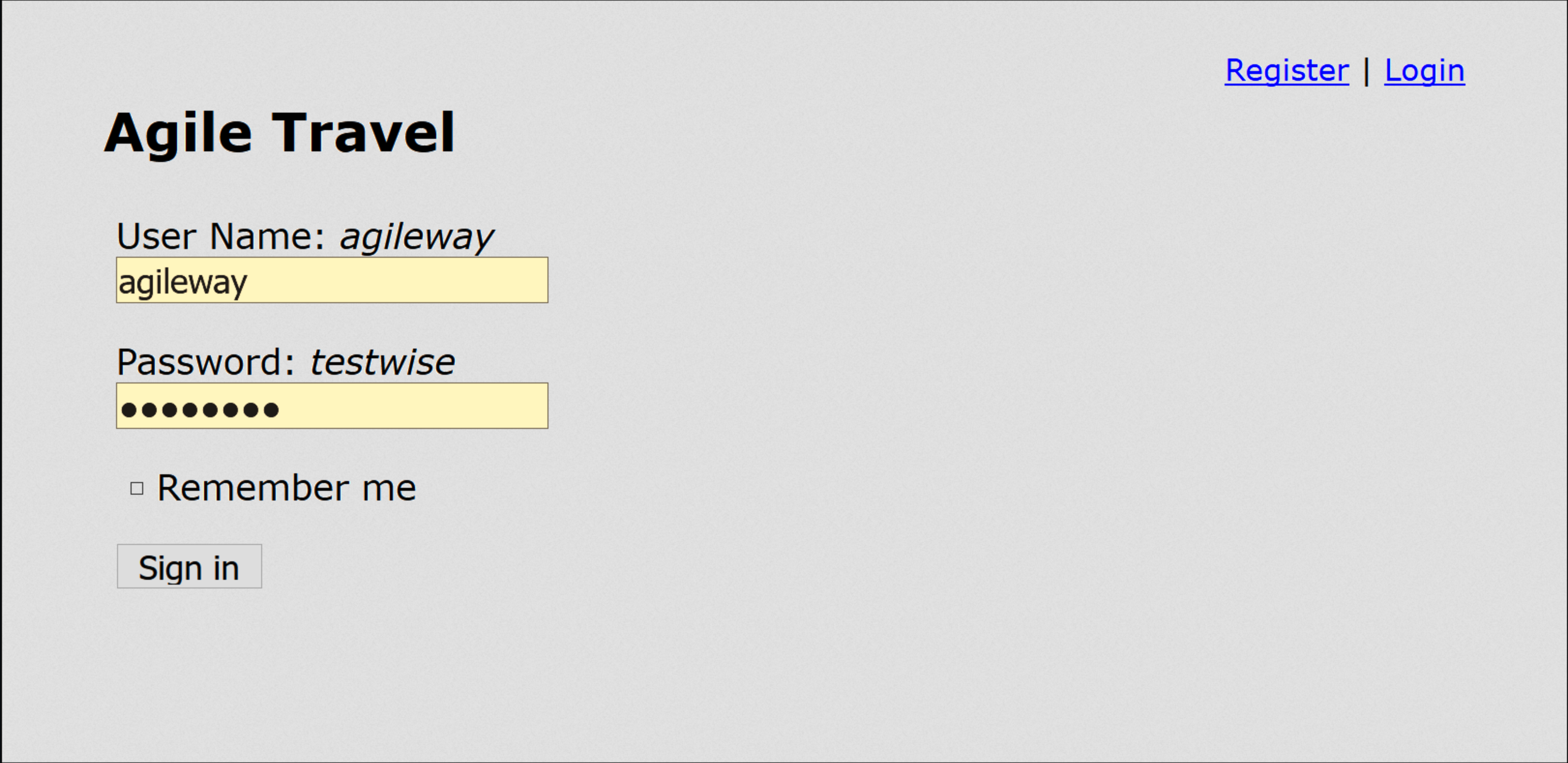
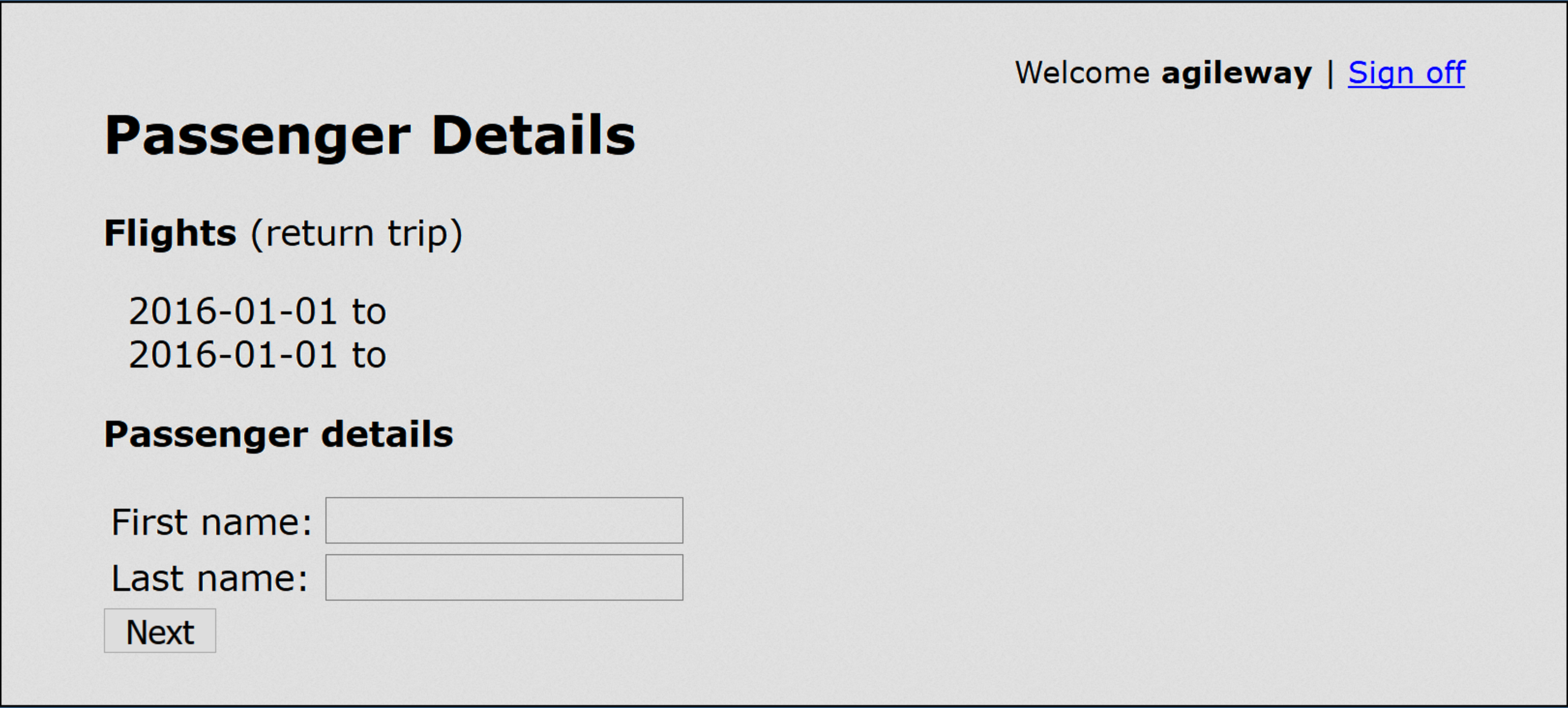
Flights can be booked after the Sign In button is pressed. The passenger's details are entered in the next step after pressing the Continue button.
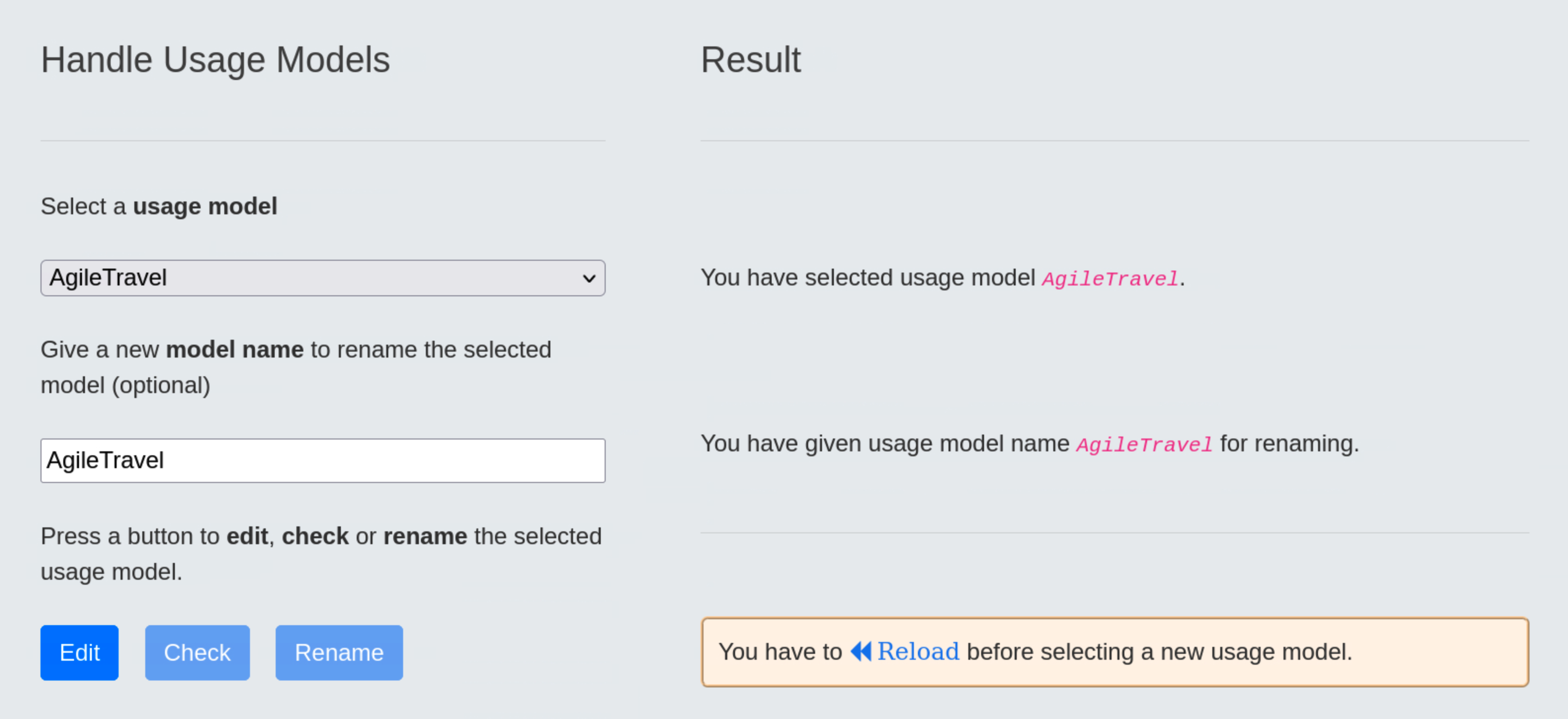
Handling of the Usage Model
Usage models are handled in Step 1 of the Test Suite Generation Wizard using the diagrams.net graphical editor.
Once the user has selected the AgileTravel usage model and clicked on the blue Edit button, the model editor will provide a dashboard for the user to edit the model:
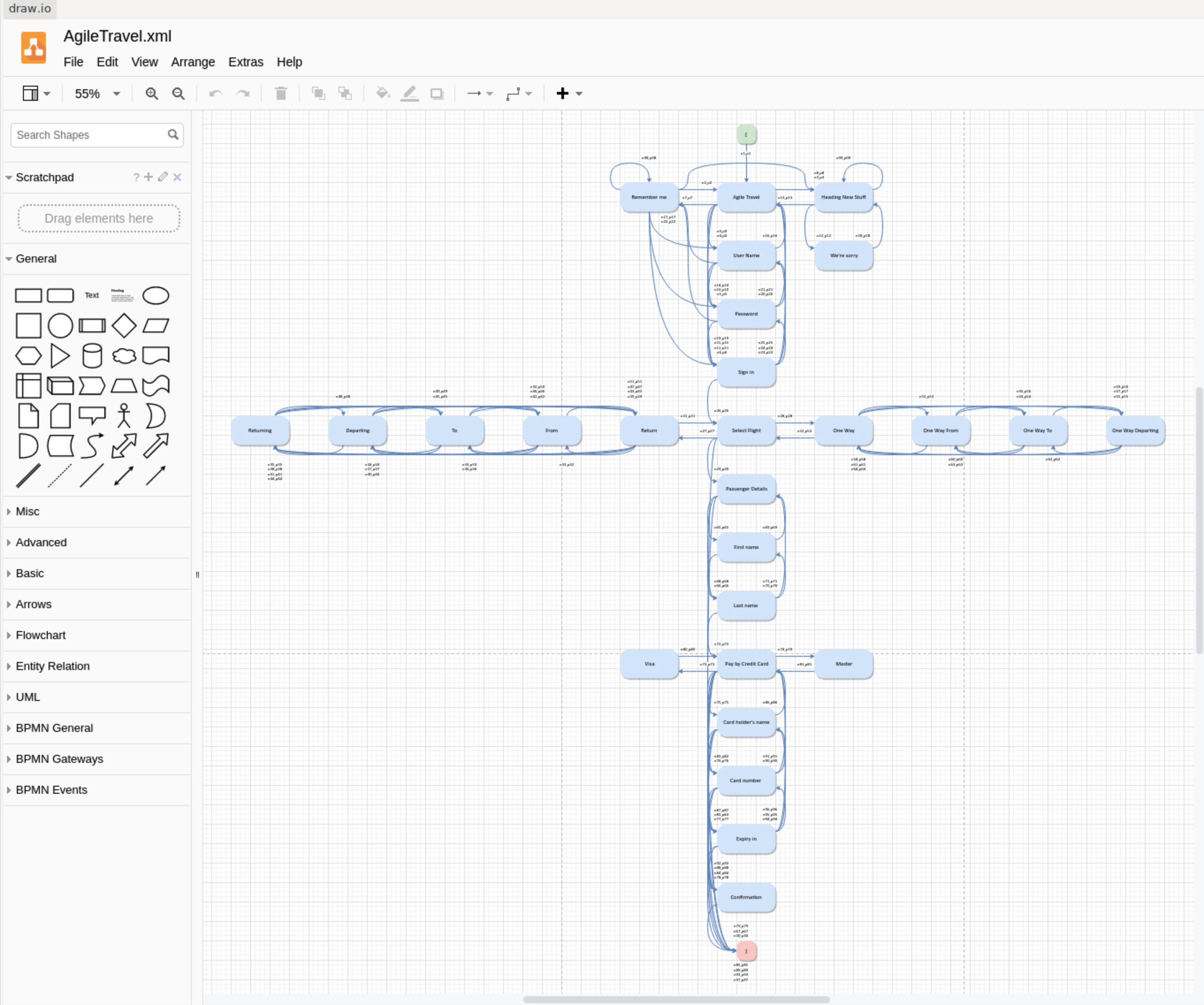
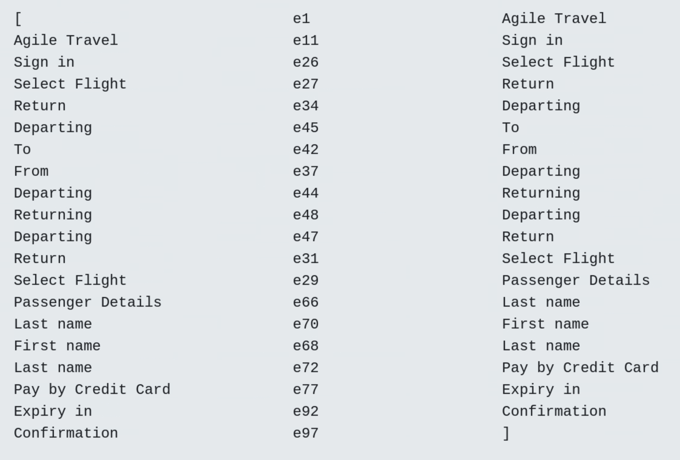
From the initial start state [ , which is executed when the test case is started, only the Agile Travel usage state can be reached directly, then other states such as Remember me , Heading New Stuff , Username , Password or Sign in can be selected depending on the user's intentions. Each test case ends when the final stop state ] is reached.
State transitions between the 29 usage states (including the start and stop states) are triggered by generic events e1 to e99, which were automatically generated by the TestPlayer© in conjunction with associated transition probabilities p1 to p99 when the user clicks the blue Check button in the Handle Usage Models tab.
Generation of a Test Suite
Step 2: select a usage model
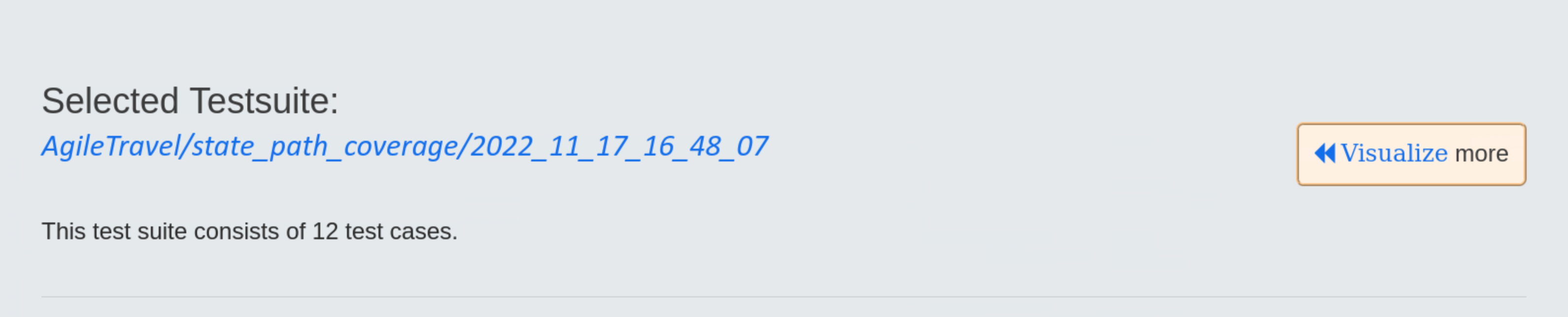
In this step we select the AgileTravel usage model, the number of test cases remains unchanged. The result of our selection is displayed in the Result area:
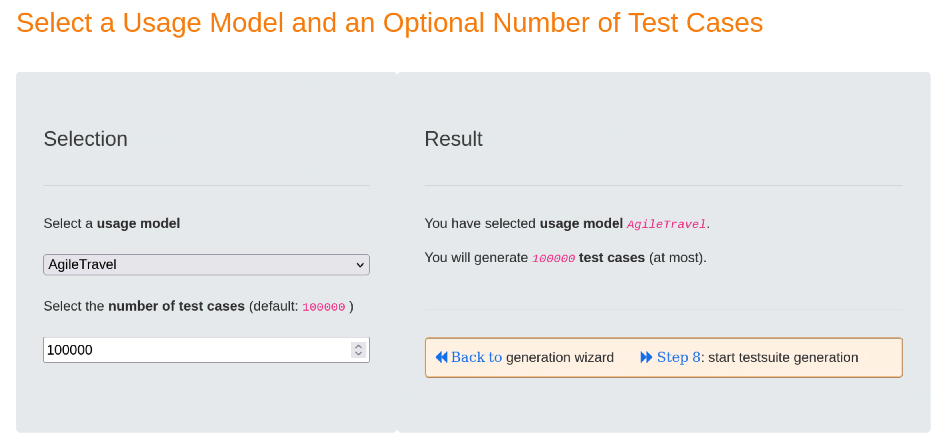
Clicking on the blue « Back to link will take you back to the Test Suite Generation Wizard.
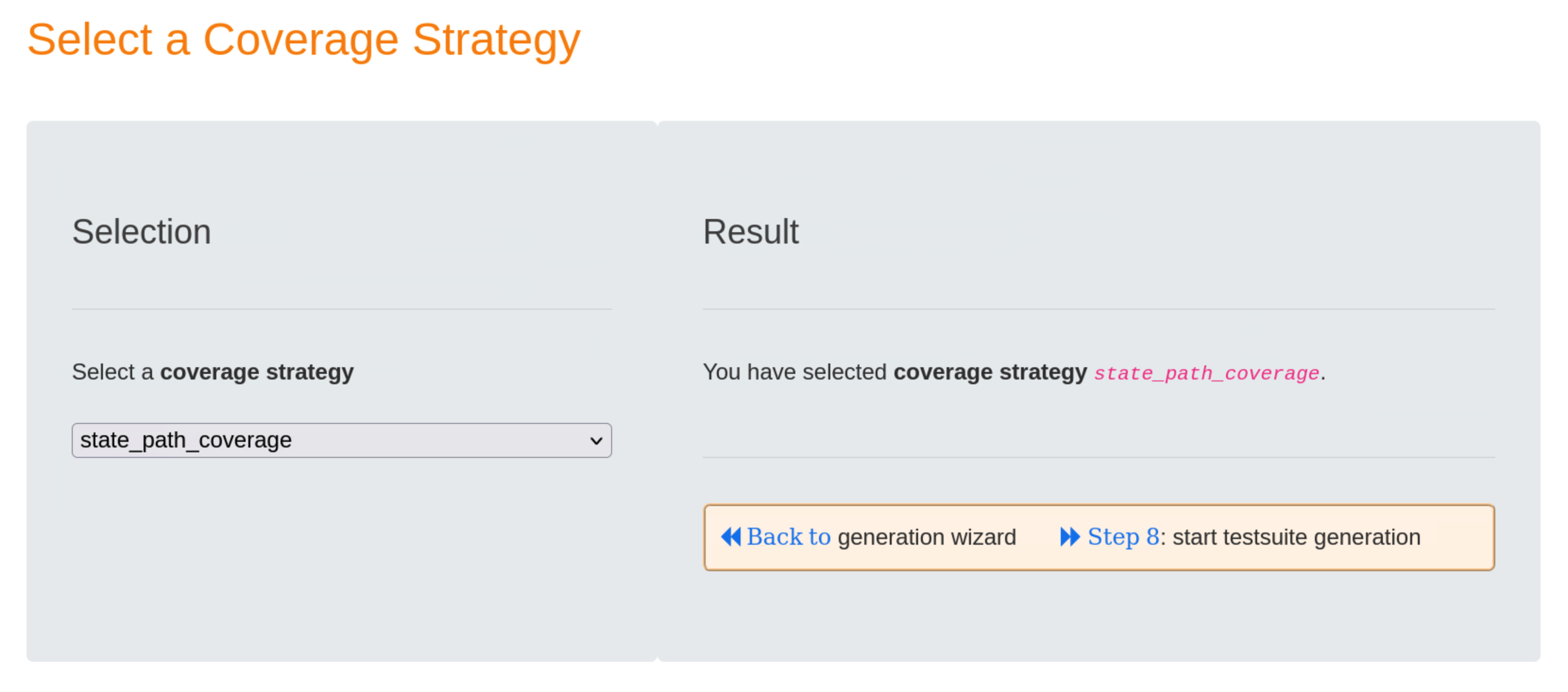
Step 5: select a coverage strategy
To avoid duplicate test steps, we choose the state_path_coverage strategy in this step. In general, the result will be test suites that are smaller in size but larger in number of test cases.
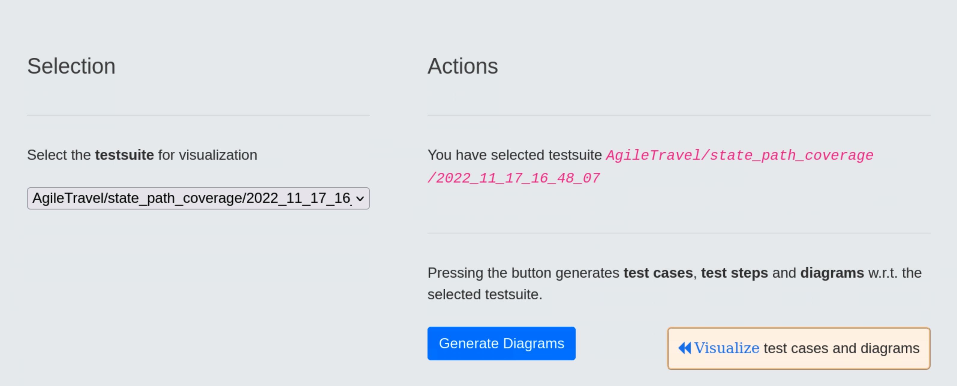
Step 8: show current values of the generation parameters and start the test suite generation
In the Generation Parameter area we can validate the selected parameter values for the test suite generation.
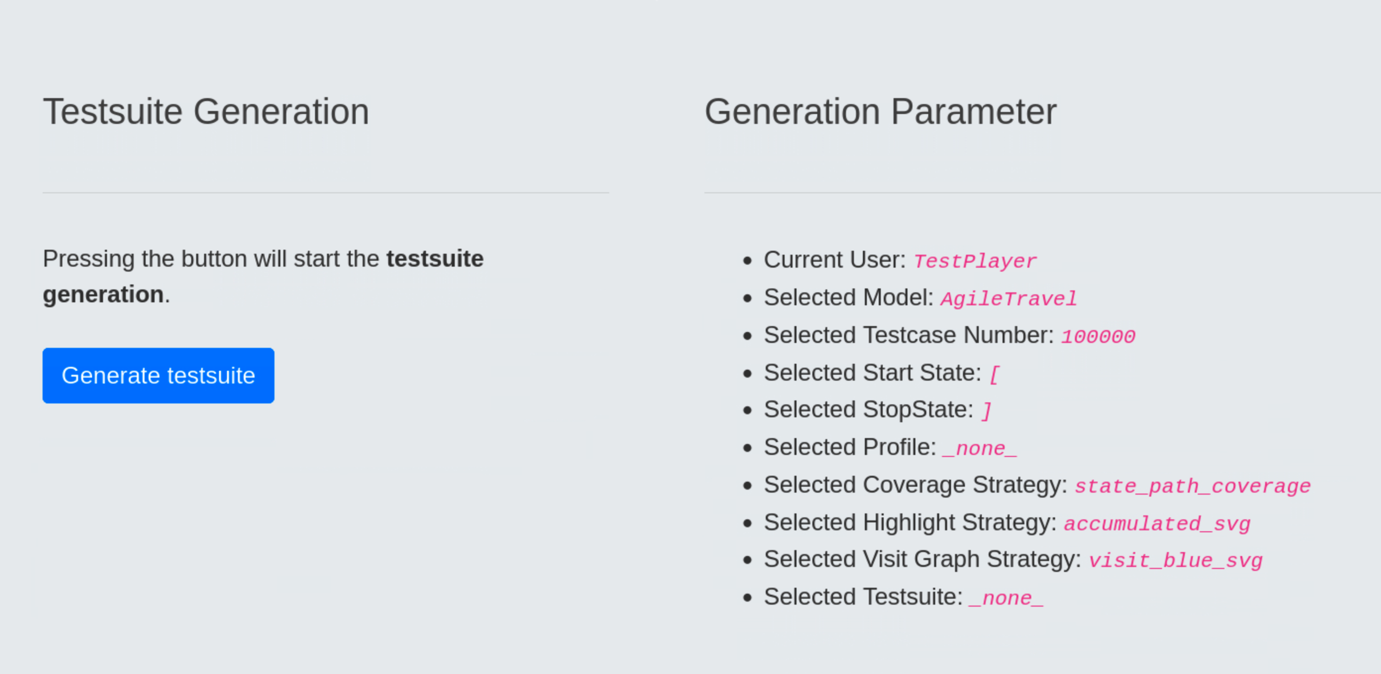
- Current User:
TestPlayer, this is the name of the current user who has logged in - Selected Model:
AgileTravel, this is the name of the selected usage model - Selected Testcase Number:
100000, this is the default value - Selected Start State:
[, this is the default value for the name of the start state in the usage model - Selected StopState:
], this is the default value for the name of the final state in the usage model - Selected Profile:
_none_, this means that we have choosen no usage profile (see below for more details) - Selected Coverage Strategy:
state_path_coverage, meaning that all states of the usage model will be visited at least once in the generated test suite and no test step appears twice in a test case - Selected Highlight Strategy:
accumulated_svg, this is the default value for the test suite visualisation, meaning that SVG diagrams of subsequent test cases will show the already covered states and edges in lighter green, - Selected Visit Graph Strategy:
visit_blue_svg, this is the default value for the visit graph visualization strategy, which produces an SVG diagram in which states and edges that are visited more often are displayed in a darker blue, - Selected Test Suite:
_none_, this means we will not use a previously generated test suite to generate additional visualization graphs
Clicking the blue Generate test suite button immediately starts the generation of the test suite generation.
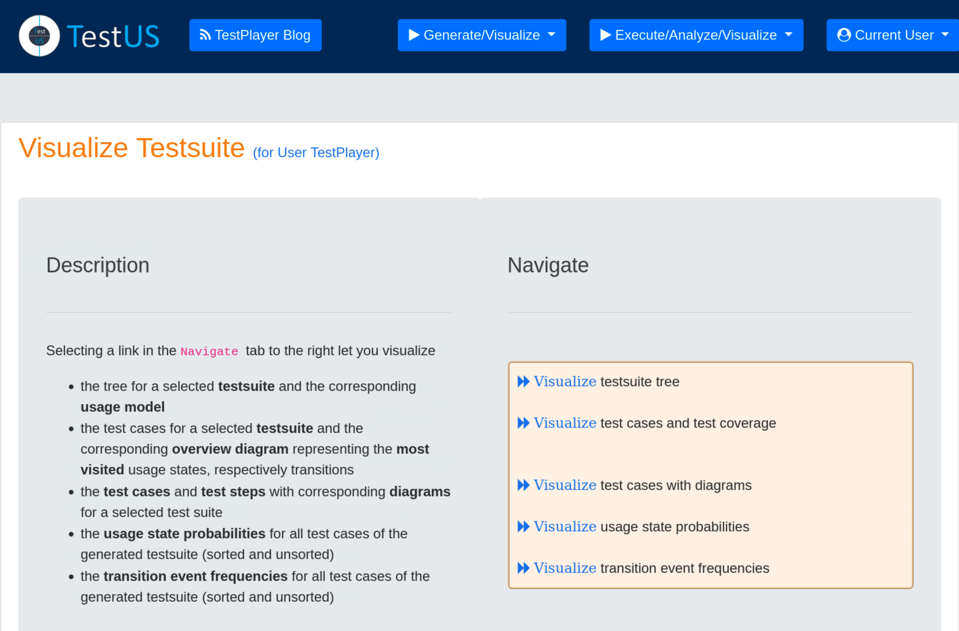
Visualization of Test Suites
Once the new test suite has been created, the test engineer can select the Visualise Test Suite tab and examine various TestPlayer© graphs to gain further insight into various properties of the test suite.
Visualization of test cases and the resulting test coverage
All test cases of the selected test suite and the corresponding overview diagram representing the frequency of visited usage states or transitions are visualized.
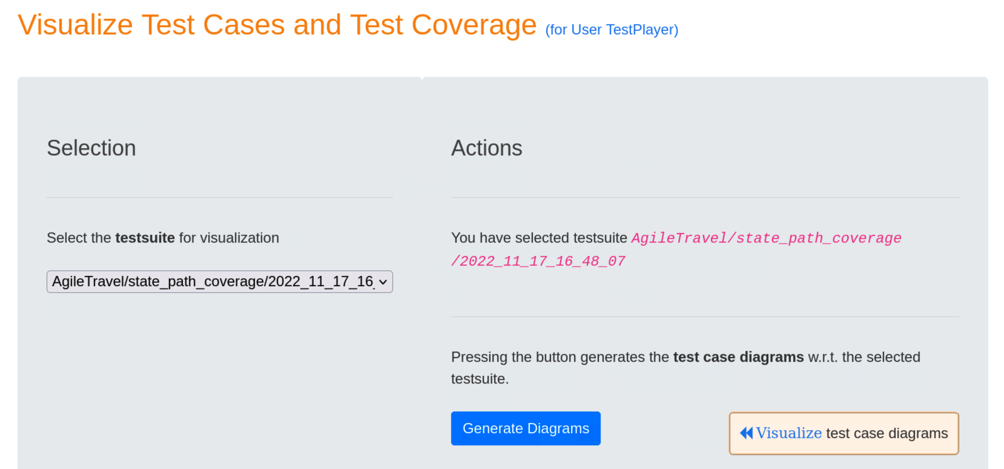
When the user presses the blue Generate Diagrams button, TestPlayer generates a series of diagrams that are displayed when the « Visualize test case diagrams link is selected.
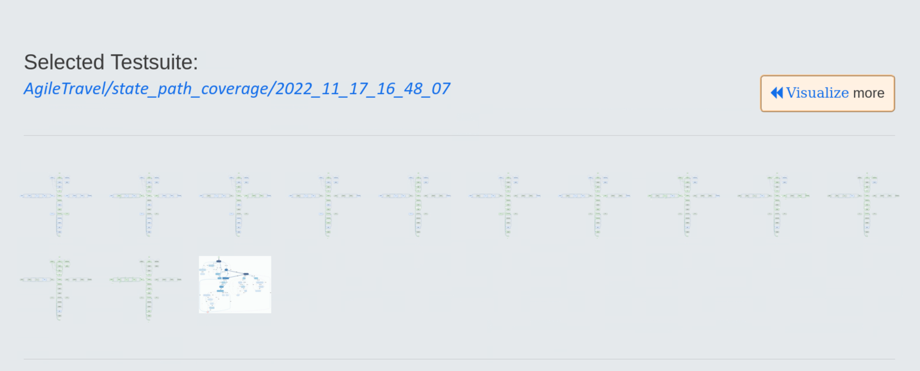
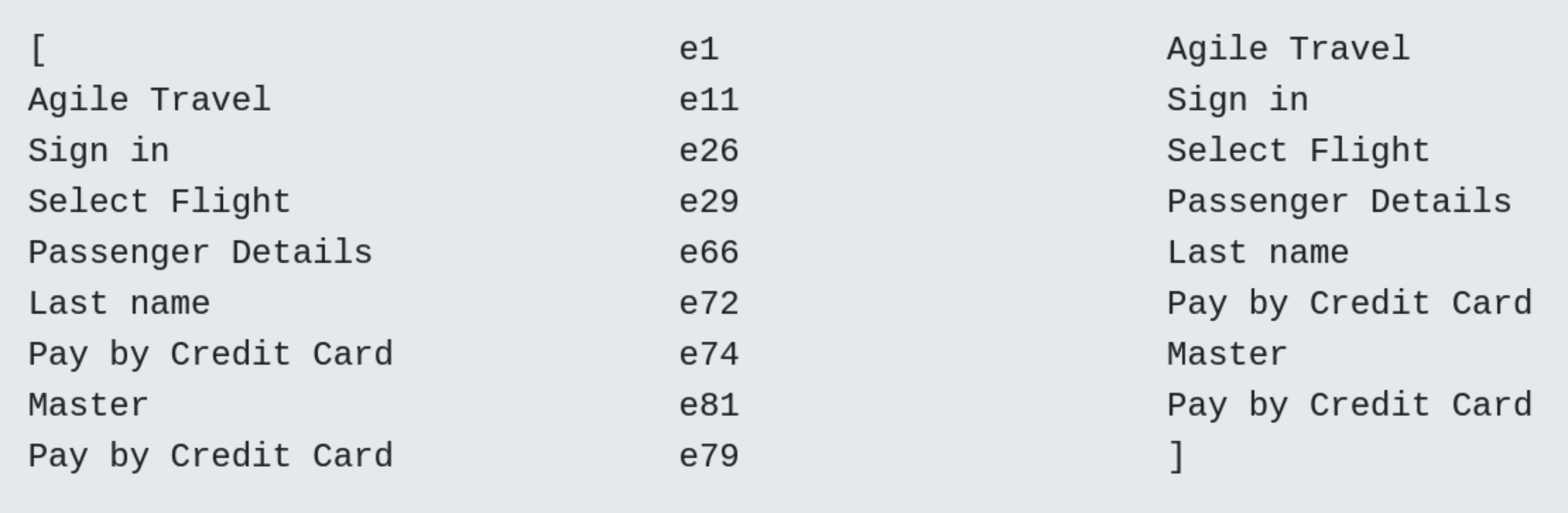
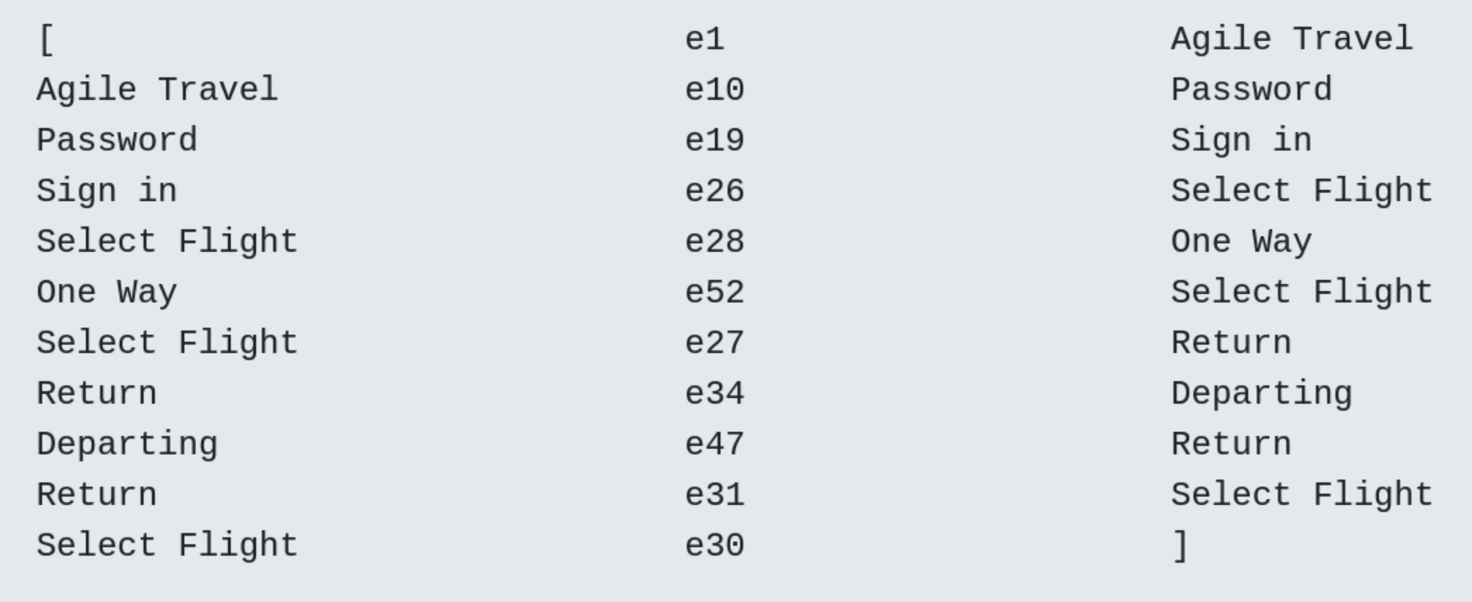
In a test case diagram, an edge (ei:n) means that event ei is triggered n times during the execution of the test case. A dark green edge is included in the current test case, a light green edge in the accumulated highlighting strategy indicates that the edge was already included in a previous test case. Blue edges indicate that the edge is not yet included in a test case.
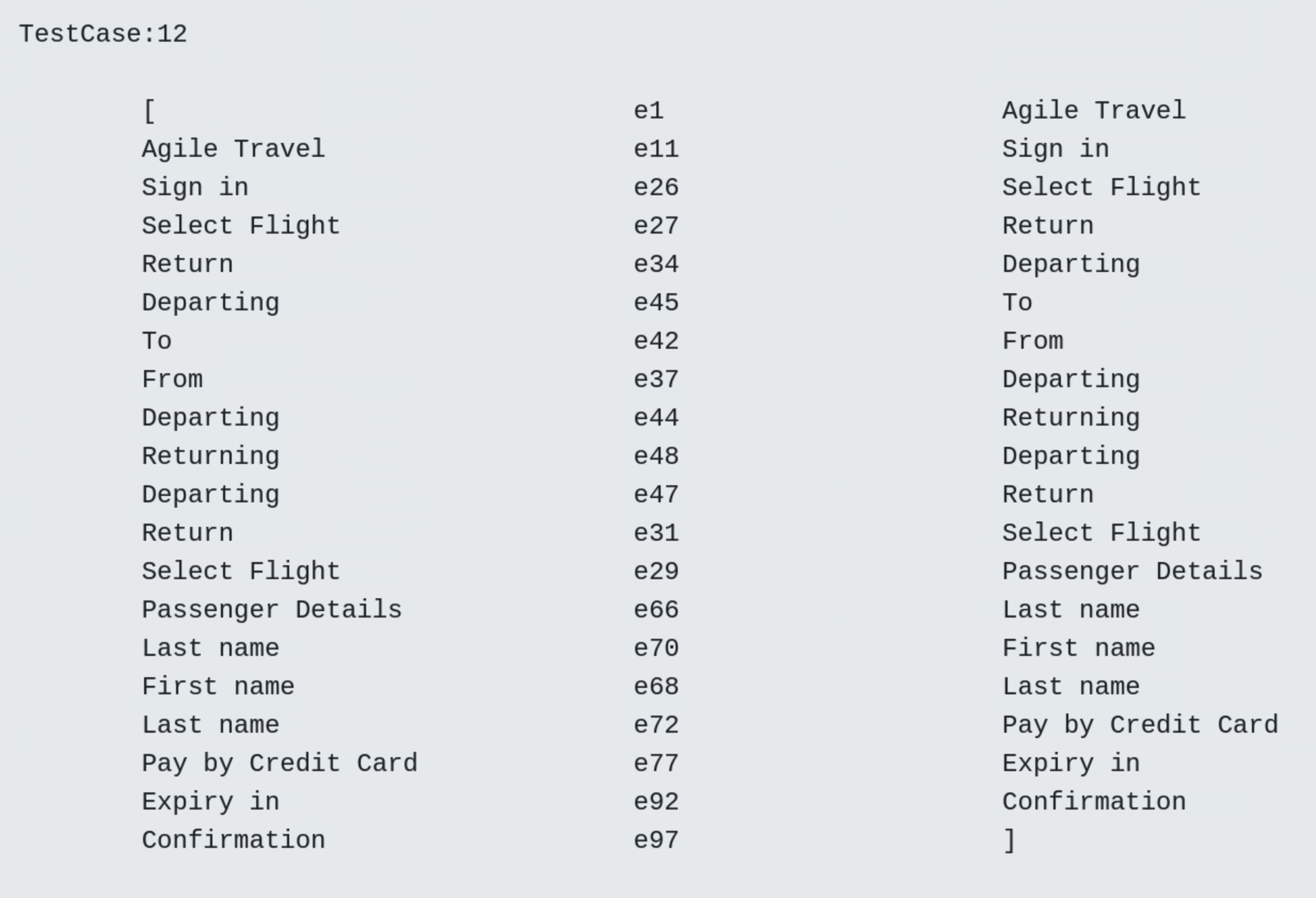
The first two test cases and the last test, number 12, are shown below. As can be seen at the end, all usage states are covered and visited once. However, there are still blue edges in the last test case, indicating that not all edges are visited during the test.
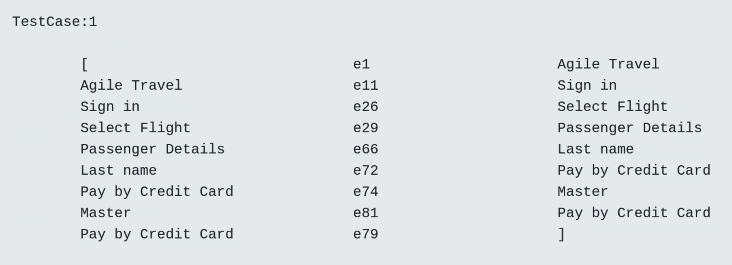
- Test Case 1

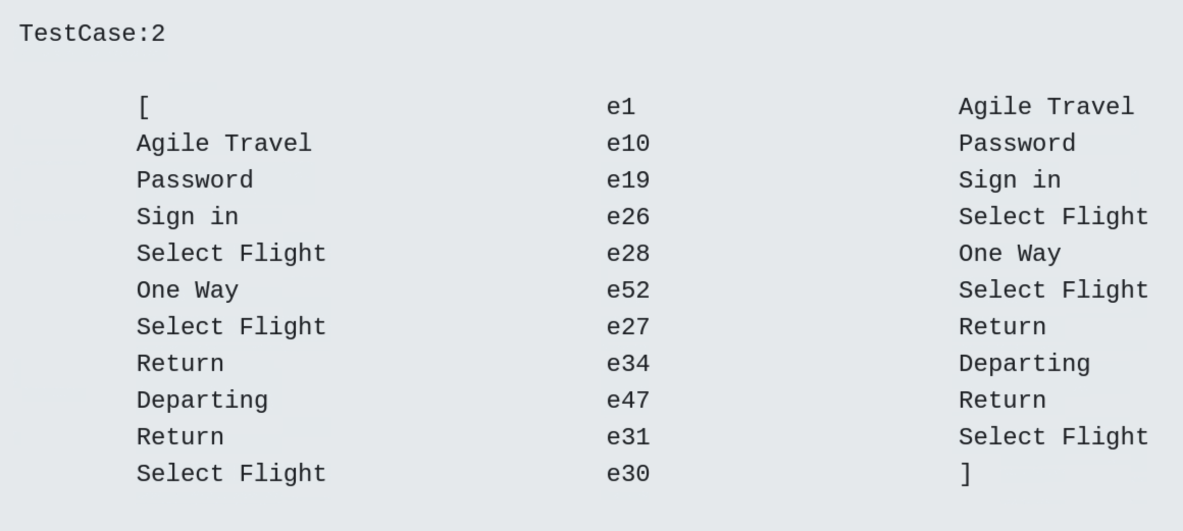
- Test Case 2

- Test Case 12

- Frequency diagram
In a frequency plot, the darkness of the blue colour indicates the frequency of a visited state or transition, i.e. the darker the colour, the more visits. The light grey colour indicates that the transition is not visited during the test.

Visualization of test cases with corresponding diagrams
For a selected test suite, all test cases and test steps are visualized with corresponding diagrams.
- Test Case 1
- Test Case 2
- Test Case 12
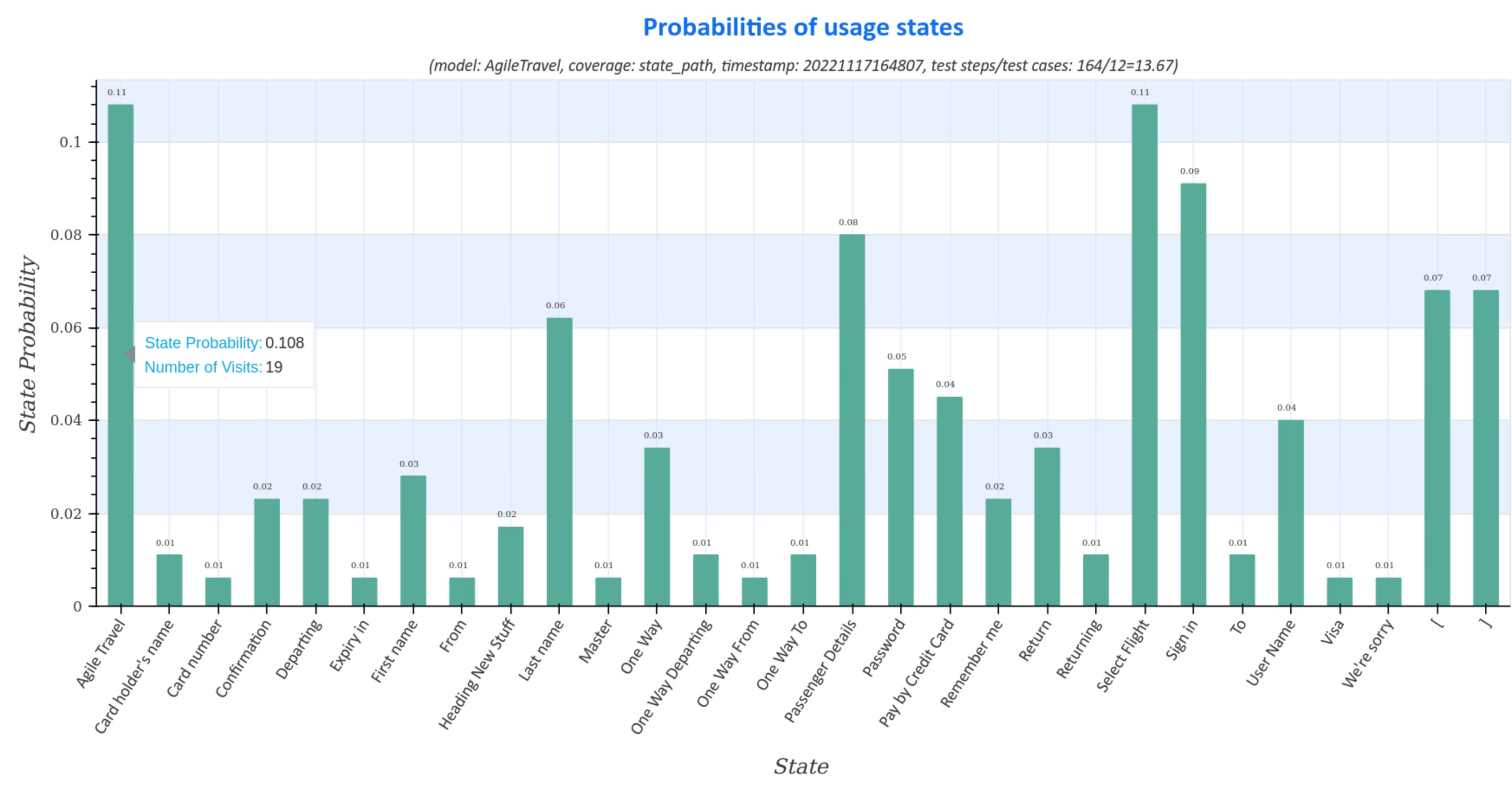
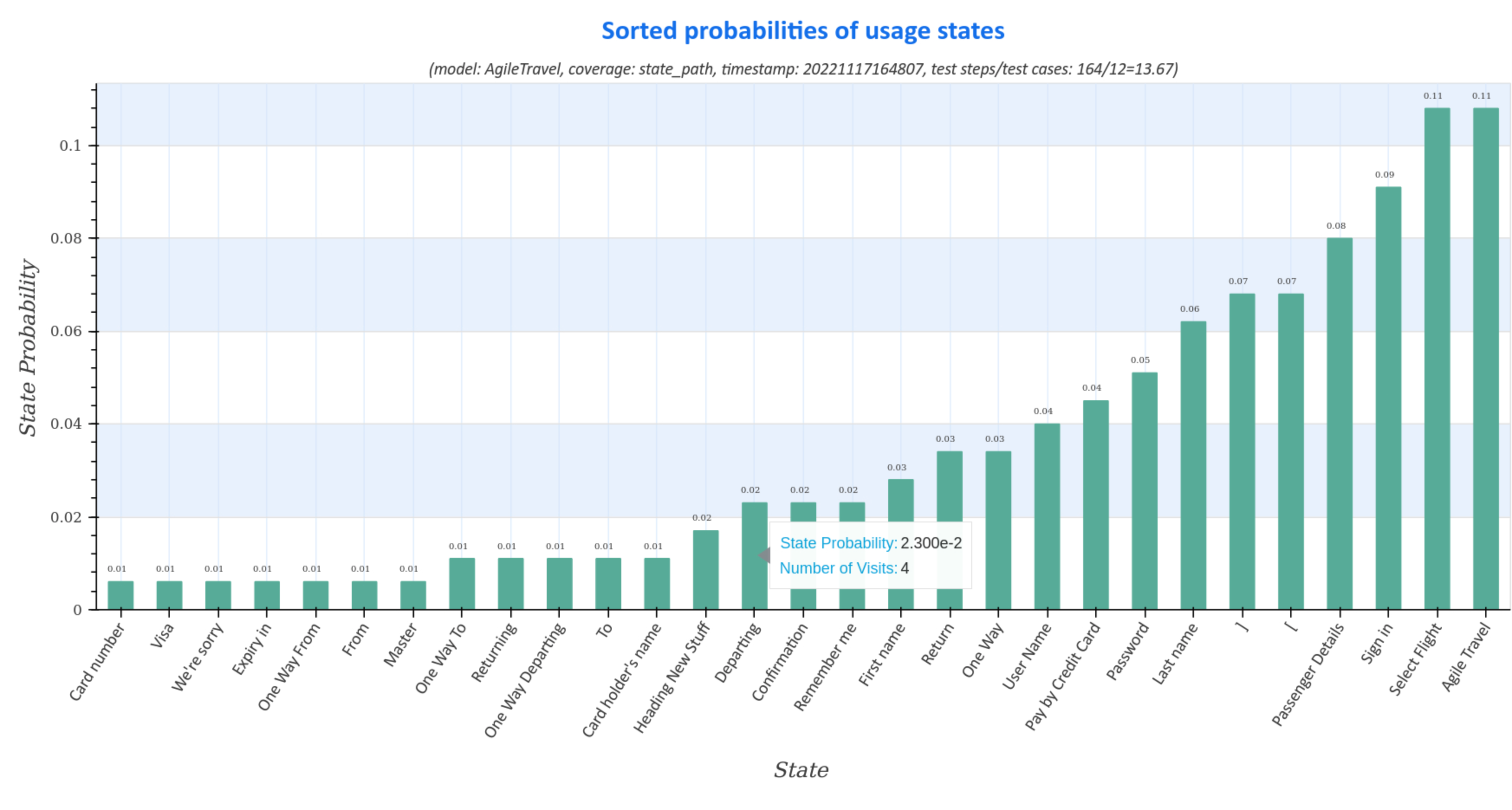
Visualization of usage state probabilities
Usage state probability diagrams of the generated test suite represent the distribution (sorted and unsorted) of usage states for all test cases.
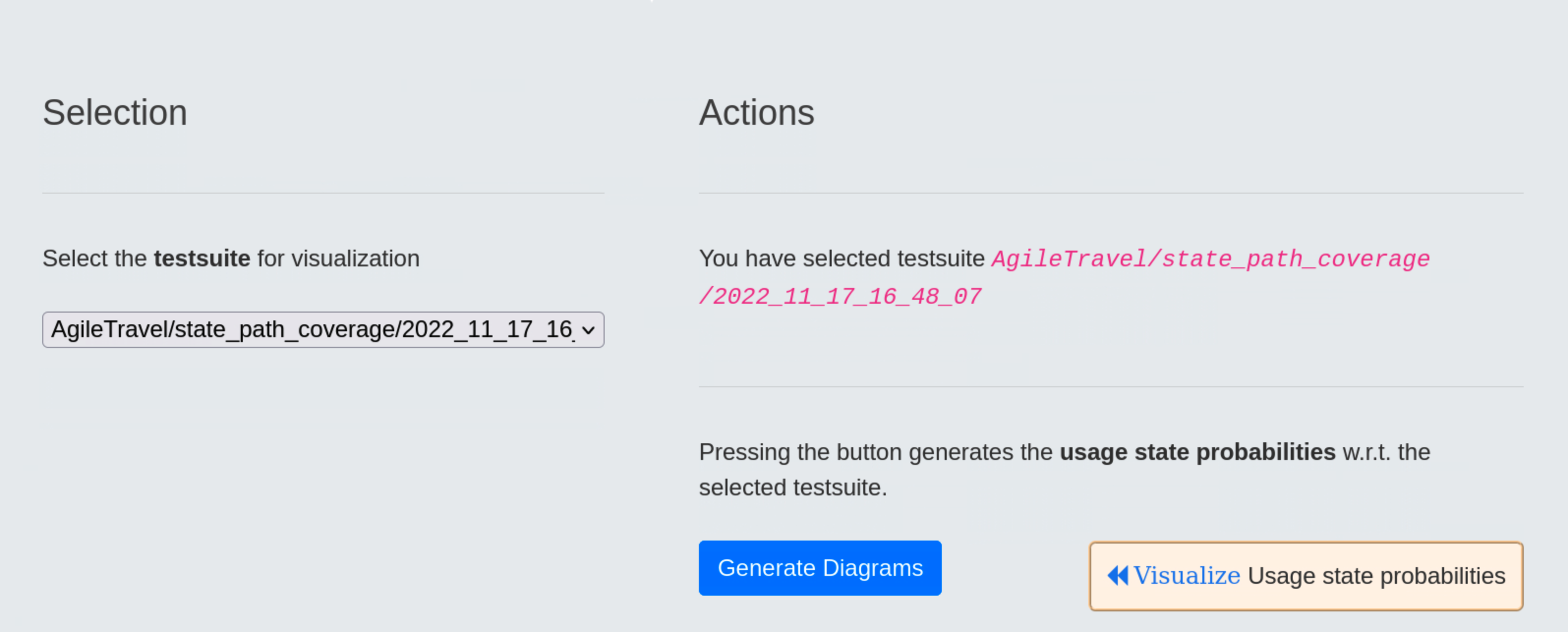
The diagrams contain information about
- model: name of the usage model
- coverage: strategy for generating the test suite
- timestamp: time, when the test suite was generated in the form
<yyyymmddhhmmss>fory:year,m:month,d:day,h:hour,m:minuteands:second - ratio of test step to test cases:
number of test steps / number of test cases. Large numbers represent test cases with a large number of test steps, which may indicate a longer execution time of the test suite during the test.
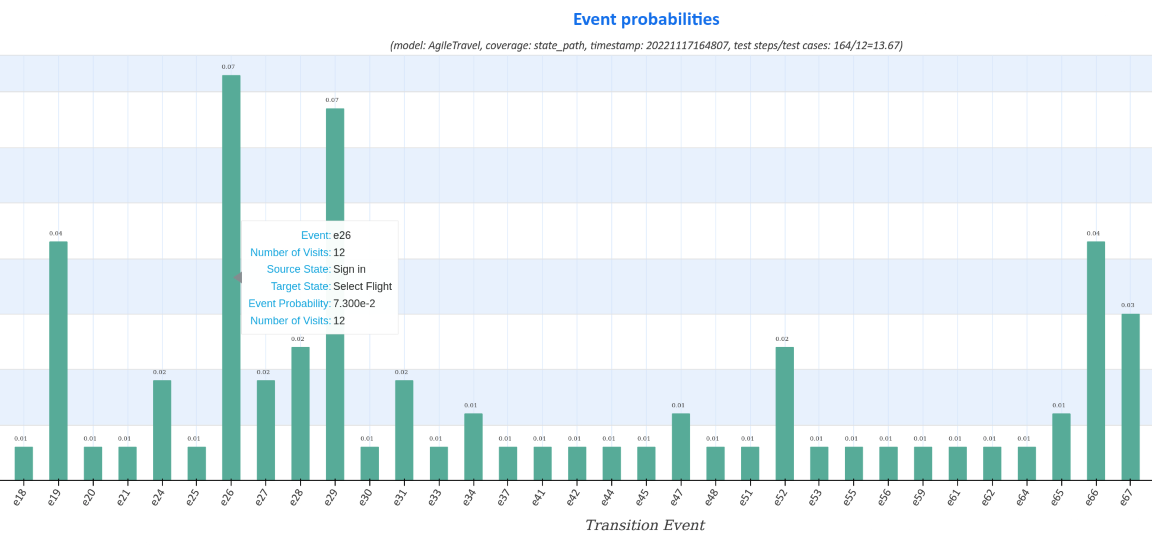
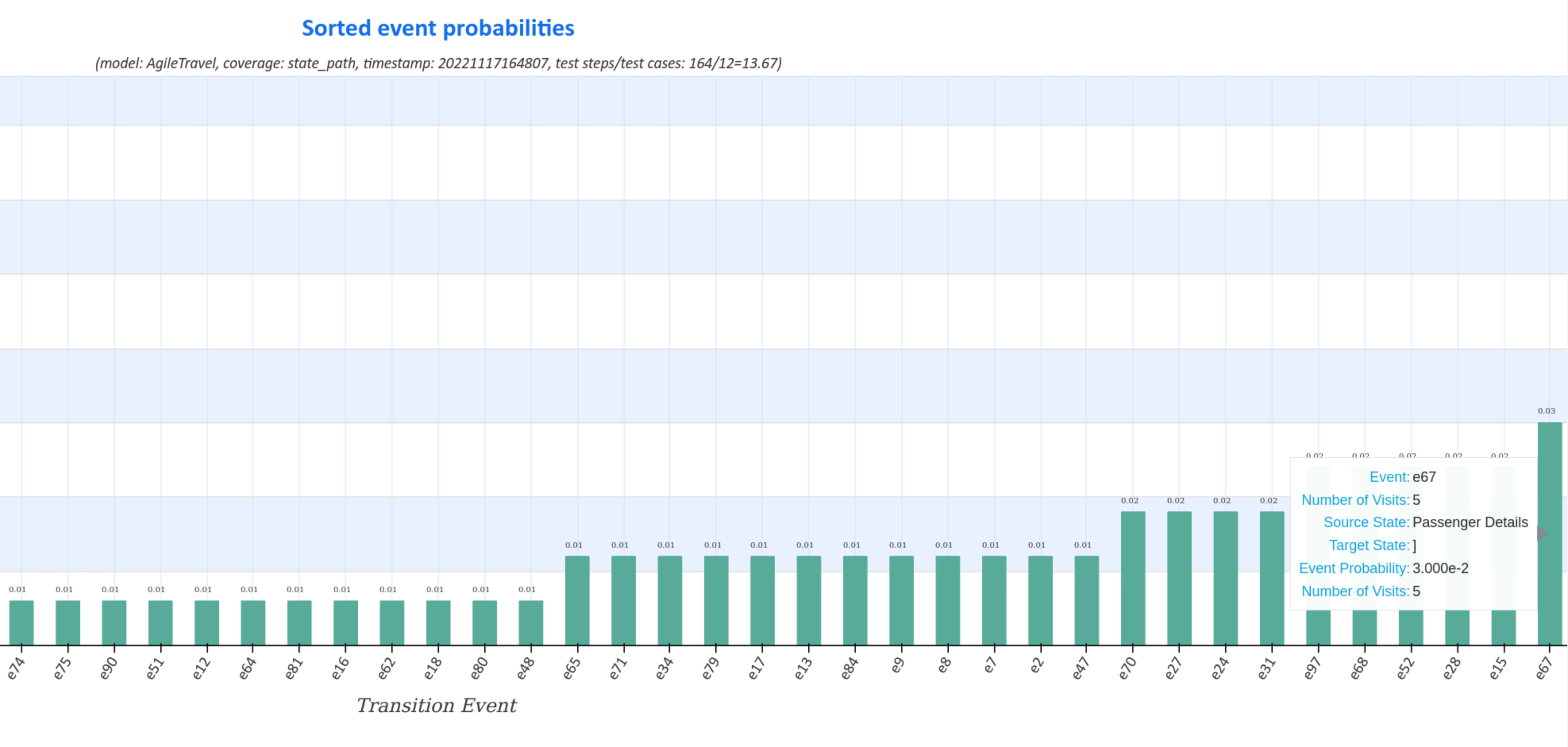
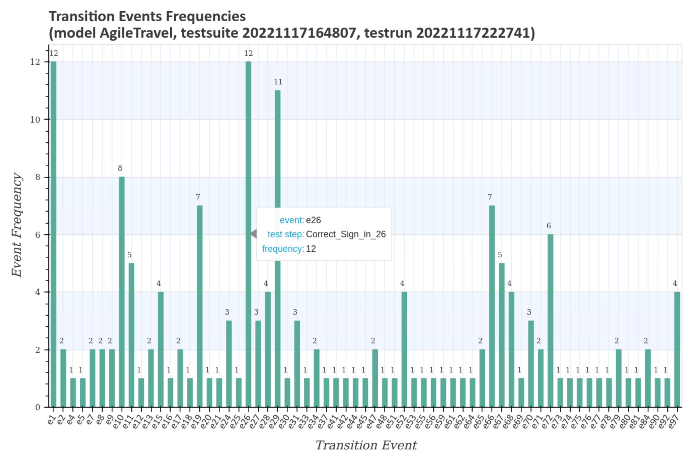
Visualization of transition event frequencies
Transition event frequency diagrams of the generated test suite represent the distribution (sorted and unsorted) of state transitions and the corresponding transition events for all test cases.
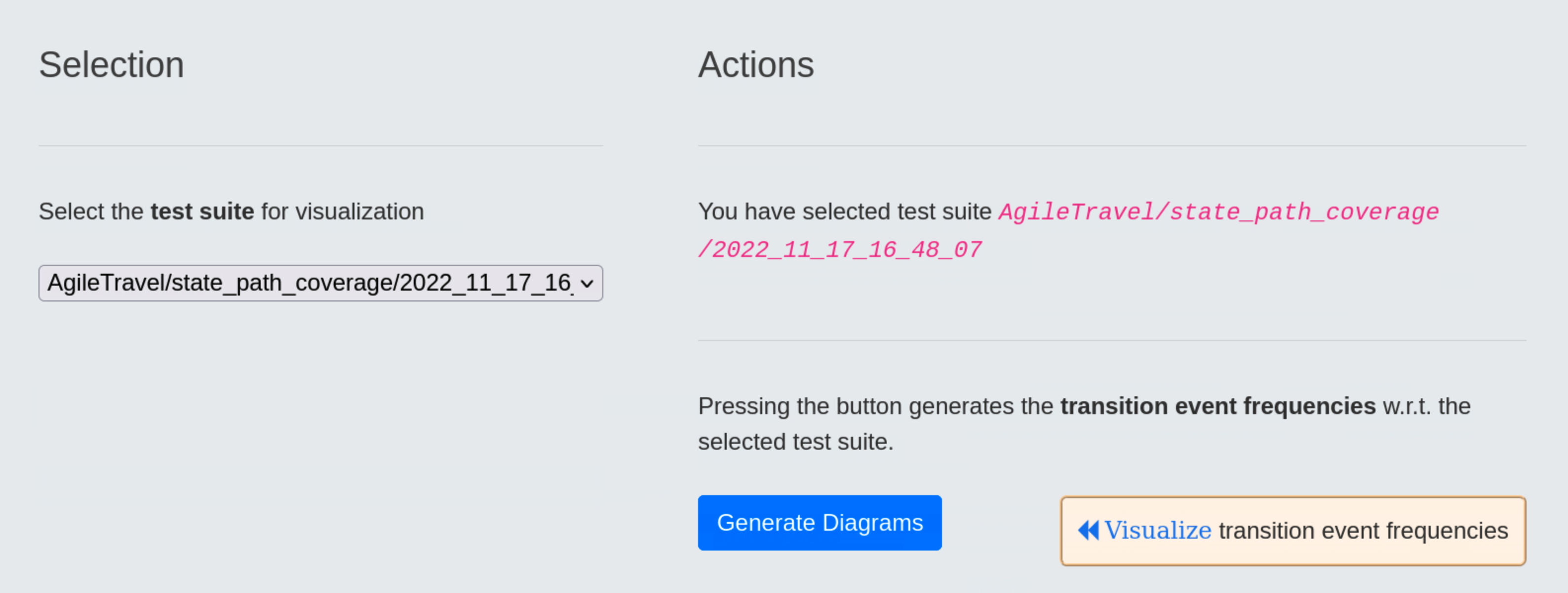
Moving the cursor over the graphs displays additional data, such as the actual number of visits during the test, the transition event and the source, respectively target usage states.
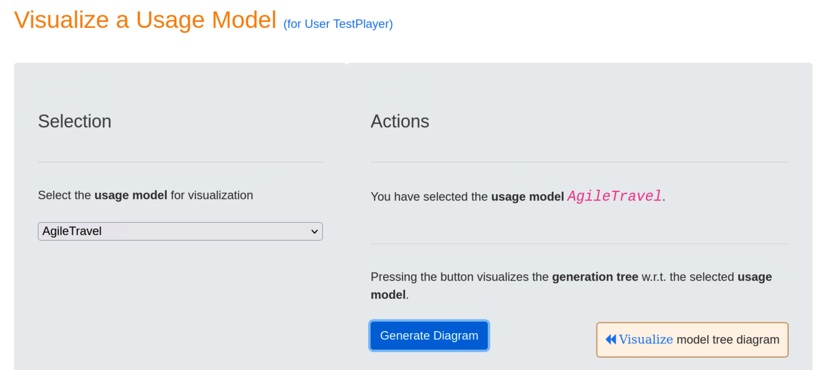
Visualization of Usage Models
Visualization of the generation tree
After selecting usage model AgileTravel and pressing the blue Generate Diagram button, the test suite tree for the selected usage model is visualized when the blue Visualize model tree diagramm link is clicked.
The diagram shows the following information:
-
Edge label
EXTENDindicates that two usage profiles, i.e.ReturnMasterandOneWayVisa, are available to focus the test suite generation on specific areas of the usage model, and -
Coverage strategy
statewas used to generate thetest suite.2022_12_20_18_37_19.

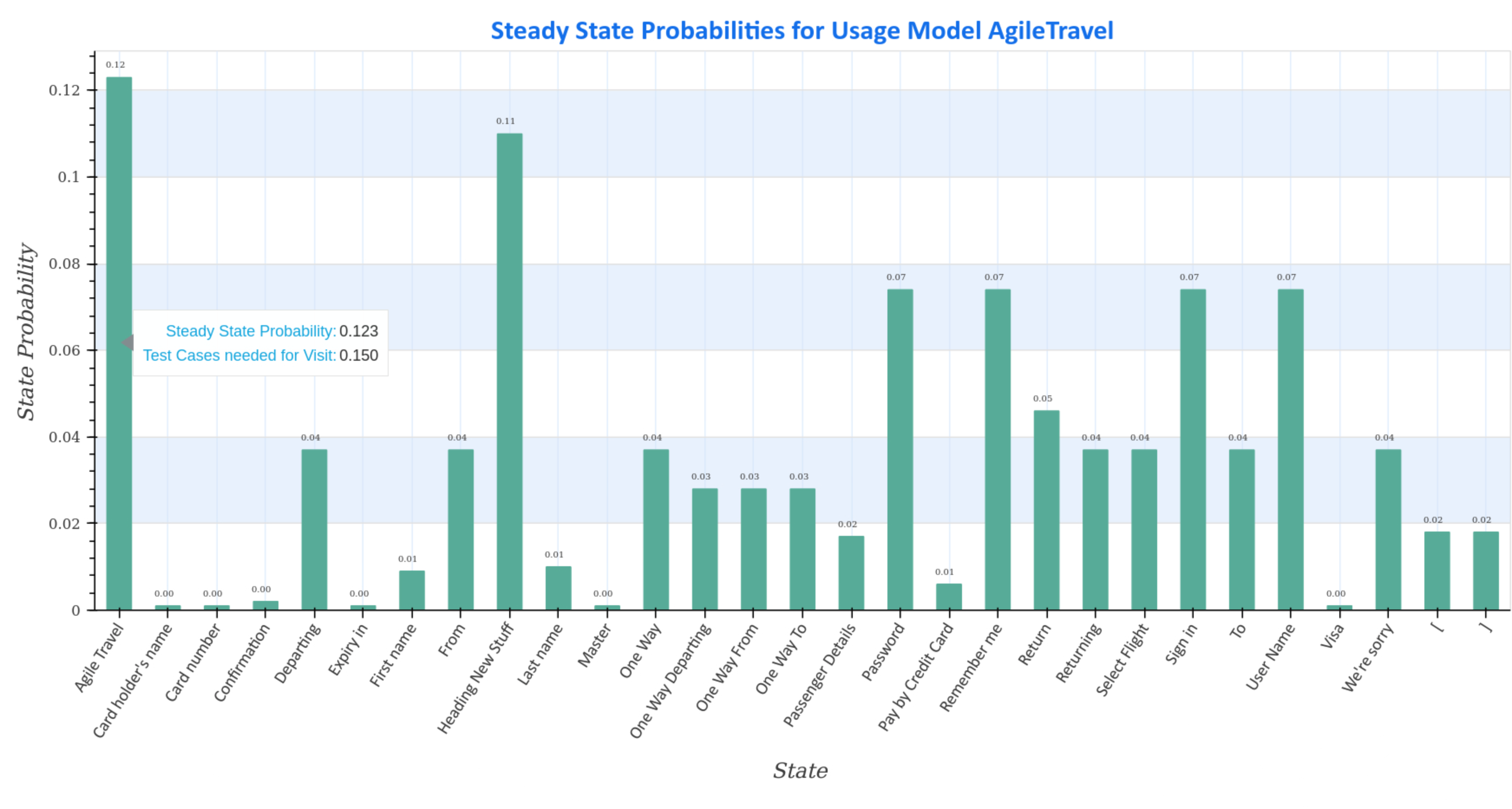
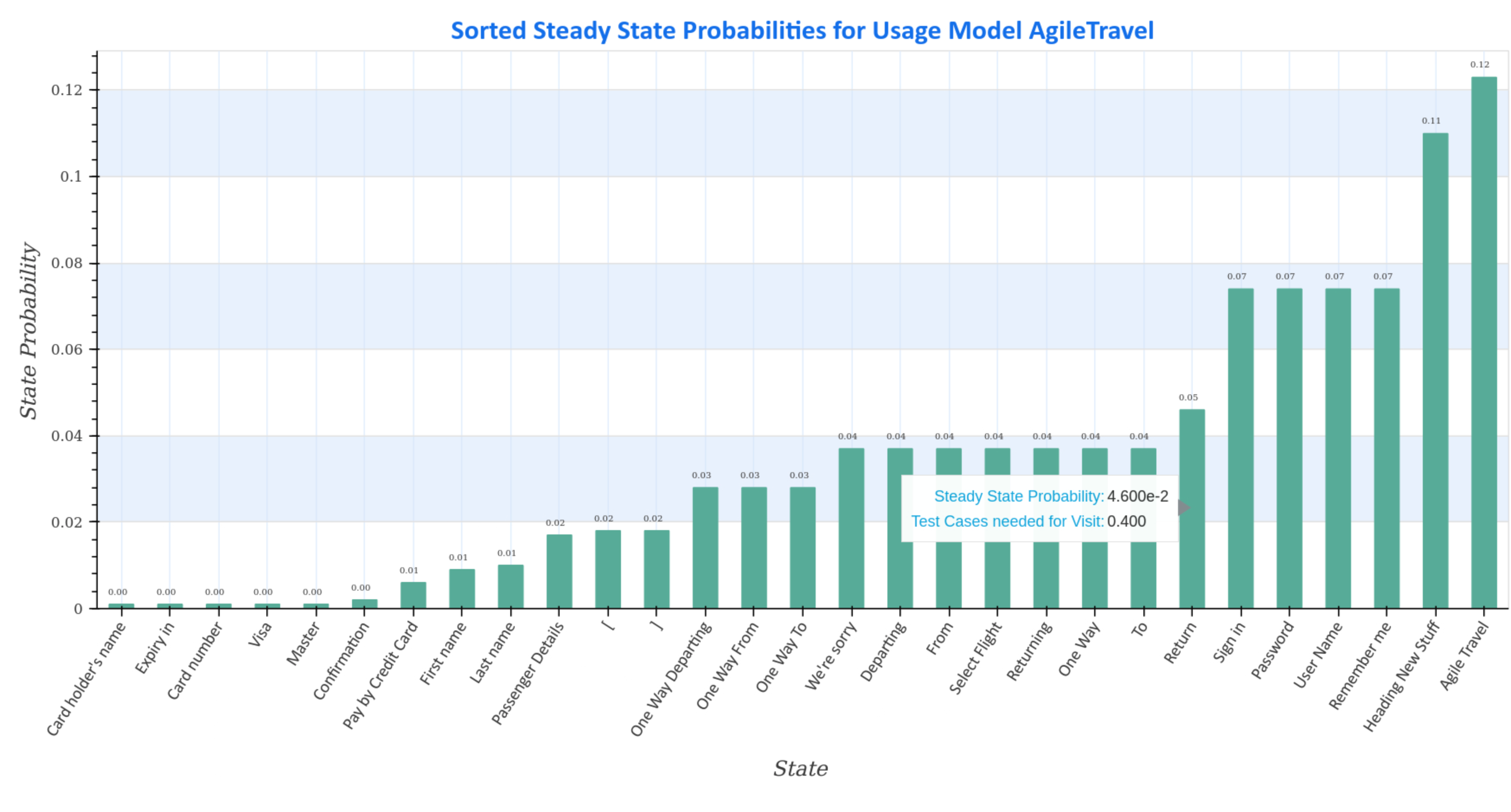
Visualization of steady state probabilities
Steady-state probability plots of the selected usage model AgileTravel show the steady-state distribution (sorted and unsorted) of the Markov chain.
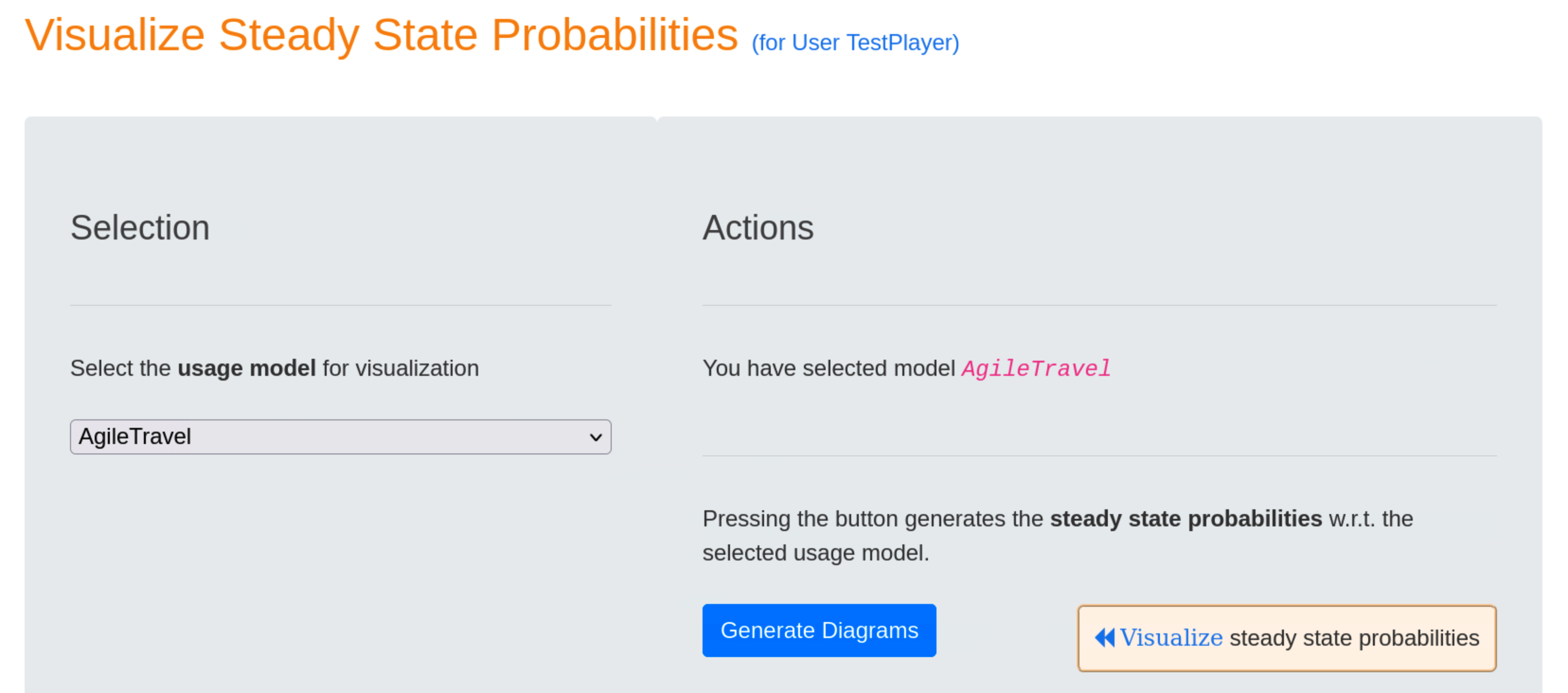
Additional data, such as the average number of test cases required to visit the state during a test, can be viewed by hovering over the graphs.
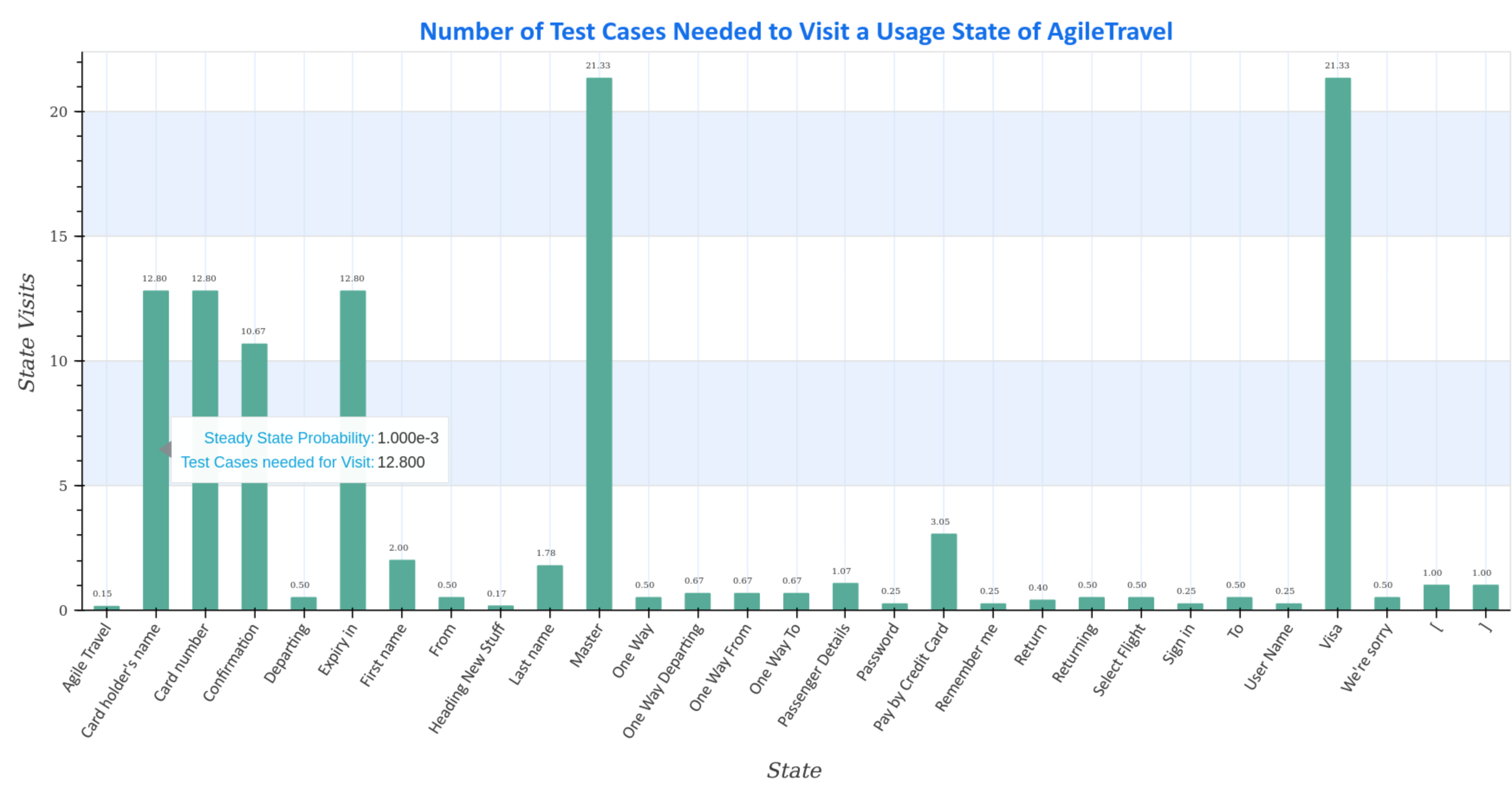
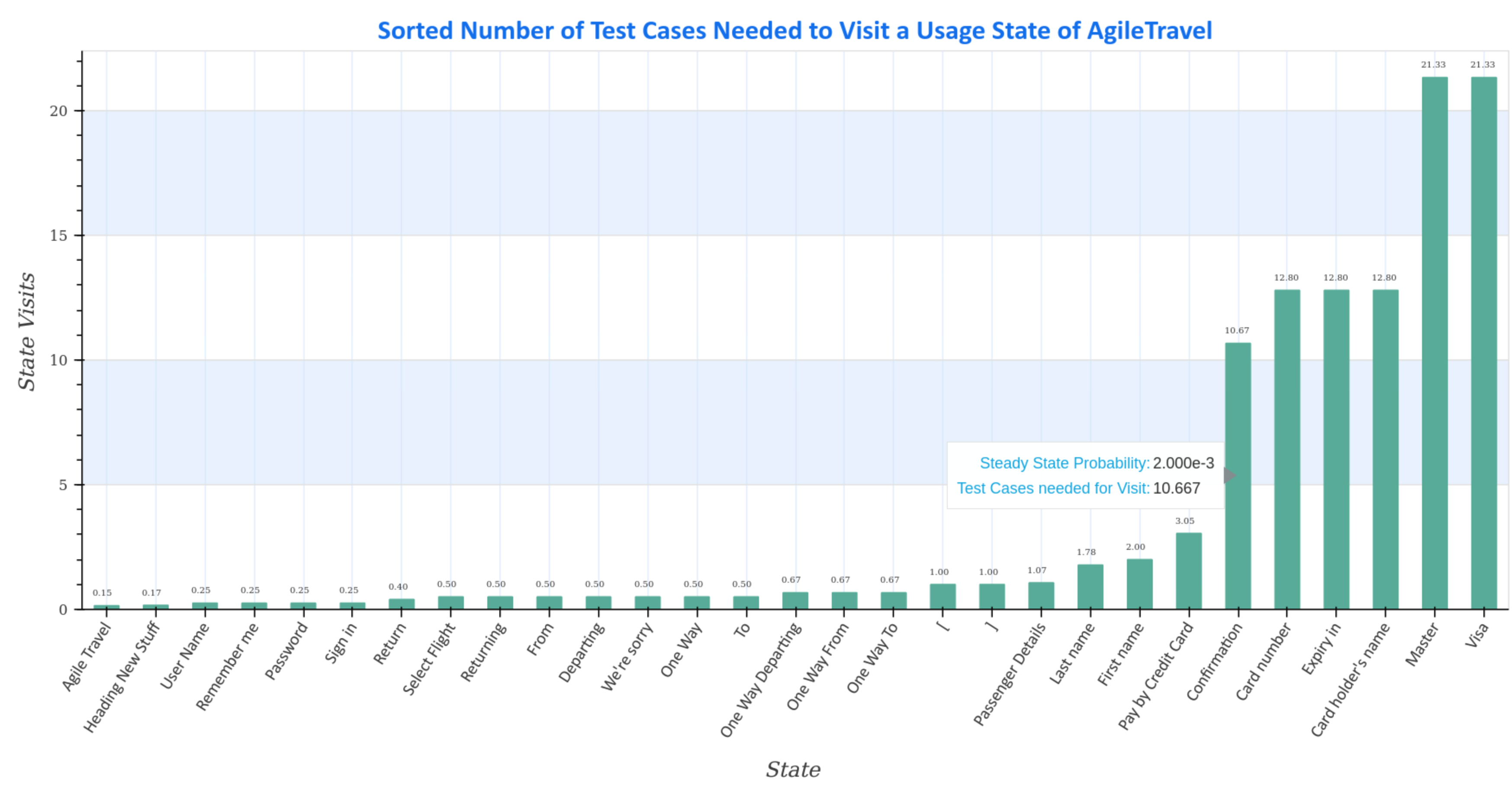
Visualization of steady state visits
Steady-state visit diagrams (sorted and unsorted) represent how many test cases are required to visit a usage state at least once for the given Markov chain usage model AgileTravel.
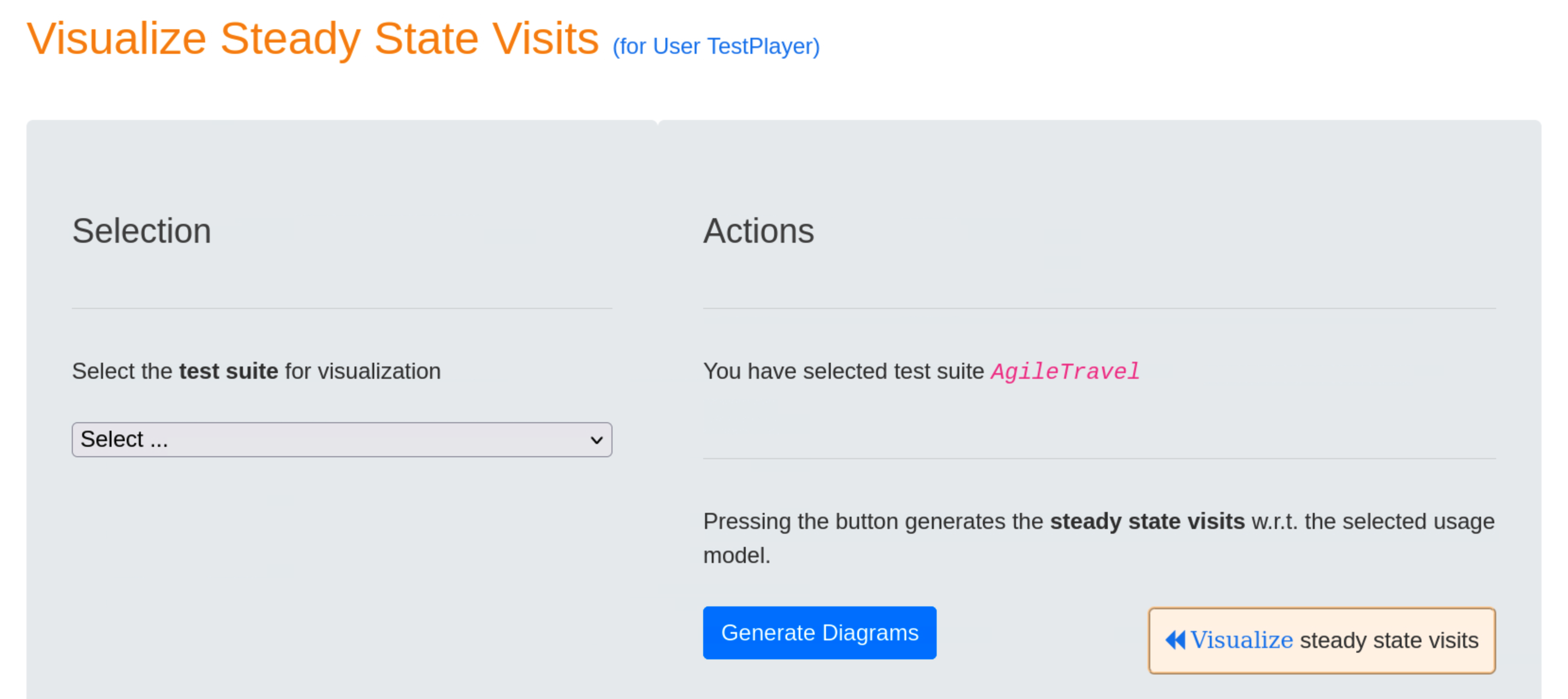
Hovering the mouse pointer over the charts displays additional data, such as the average number of test cases required to visit the state during a test.
Execute, Analyze and Visualize Tests
After the automatic generation of a test suite, the TestPlayer© Extension offers the tester the possibility to execute, analyze and visualize executable test cases. Furthermore, detailed test reports can be displayed.
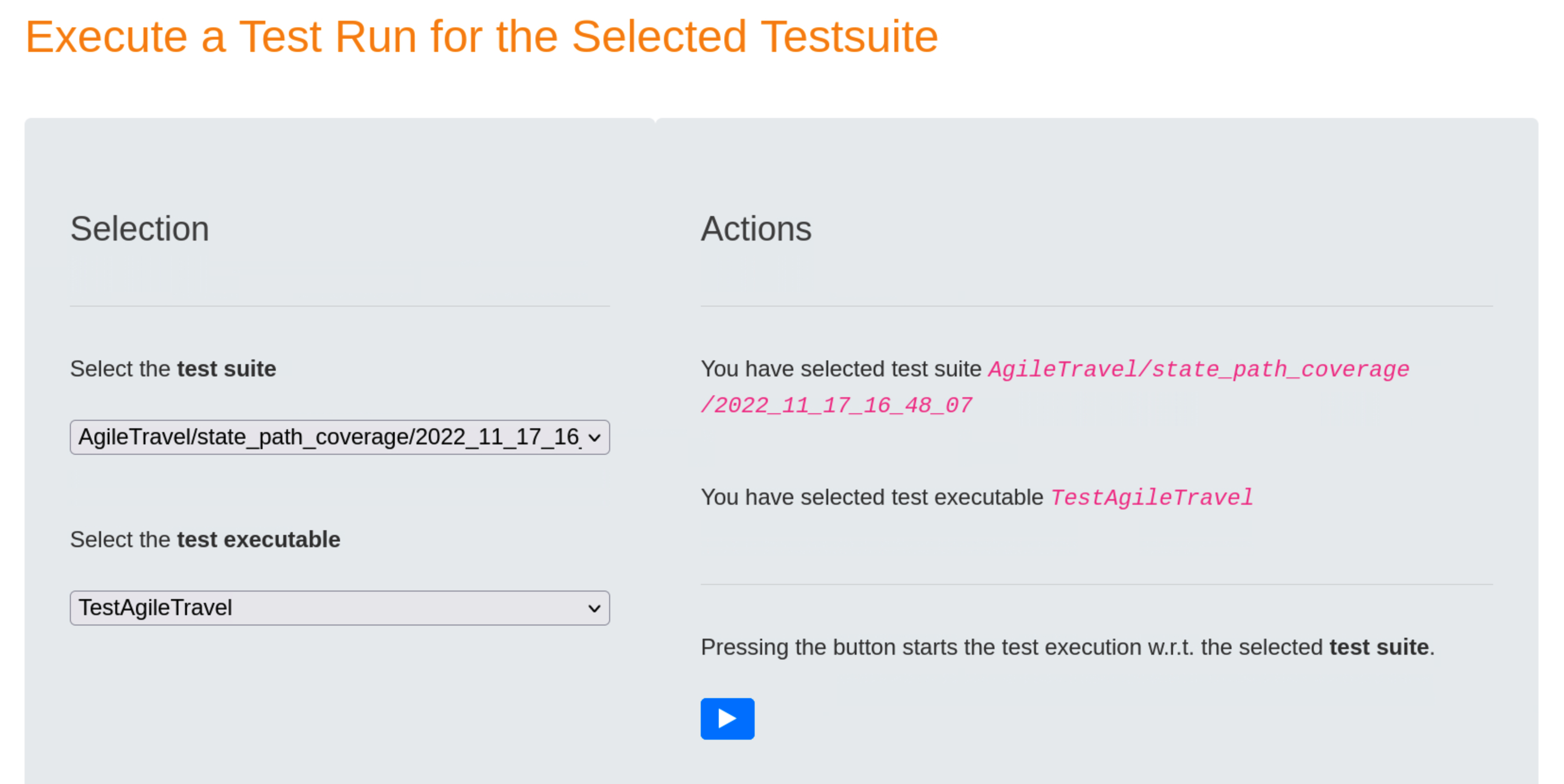
Execute Test Run
Once the specific test suite and a suited test executable have been selected, the TestPlayer© Extension starts a robot browser (Firefox, Google, etc.) and executes the test suite automatically when the user presses the blue ⏵ button.
Analyze Test Run
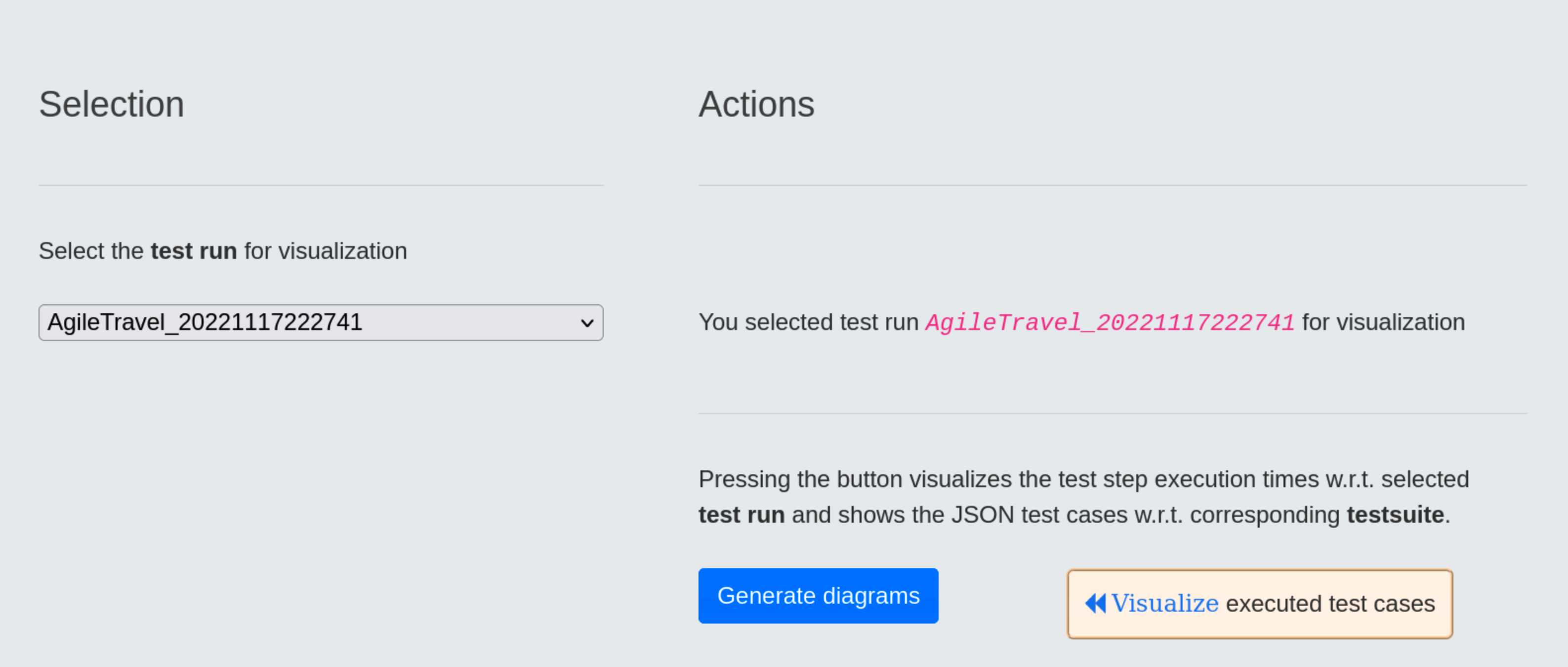
When the test run is completed, it receives a timestamp, in our case 20221117222741, which the test engineer must use to start the test run analysis.
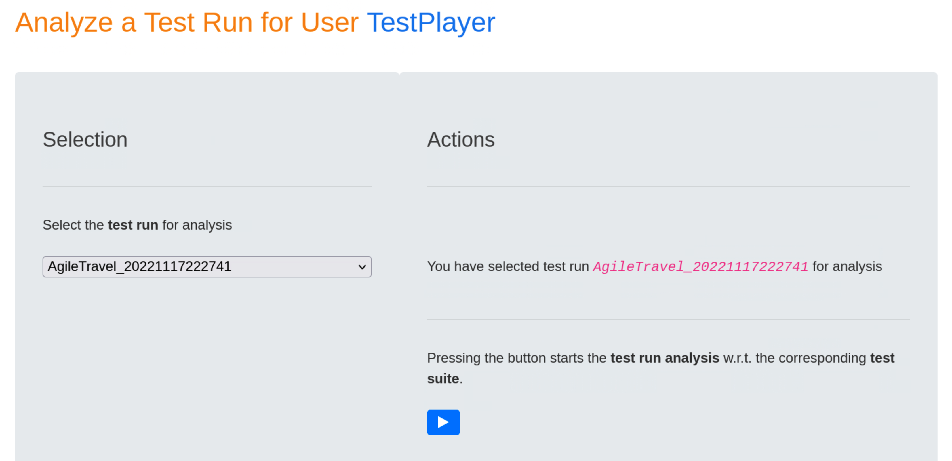
Pressing the blue ⏵ button starts the test run analysis in relation to the corresponding test suite. The result is a series of diagrams used to visualize various aspects of selected test run.
Visualize Test Run
Upon completion of the test run analysis, the TestPlayer© Extension provides various diagrams and test reports. The tester is able to evaluate characteristic properties and the quality of the SUT by evaluating
- test step execution times of individual test cases in relation to the selected test run and the associated test suite
- frequencies of test steps with respect to the selected test run and frequencies of transition events for the corresponding test suite
- various metrics of test step execution times with respect to the selected test run, e.g. minimum, average and maximum values of execution times.
Visualize test step execution times
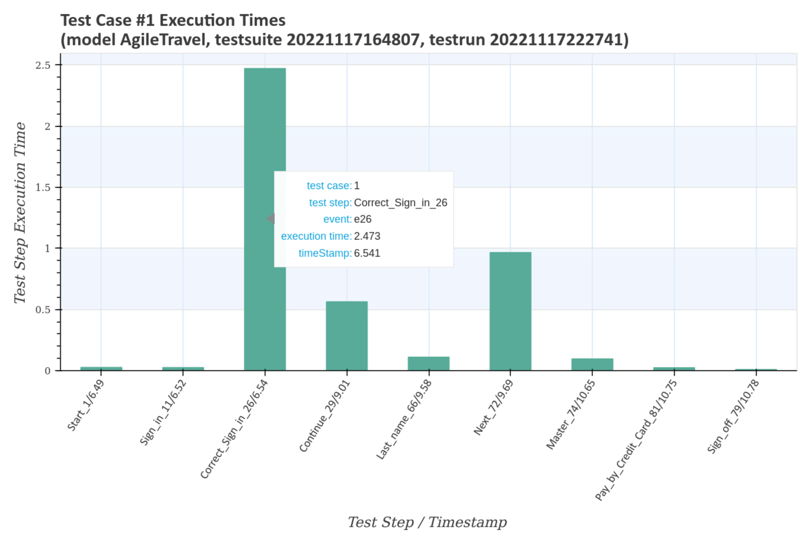
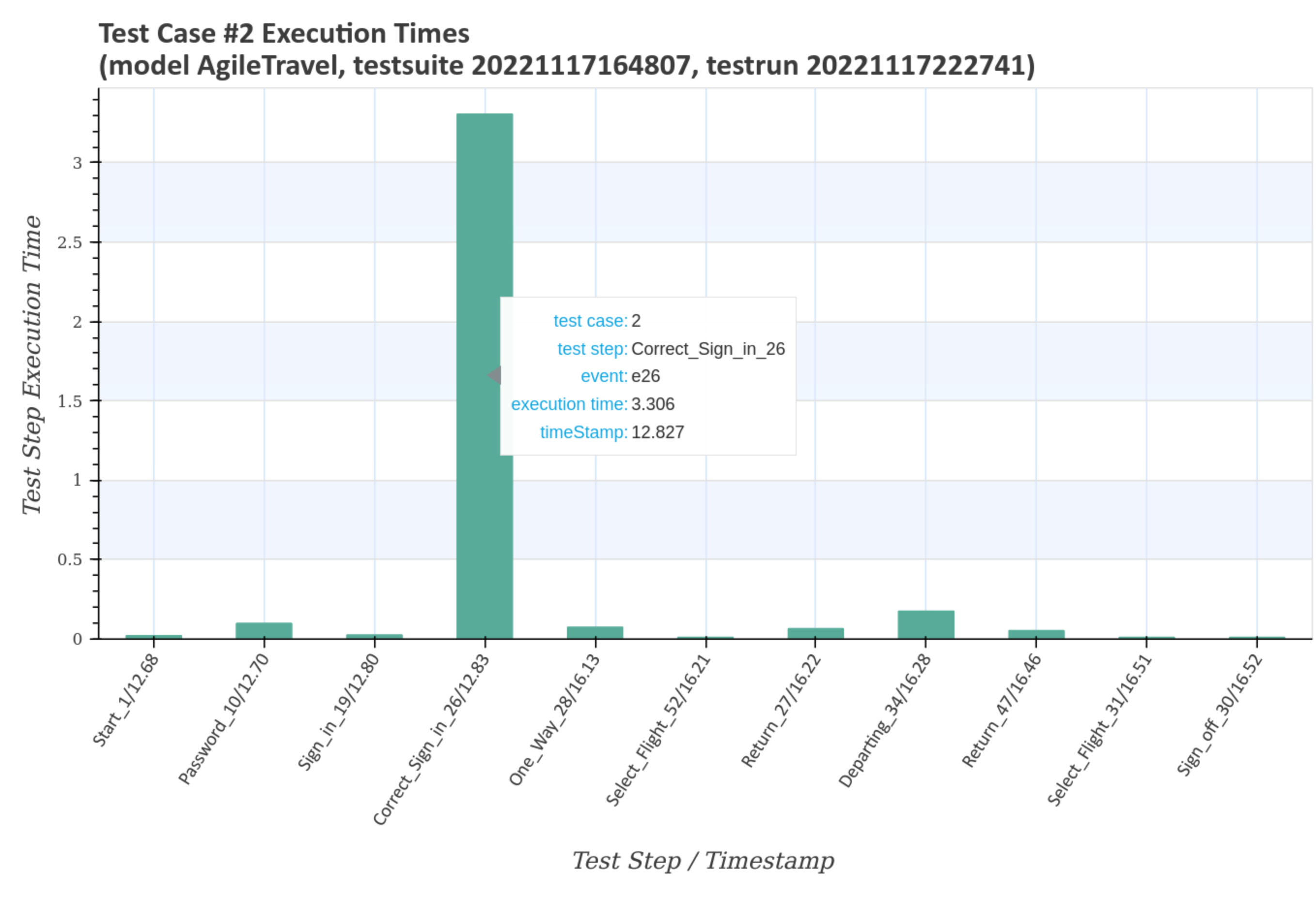
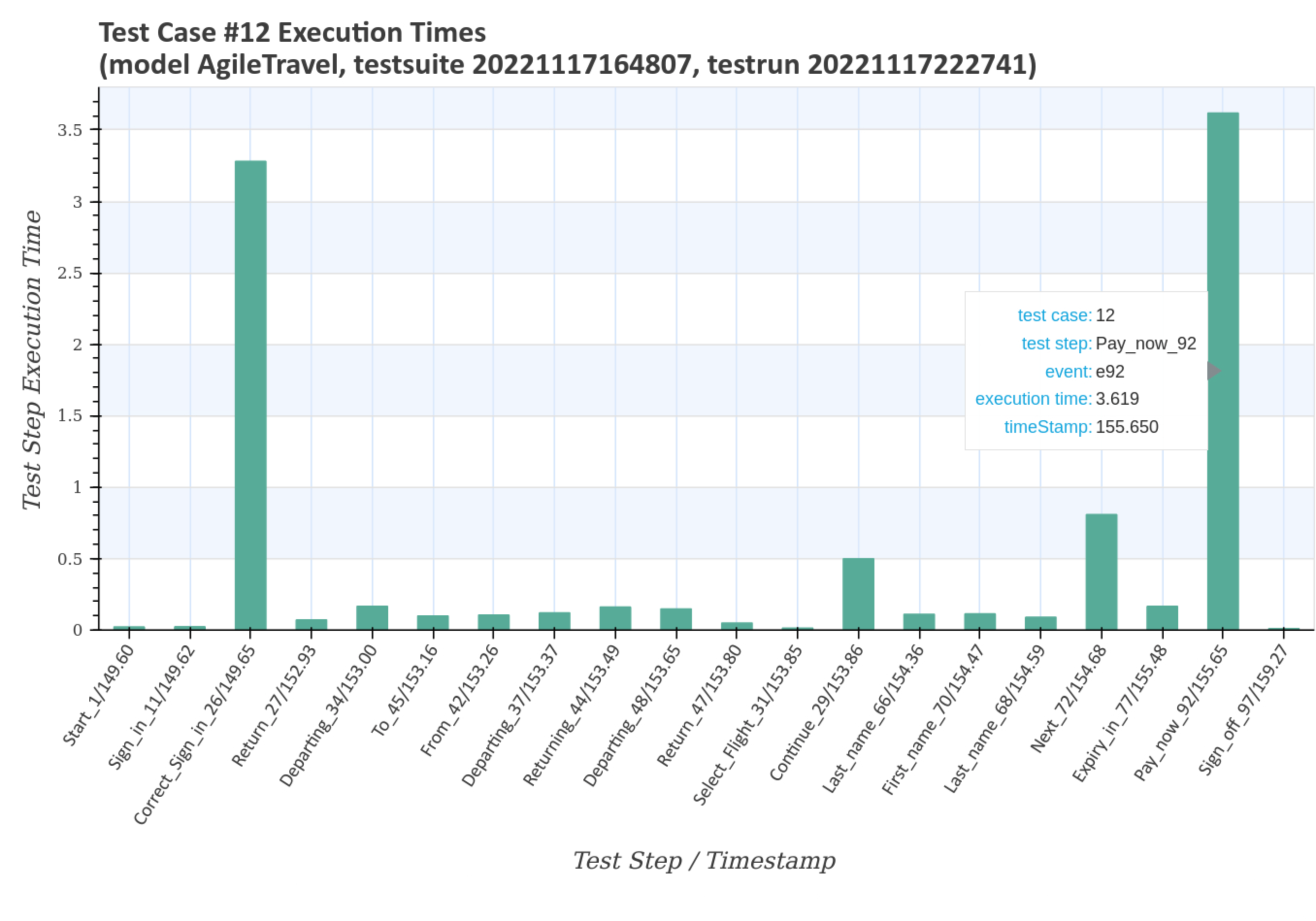
Test step execution times of individual test cases in relation to the selected test run and the associated test suite are visualized after pressing the blue Generate diagrams button and the Visualize executed test cases link.
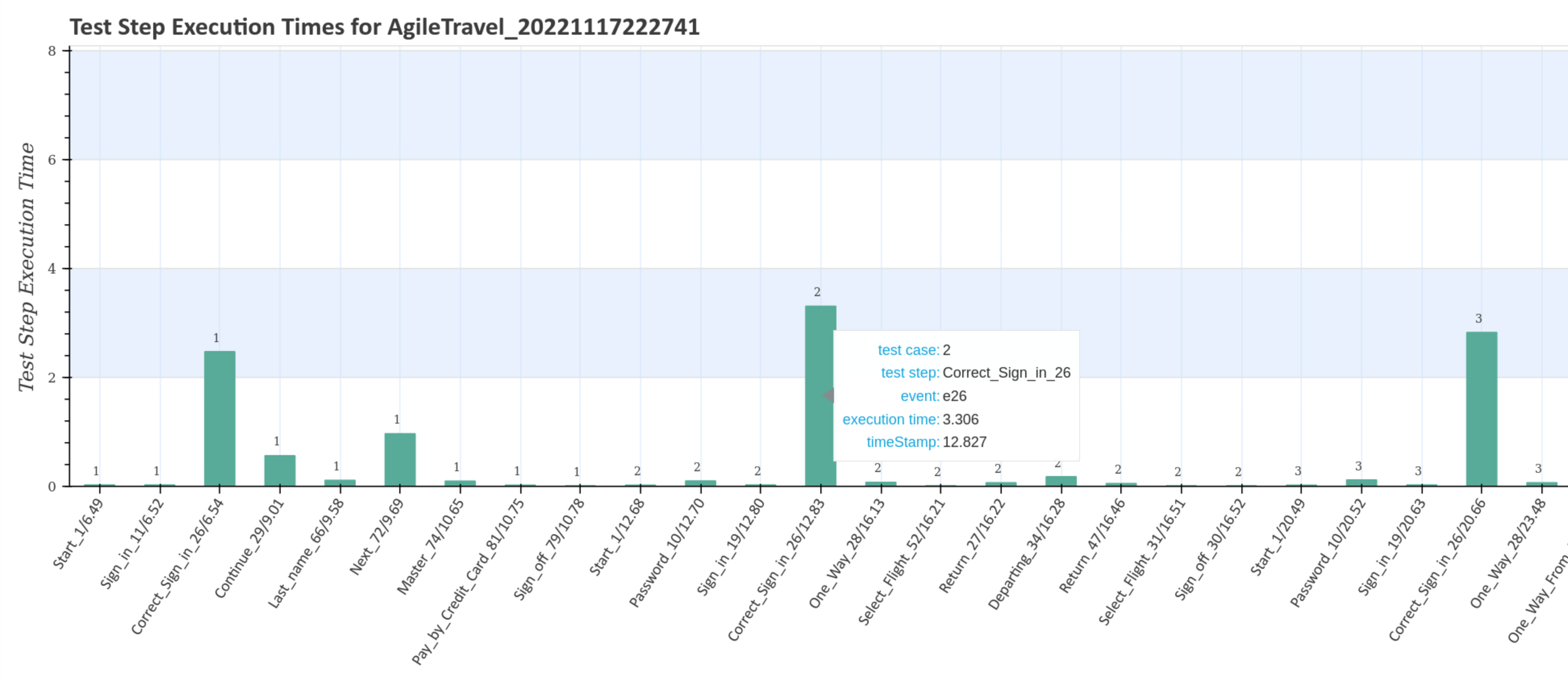
The first diagramm gives an overview of the execution times of the test steps for the complete test suite with the unique timestamp 20221117164807. Double-clicking on the image shows an enlarged image with more details when you move the mouse pointer over it.
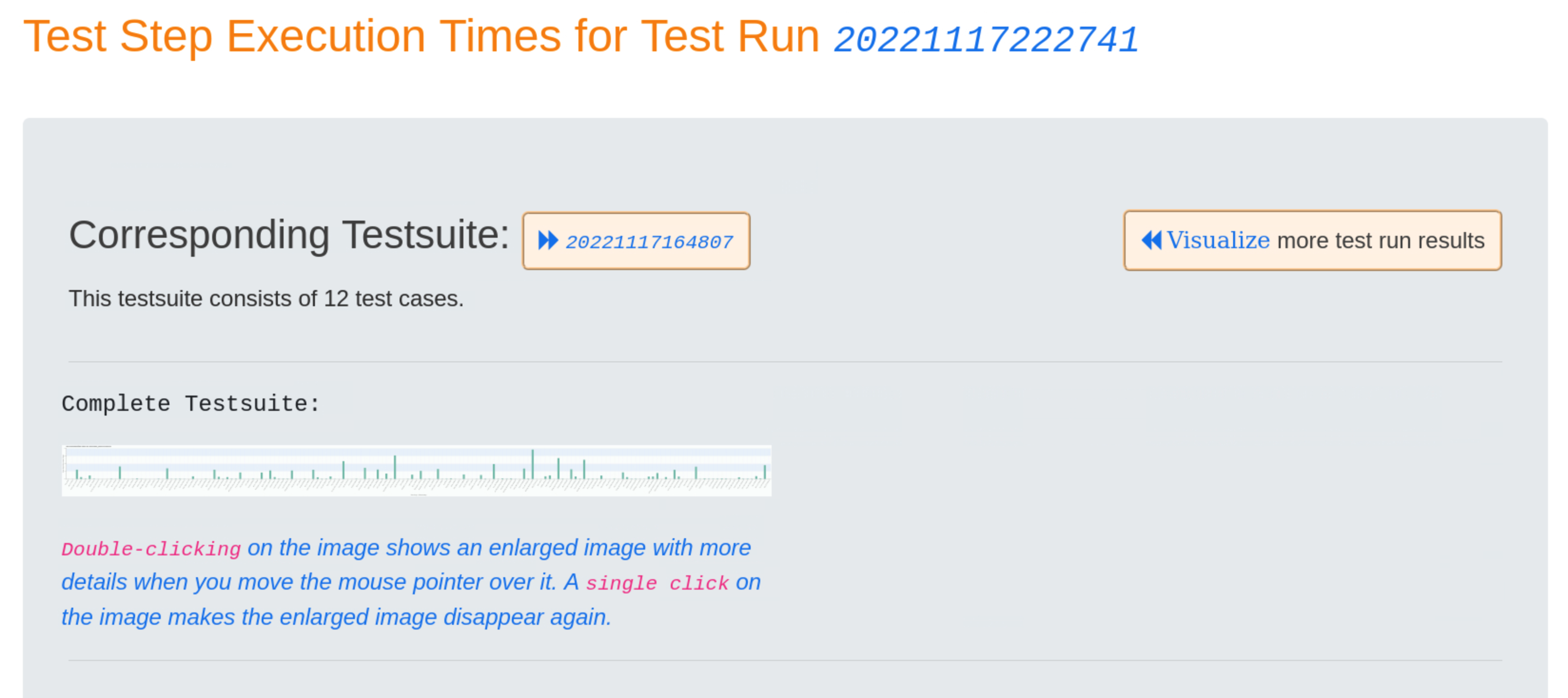
The larger diagram shows the test case numbers and transition events associated with the test steps, as well as the corresponding execution time and timestamp.
...
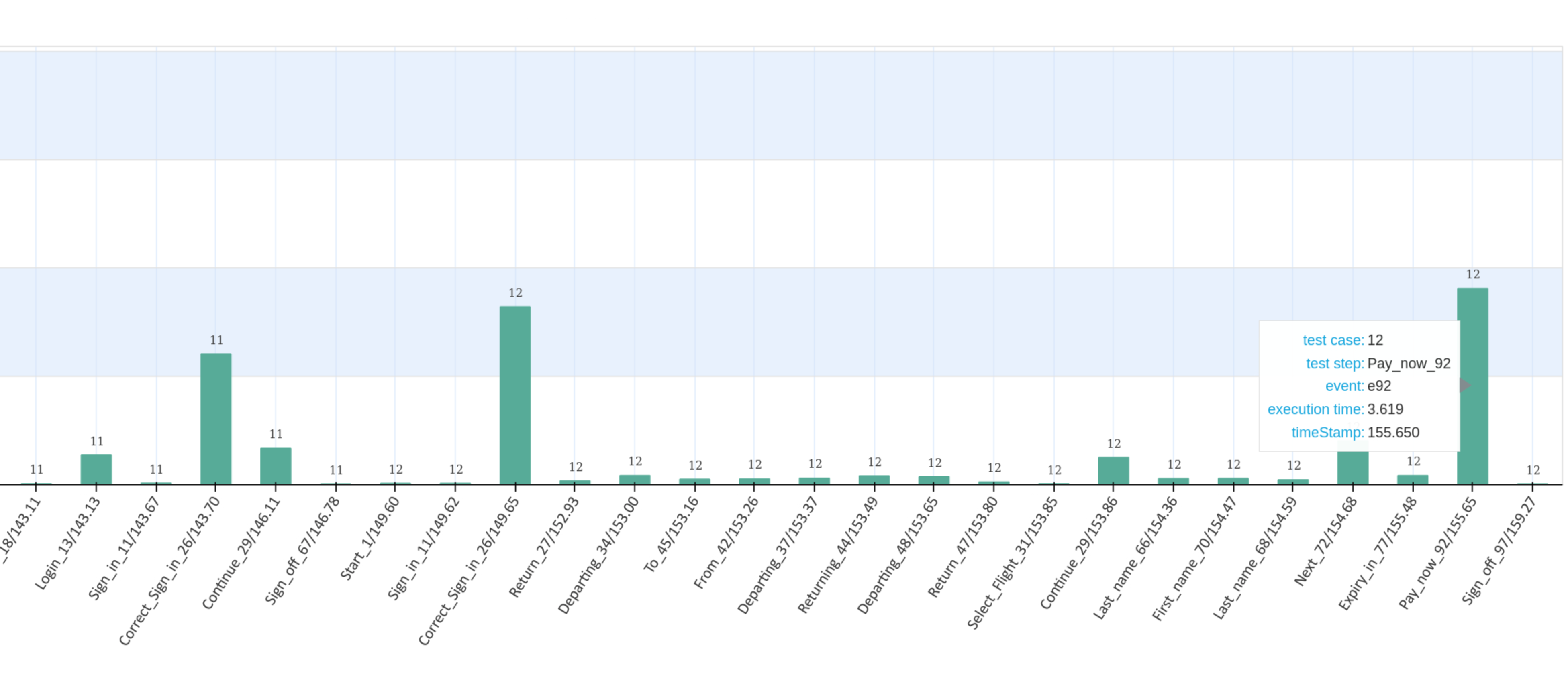
Subsequently, all test steps for all test cases are displayed with the corresponding detail diagrams. The following charts show the results for the first two and the last test case of the executed test suite.
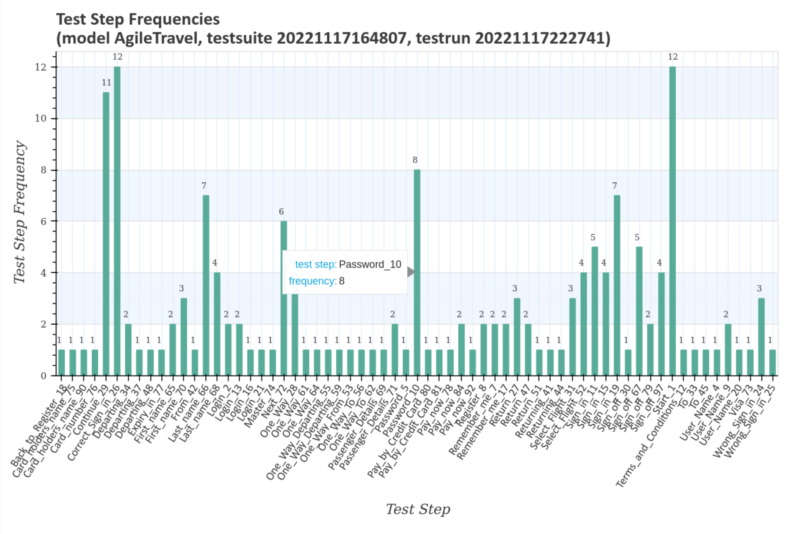
Visualize test step frequencies
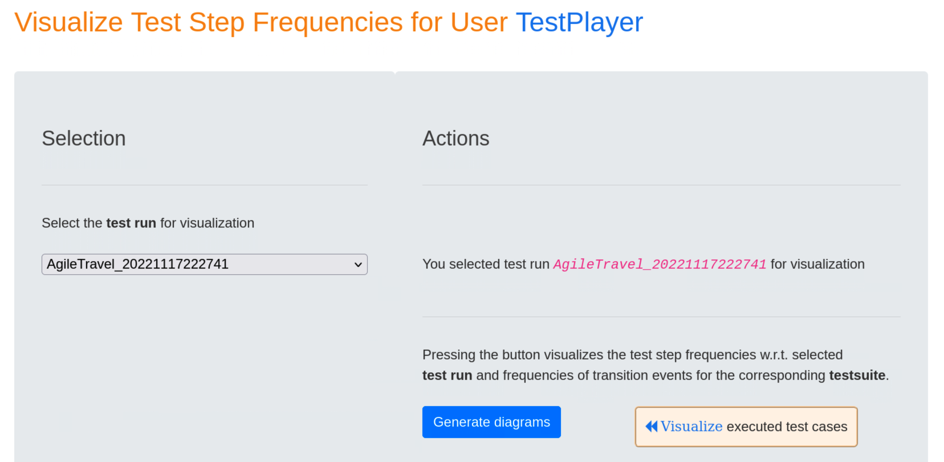
Test step and transition event frequencies of individual test cases in relation to the selected test run and the associated test suite are visualized after pressing the blue Generate diagrams button and the Visualize link.
The first diagramm gives an overview of the transition event frequencies for the test suite with the unique timestamp 20221117164807. Double-clicking on the image shows an enlarged image with more details when you move the mouse pointer over it.
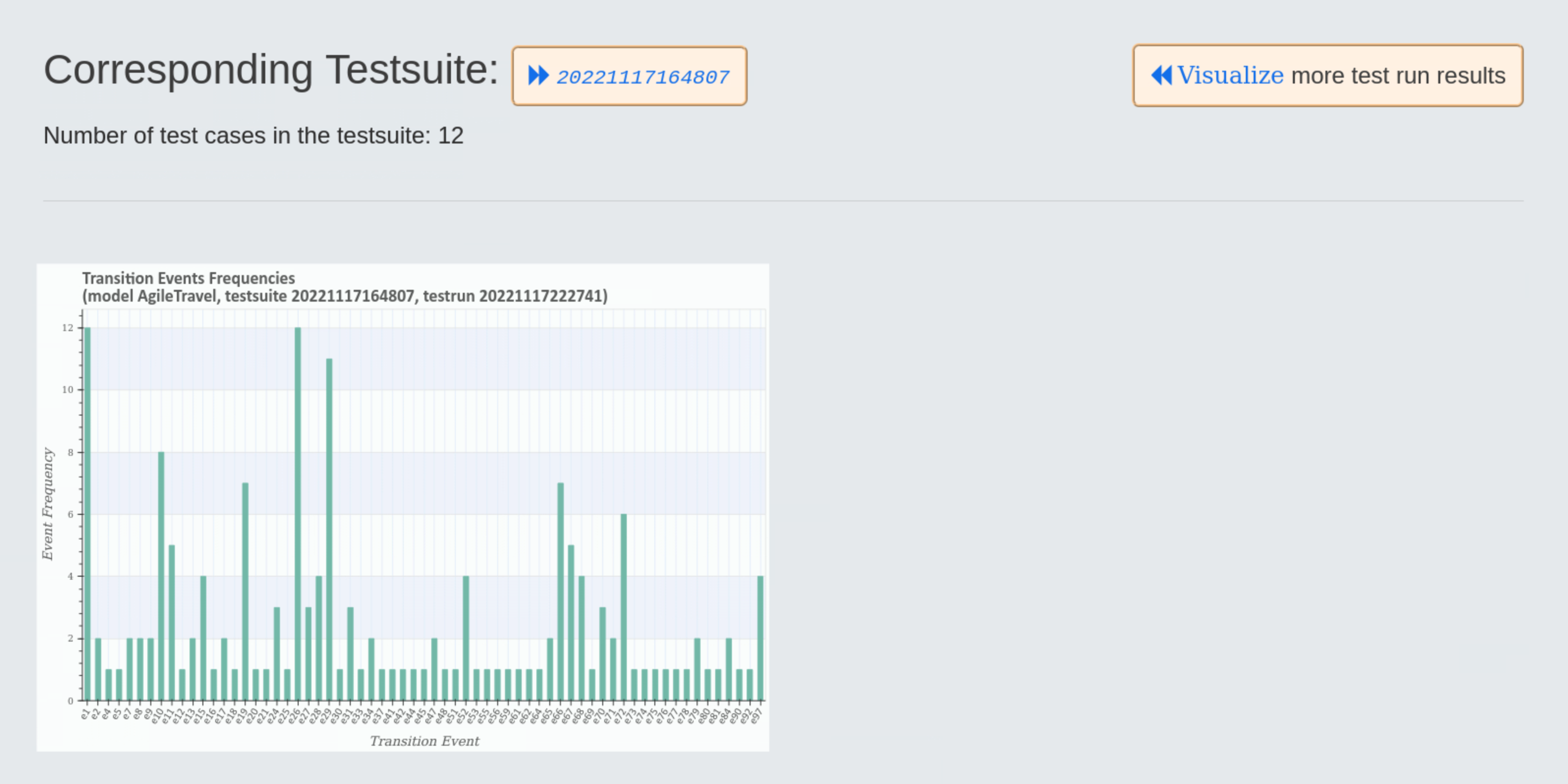
The larger diagram shows the transition event frequencies and the test steps associated with the transition event.
The next larger diagram shows the test step frequencies and the transition events associated with the test steps.
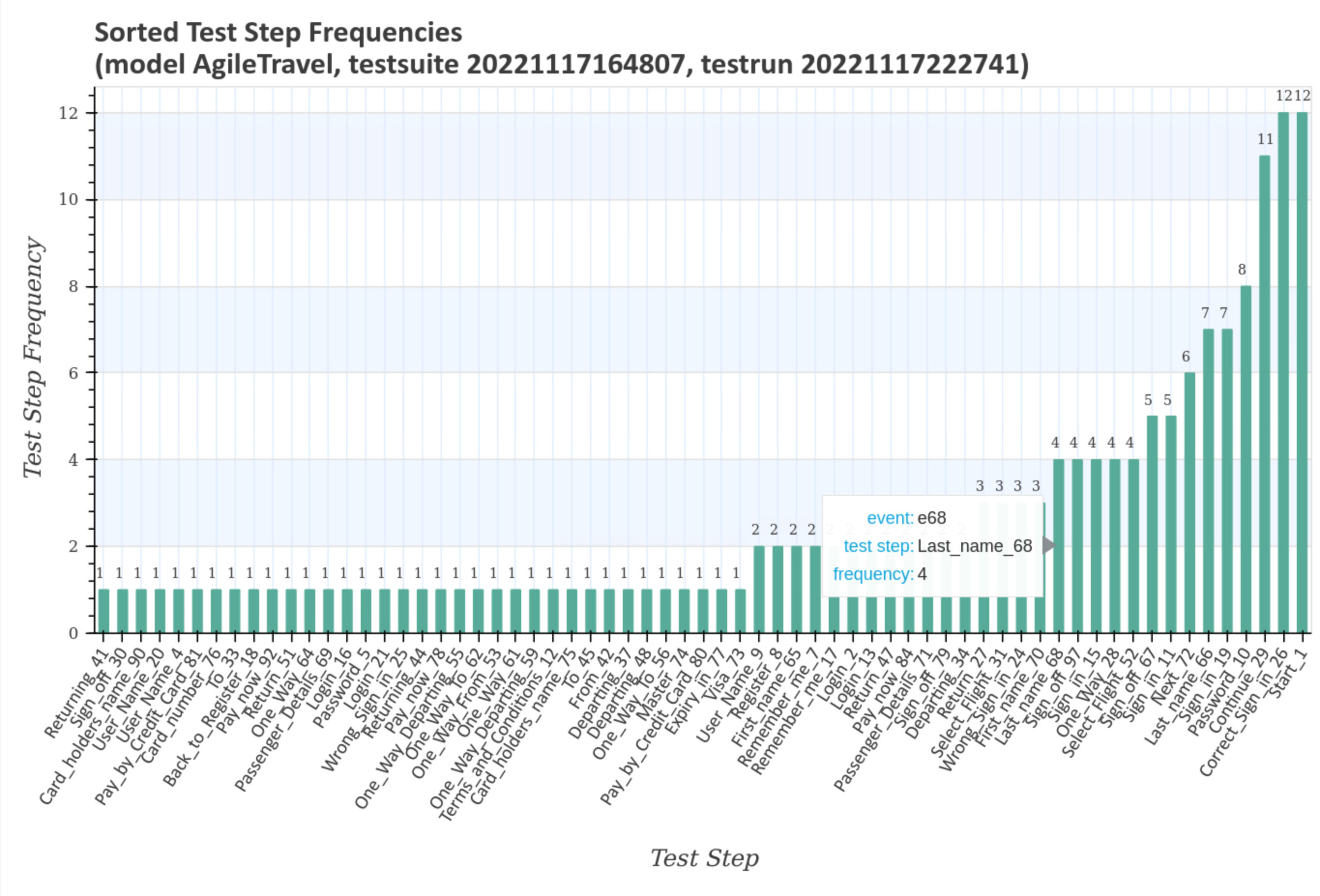
The last enlarged diagram shows the sorted test step frequencies and the transition events associated with the test steps.
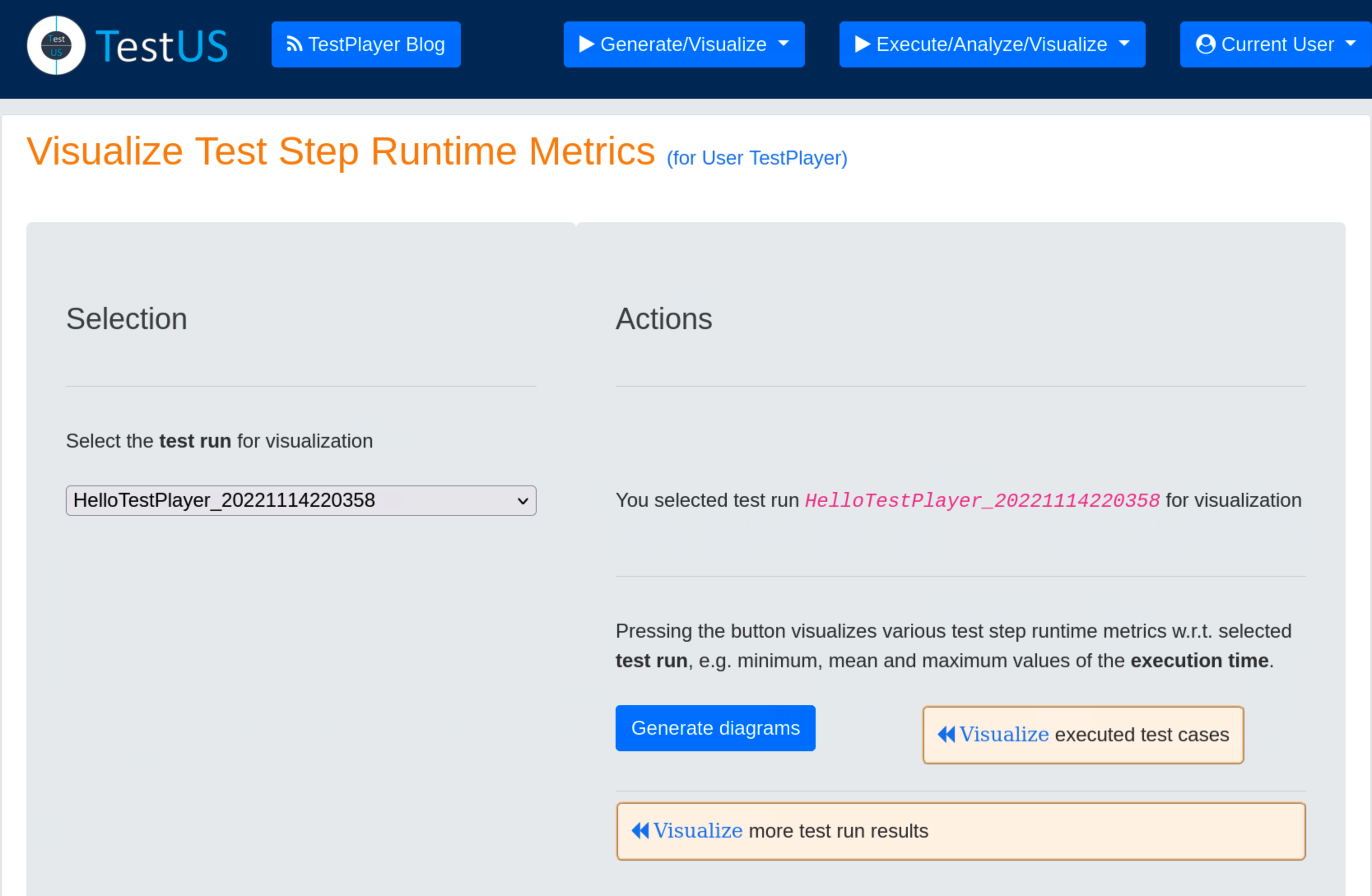
Visualize Test Step Runtime Metrics
Test step and transition event frequencies of individual test cases in relation to the selected test run and the associated test suite are visualized after pressing the blue Generate diagrams button and the Visualize link.
The first three graphs show mean, minimum and maximum of the test step execution times for the test run with the unique timestamp 20221117222741 and the associated test suite with the unique timestamp 20221117164807. All three graphs look very similar and show a characteristic pattern for the test run.


The following diagramm shows the sorted frequencies of the test steps for the test run with the unique timestamp 20221117222741 and the associated test suite with the unique timestamp 20221117164807. As can be seen, test step Correct_Sign_in_26, for example, is executed exactly twelve times.

The next two charts contains the sum and the sorted sum of the test step execution times for the test run with the unique timestamp 20221117222741 and the associated test suite with the unique timestamp 20221117164807. This is particularly interesting for finding candidates for application performance optimization, e.g. Correct_Sign_in_26.


The last diagramm shows the sorted mean of the test step execution times for the test run with the unique timestamp 20221117222741 and the associated test suite with the unique timestamp 20221117164807. This chart is also interesting for finding candidates for application performance optimization, e.g. Correct_Sign_in_26.

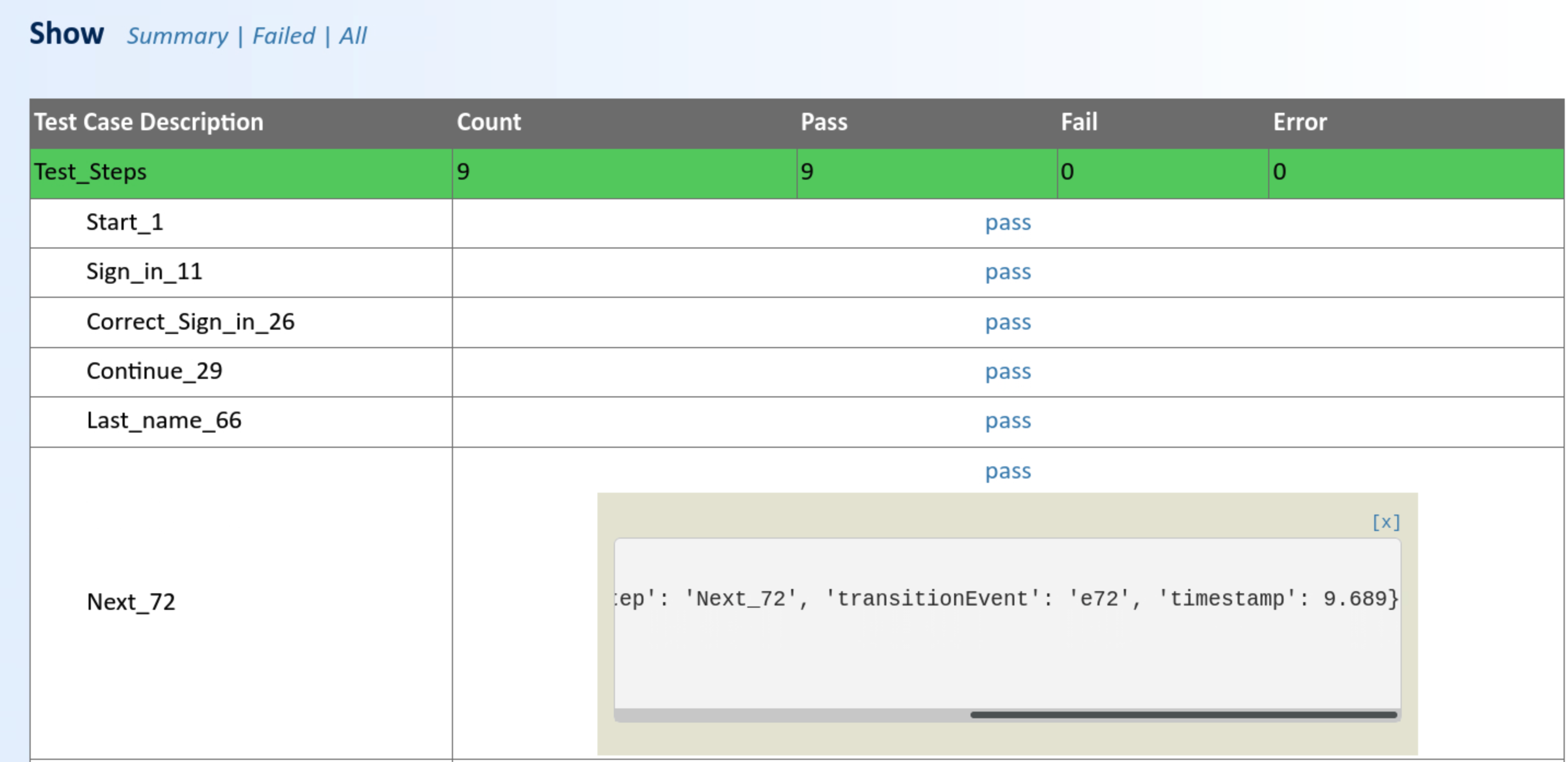
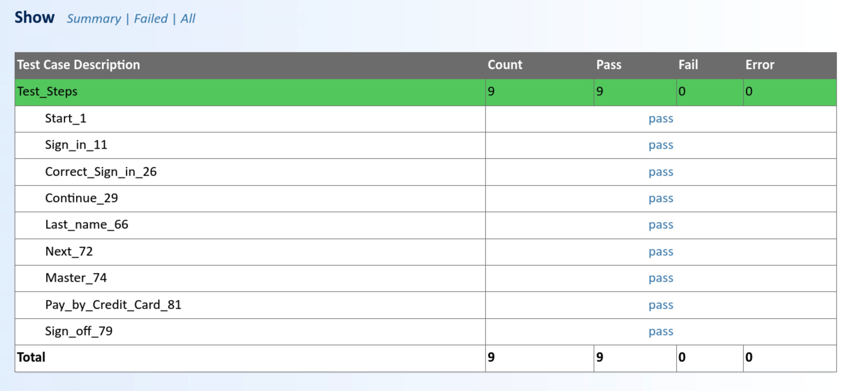
Show Test Report
During a test run, a detailed test report on the results of the execution of the test suite is automatically generated. This can subsequently be retrieved and reviewed by the test engineer.
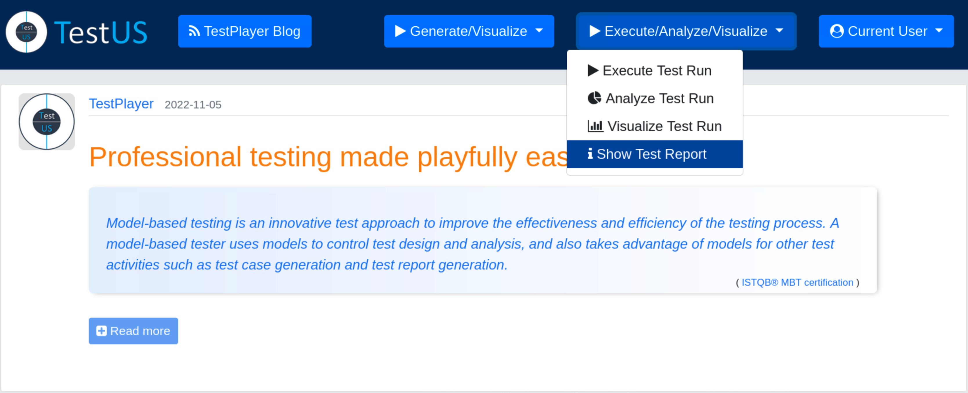
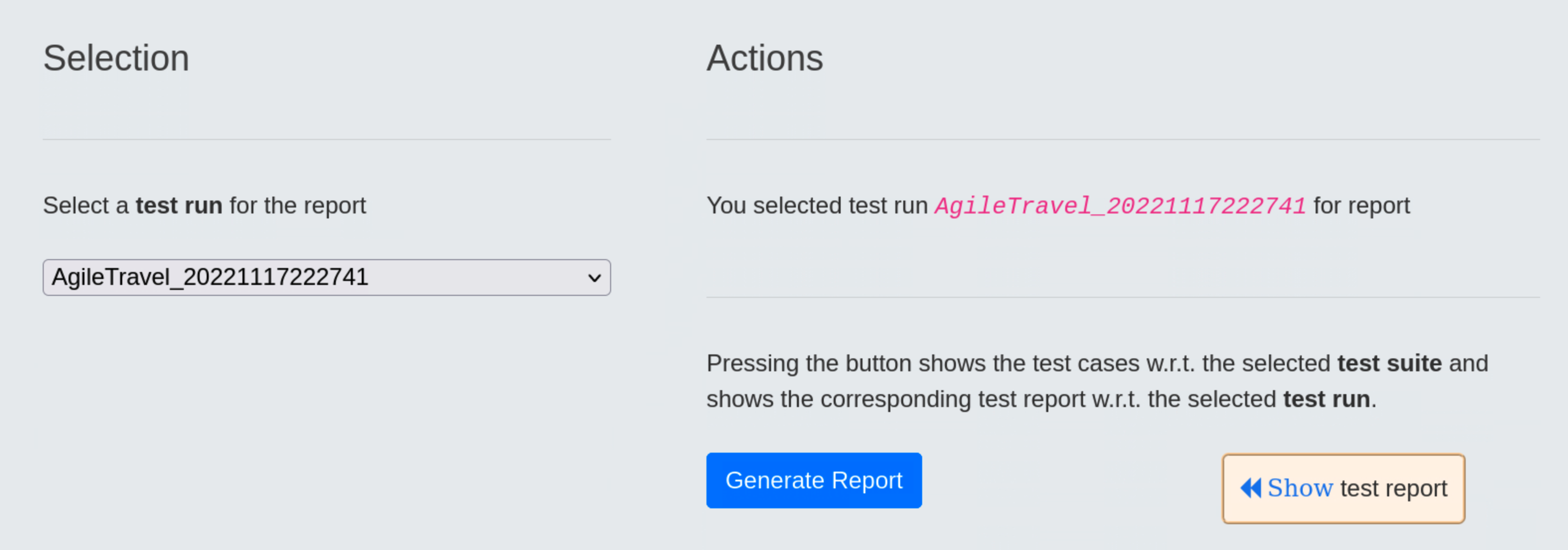
Once a test run has been selected, pressing the blue Generate Report button will result in displaying a detailed report after the « Show Test Report link has been selected.
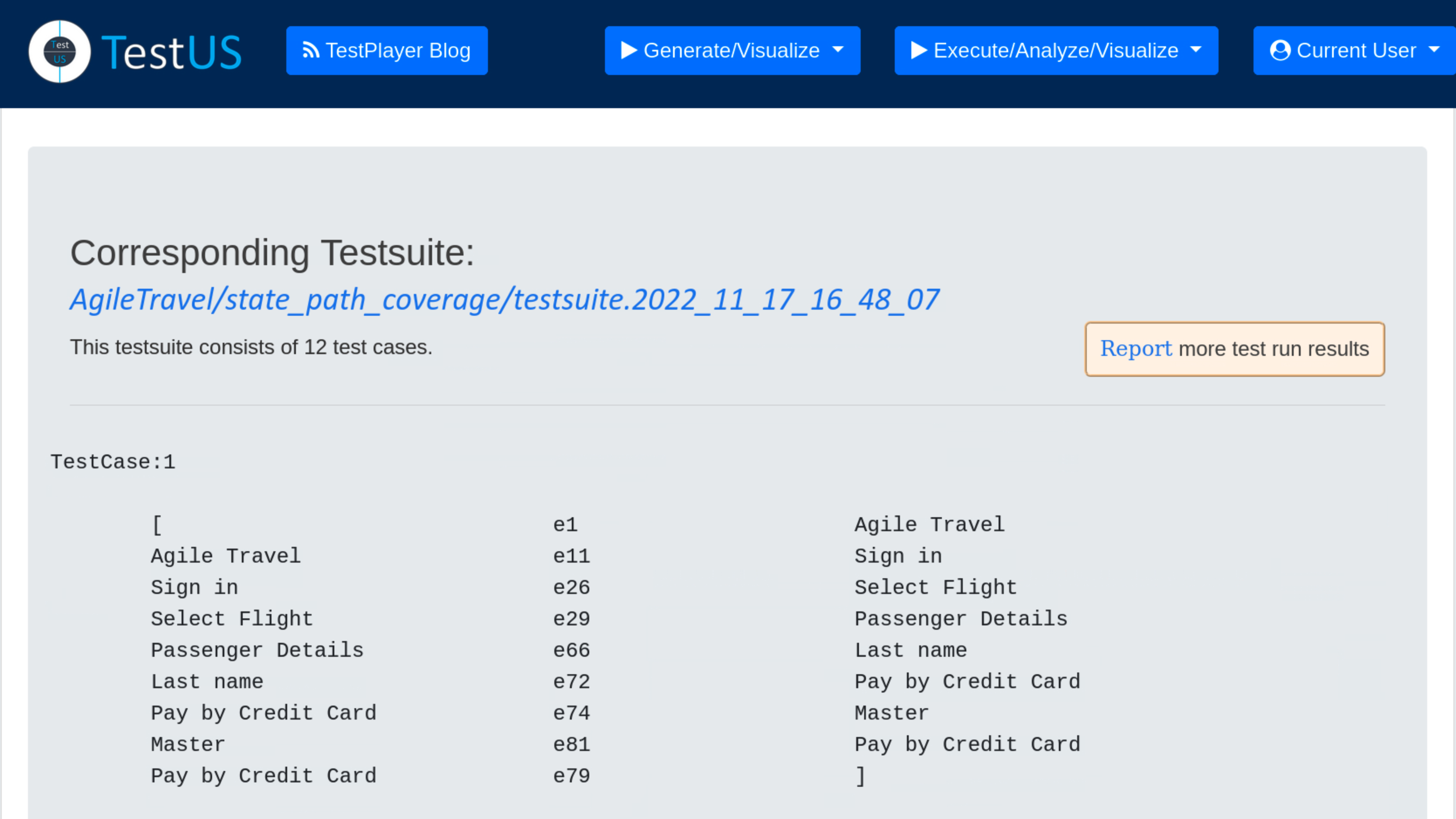
The test report includes
- the unique test run
- the unique test suite
- for each test case the specific test steps and a detailed test verdict
Summary mode displays a summary of the test report, showing the test case number,start time, duration and result (Pass or Failed) of the test case.
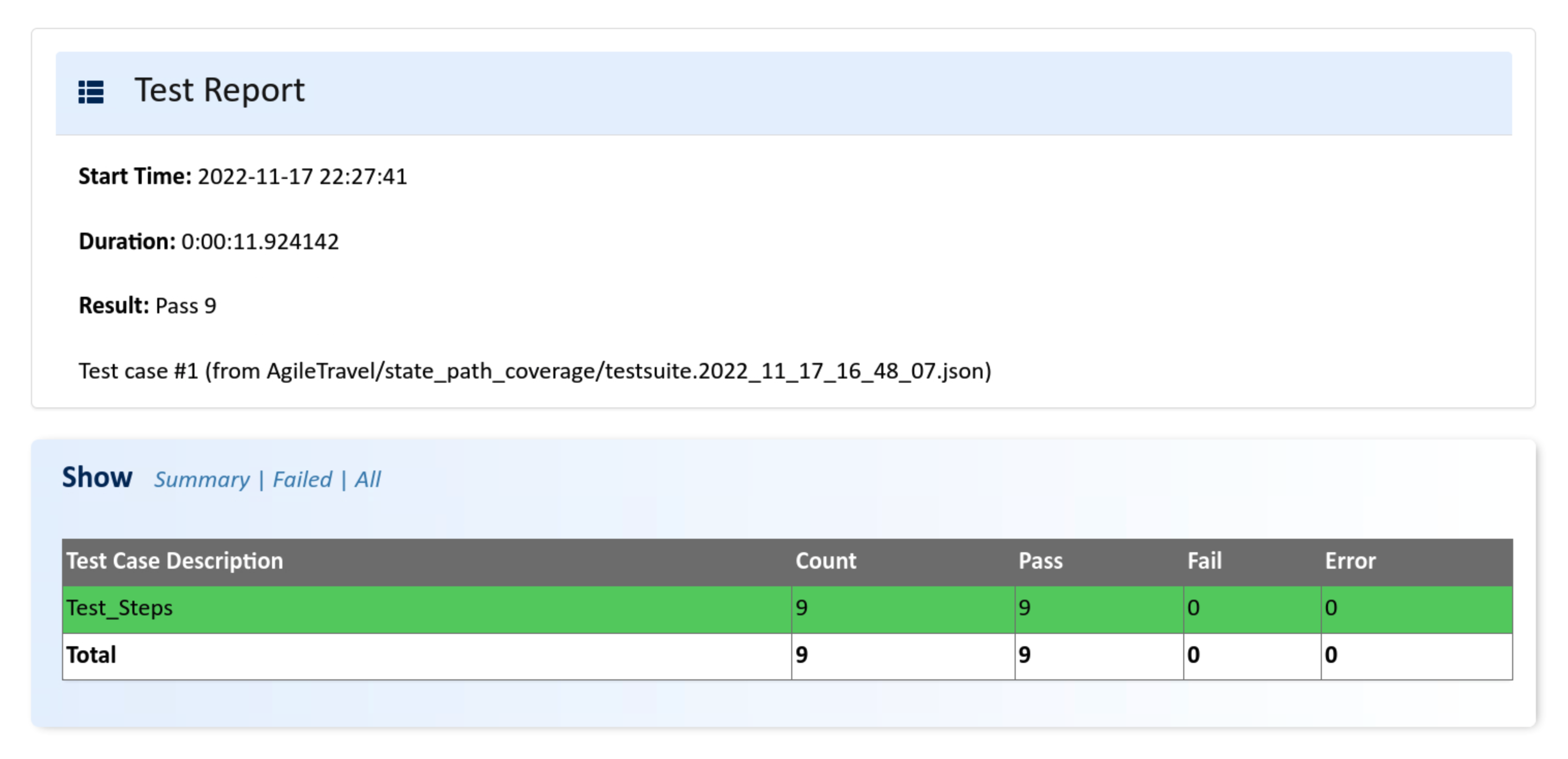
The All mode shows more details for each of the test steps in the test case.
Additional data for each test step, i.e. test case number, transition event and timestamp when the test step was executed, is displayed by pressing on the test verdict pass.